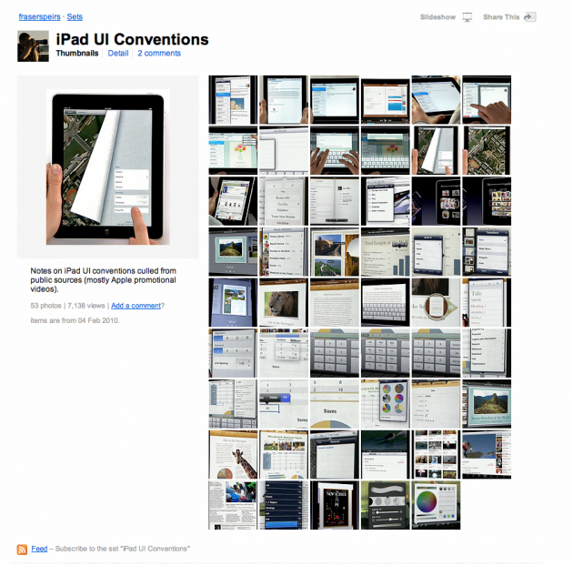
 Following its unveiling last week, everyone continues to debate Apple’s iPad. Some are certain that it’s doomed to fail, while others are sure it’s the future of computing. The truth is that, like the iPhone, it’s hard to make any kind of accurate judgement about it until you’ve actually used it. Unfortunately, that’s not yet possible since the earliest models are still about 60 days away from shipping. But until then, developer Frasier Speirs can give you the next best thing.
Speirs has made a Flickr set in which he dissects screenshots of the iPad from the promotional shots and videos Apple has released. On each photo he adds his own notes of things to take notice of. But rather than go for most of the obvious elements, Speirs focuses on a lot of UI elements that the majority of people will overlook while watching the videos. This is important because as any good fanboy will tell you, it’s often the subtle things Apple does in its UI work that make its devices stand apart.
And with the iPad, Apple has a number of new UI ideas it’s putting out there. As Steve Jobs made clear during his keynote, the iPad was built to be equally as good in either portrait or landscape mode. This is already different from the iPhone which, while full of plenty of nice landscape UI elements, is still going to be used in portrait mode most of the time. But on the iPad, there are elements such as a left hand pane that is visibile in the Mail app only when the device is horizontal. Turn it vertical, and it only shows the message area, and there are new overlays that you activate to navigate in this view. And that’s probably the most obvious example of elements Speirs points out.
If you’re really chomping at the bit to get your hands on an iPad, Speirs’ 53 photos should be right up your alley.
[via Finer Things In Mac]
