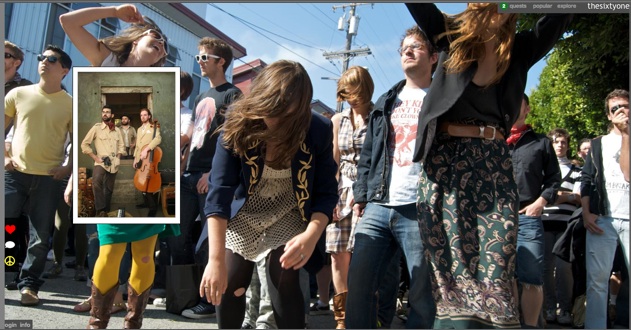
Music discovery site thesixtyone unveiled a radical—and gorgeous—redesign a couple days ago. The redesign presents a single, lush full-screen photograph as each song plays, while smaller snapshots fade in and out screensaver-style. The controls are minimized to rollover menus on the upper right, an account-info strip along the lower left, and green arrows to skip to the next or previous songs. You are supposed to just select a type of playlist (top songs, hot, moods) and let it play. Thesixtyone adds Digg-like voting and gaming elements to surface the best indie music.
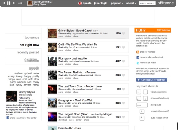
Users hate it. Or at least the vocal ones complaining about the change on the startup’s Facebook wall, organizing a boycott, and sending us tips. This backlash is predictable and always happens whenever a site goes through a radical change. But some of the complaints are valid. For instance, the biggest change is that you can no longer see the playlist of songs you are listening to or skip around willy-nilly. You can see the old design here or in the screenshot below. The old design was more conventional, but it was certainly easier to navigate.
I asked founder James Miao about the backlash, and he responds:
We’ve had an interesting history with change. The reality is that we’re doing some very experimental things and I feel it’s important to have the freedom to explore new directions. Nearly every change we’ve done since releasing in 2008 has been met with a very similar reaction.
He also notes that “we find that lists aren’t very effective for browsing music you don’t already recognize,” but agrees that it should be easier to navigate the site, and more changes are coming which will improve the experience.
There is another issue. Thesixtyone was able to build a small but loyal community of artists and music lovers. The biggest complaint is that many of the community features have been stripped out. Esteban, one “pissed off t61 user,” writes us:
Not sure if you guys cover this sort of thing, but there’s a lot of angry users over at thesixtyone over the big website overhaul. As you may or may not know, thesixtyone is a music discovery website where many indie artists could easily find listeners. The community aspect and fun features of the site were what drove users to be so passionate, when the redesign (most likely design whores) did away with the greatest features, and killed usability it left a big hole in all the hearts of the users and artists alike.
Miao says that there were problems with the old community features. Specifically, some artists were abusing the system, trying to game the ratings or spamming users with mass messages. The new site is designed to create conversations between fans and artists around songs, and more features in this area are also going to be introduced in the future.
I personally like the new design and the way music just plays with minimal fuss. Many of the navigation and discovery issues can be solved simply by bringing back a playlist view as an option for when you want to dive deeper into the playlist or skip around.
Which design do you think is better?