 YouTube is on a roll. Last night, the world’s largest video site rolled out HTML5 support, its first video rentals, and even a nifty music feature called Disco. Today, it’s making an even bigger change: the site is launching a new ‘Watch’ page, stripping it down to its most key elements and ensuring that nothing is drawing your attention away from the video on the screen. To most people, this Watch page is really the heart of the YouTube experience — it’s where you view clips and browse for the next thing you want to watch, so any significant changes are a big deal. The new streamlined page is opt-in for now, and you can activate it here.
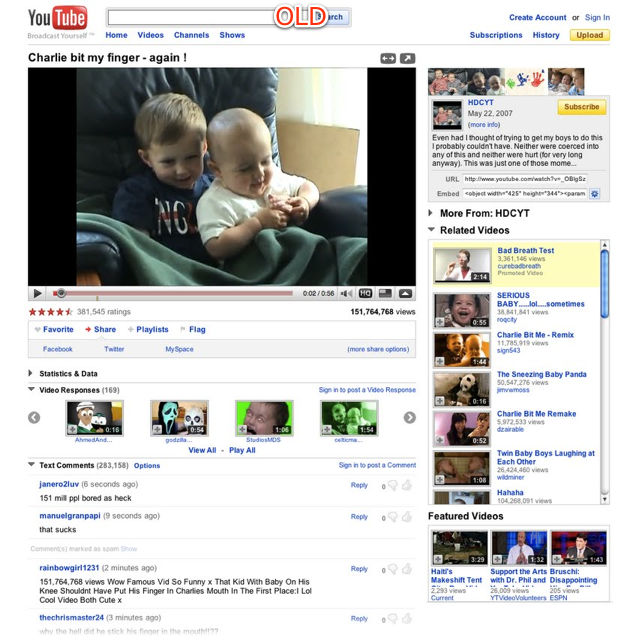
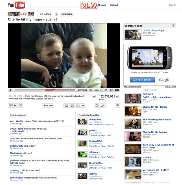
Many of the changes are aesthetic. You’ll find that YouTube has removed nearly all labels and extraneous text, resulting in a much cleaner feel (and one that feels more Googleish). The logo has even dropped the “Broadcast Yourself” tagline, though YouTube hasn’t committed to dropping that entirely. Things like the video description have been moved around, the all-important view counter is bigger, and nearly all ‘advanced’ information has been collapsed (you can hit buttons to reveal it again).
But there are also some changes that may affect how you use the site. First, YouTube has ditched the five star rating system it has employed for years in favor of a binary “Love It” or “Thumbs Down” system. The company has been talking about how useless its rating system is for some time now, so the move doesn’t come as a surprise. YouTube says that any rating your video currently has in the old system will somehow be transitioned to the new one, though the details haven’t been worked out.
The other major functional changes are related to navigation. The right side of the screen features a list of videos that you might be interested in watching next (just as YouTube has always done). But now it’s contextual. Say, for example, I ran a search for “Avatar”. Clicking on a result would bring up the video as usual, but instead of just showing Related Videos on the right hand side of the screen, YouTube will now show other search results from that query, making it much easier to jump between different results. You’ll also find that you no longer have to scroll within a widget to browse these additional videos, which was one of my gripes with the old design.
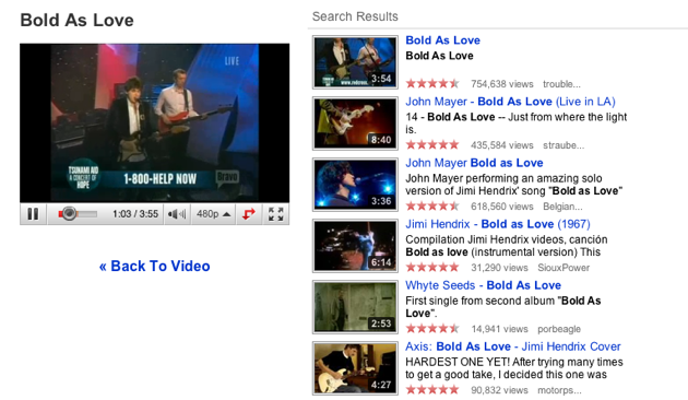
YouTube has also implemented a very slick feature for when you’re actually running a search. In the “old” YouTube, when you run a query you leave the video you’re watching and are taken to a results page. Now when you run a query, the currently playing video will slide to the left side of the screen while results populate the right-hand side, allowing you to queue up your next videos without having to stop the one you’re watching.
Other changes include new controls that let you specify what video resolution you want to view a movie in (YouTube will serve the “ideal quality” as the default).
Here’s a shot of the old site: