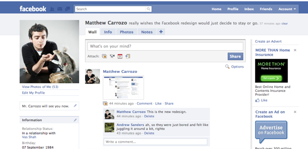
Over the last few days, Facebook has apparently been rolling out some UI changes to a small number of users, moving many of the navigation elements that currently rest at the bottom of the screen back to the left sidebar. The changes are subtle enough that they probably won’t spark yet another user rebellion against Facebook — aside from the people who will hate it automatically — but they’re very significant.

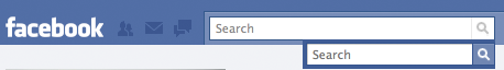
The changes in the screenshot above are nearly identical to the shots that were presented at Facebook’s developer garage a month ago. But there are some key differences. First, search now has much more prominent placement, appearing just above (and almost as an extension of) your News Feed. Previously the search box was positioned in the far upper right of the screen. The search box itself appears to have grown by around 50%, as you can see in the comparison shot below.
There are a few other changes from the design we saw in October. The top navbar has been tweaked, especially in the upper left where there are now icons for your invitations, inbox, and notifications. Again, search is going to get a boost from these changes — each of these icons will be tagged with a bright red badge whenever you have a new update, immediately drawing your eye to that part of the screen when you log in. And, surprise, search is right next to them. It’s also worth noting that some of these changes (particularly the use of icons in the main navigation bar) were first explored in Facebook Lite.
So why the new emphasis on search? Facebook search has long been a rough patch for the site. For a very, very long time, it was just plain bad. Facebook does a great job using algorithms behind the scenes to help surface people you may know at the top of your search results, but actually navigating those results was a pain. Facebook rolled out a much improved version of search in August, but I suspect few people have really explored the new search features, given their poor experiences in the past. And that needs to change: Facebook needs to get people to start using search more if it wants to leverage its Everyone updates as a viable alternative to Twitter’s realtime search.
Again, these changes are part of a bucket test, so don’t be surprised if you don’t see them. It’s also possible that Facebook is only testing this design — the one it eventually rolls out to everybody could look different.
For more shots, check out this blog post (it’s in French, but the screenshots are easy to access).
Thanks to Matthew Carrozo for the tip.