ZURB, a well-regarded interaction design and strategy firm in the San Francisco Bay Area that has in the past done work for eBay, Facebook, Yahoo, Zazzle and many other familiar names, regularly publishes insightful design deconstruction posts for homepages of some of the most popular websites on the net, using its very own Notable app (also see our review of the website feedback tool).
After taking a critical look at CNN.com, MSN.com and Twitter.com, the ZURB team has recently shined its light on TechCrunch.com. And we took notice.
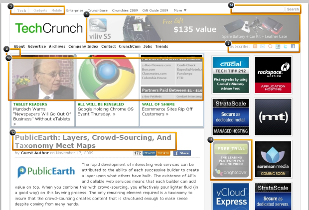
The best way to check out what ZURB had to say about our homepage design – which has been live since Summer 2008 when we did a major redesign for the second time – is to visit this full-page screenshot, where you can hover over their notes to see what feedback the team had to give.
Apart from the visual aspect, the Notable page also allows you to check out the code, content and SEO elements of a website, and you can download the whole critique as a PDF straight from the app without the need to register.
Just for the record, we agree with nearly everything the ZURB team had to say about our homepage design, both the good and the bad. No design is perfect, but we like to think we’ve struck a good balance between making it as easy as possible for readers to check out our content, while giving advertisers valuable real estate that doesn’t interfere with the editorial.
We’re committed to making the experience even better, so note that we are currently working on an entirely new template and design for TechCrunch.
Stay tuned, and in the meantime, do let us know what you think about the current design.