
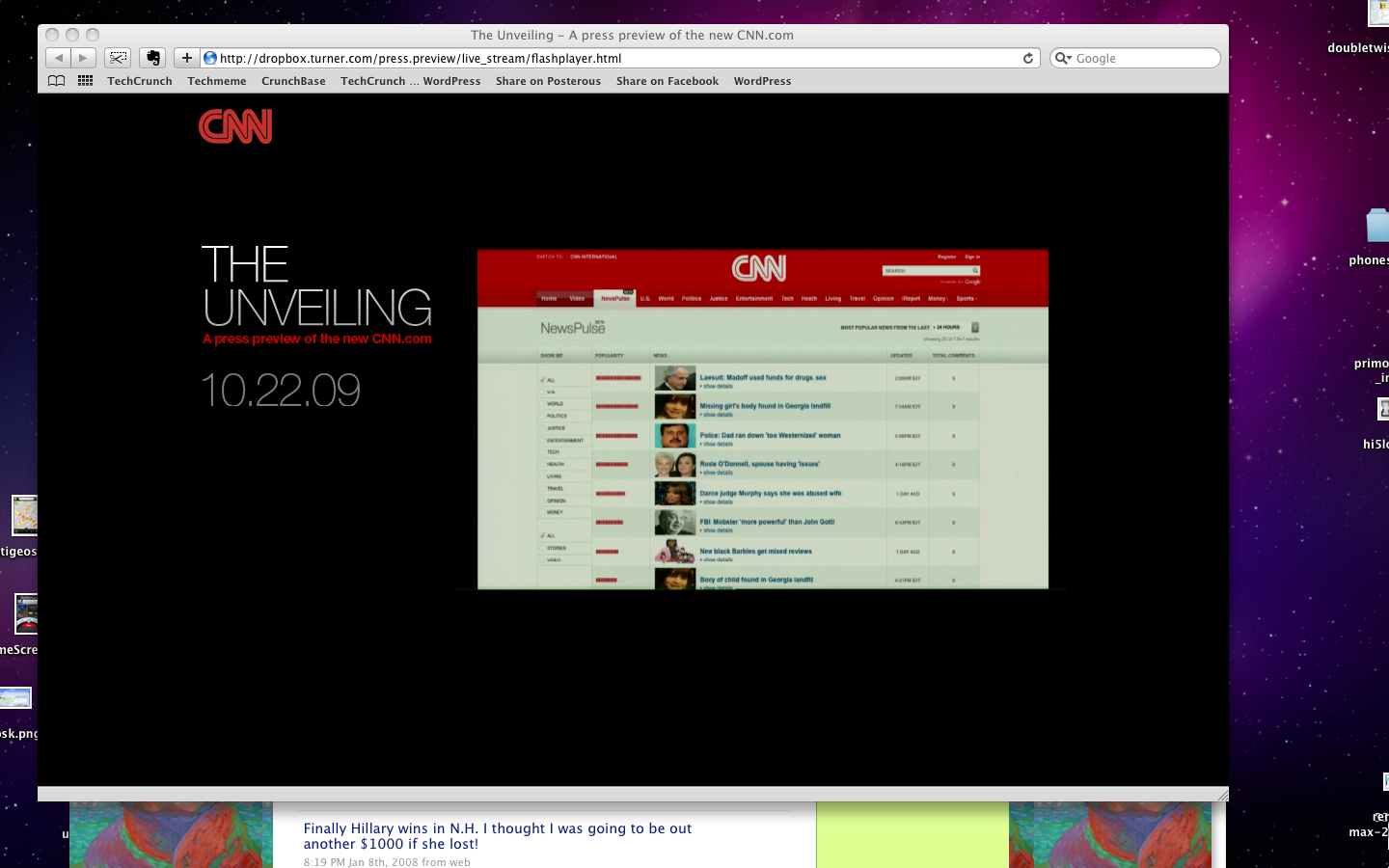
Today, CNN has invited a number of journalists to One Time Warner Center in New York City to witness a preview of the new CNN.com homepage (they’re calling the event “The Unveiling“). The site serves as one of the Internet’s most popular news sites and is also among the most trafficked sites overall, so a major redesign is no small undertaking.
Jim walton, President of CNN Worldwide, kicked off the presentation by talking about how the last time he had taken the stage, it was during CNN’s annual all-hands meeting in January, when he kept receiving questions about layoffs. He recounted that he had said “if we have significant layoffs, I will sit on this stage, and allow all of you to throw tomatoes at me.” going on to say that today, “nobody is going to be throwing tomatoes. He said that CNN had increased its profits year over year, and that it would be ending the year with more journalists than it started with.
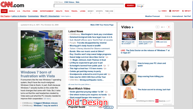
The presentation then launched into a slideshow of past CNN designs, beginning with the site’s original launch in 1995. Then Kenneth “KC” Estenson, Senior Vice President and General Manager of CNN.com took the stage to talk about the site’s traffic: CNN.com has 38 million unique visitors every month, 1.7 billion page views, and 100 million video views. 121 Billion total page views all time.
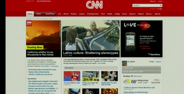
Estenson says there are two reasons to change CNN.com: the site wants to constantly move forward, and it wants to help expose the wealth of content that exists beyond what sits on the homepage. The site wants to emphasize breaking news, and more video, as well as perspective and analysis, and keep it easy to use.
The new site will go live on Monday.

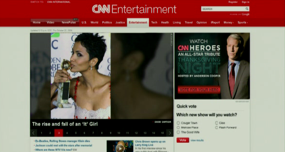
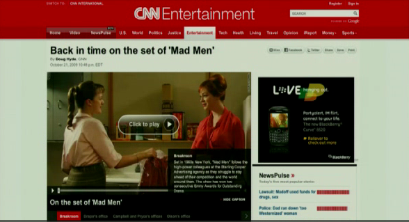
There will be a new Entertainment portal, which will include a new partnership from Entertainment Weekly and People Magazine.

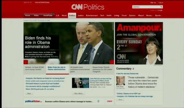
Article pages have been redesigned:

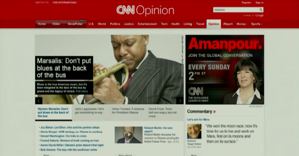
The site also has a more prominent opinion portal, including pieces by David Frum who is a new contributor:

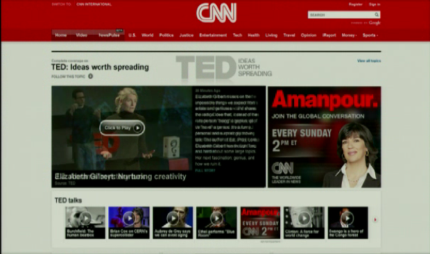
CNN.com is also partnering with TED, and will now feature TED’s talks, which include presentations from some of the world’s most notable scientists, artists, and more.

iReport will now be more deeply integrated into CNN’s homepage.
New product called NewsPulse “very early, launching in Beta”. “An iTunes for news” — a listing of all the articles inside of CNN, and you can go in and sort them by popularity, sort my content and categories. Watch video inline.

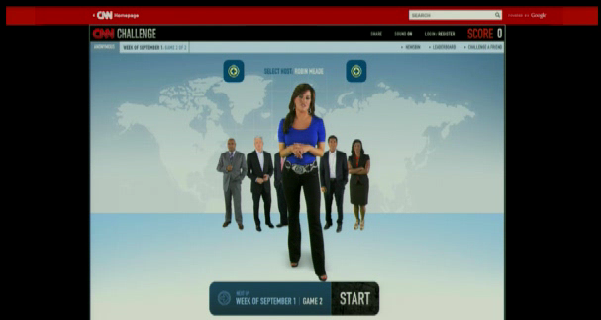
Launching new quiz called CNN Challenge. Flash-based interactive quiz show every week to test your knowledge of recent news/events.

Earlier this year the site did a collaboration with Facebook to do live feed with Facebook stream. Did it again for the Michael Jackson memorial. During inauguration, had 27 million video views (largest live video event ever). Next month they’re doing it again — on Nov. 9th, CNN and Facebook are adding Oprah. At 9 PM that night Oprah will be hosting a book club on CNN.com, with Facebook chat to bring these three brands together. Oprah will be announcing this tomorrow at 9AM on her show.
CNN’s last major redesign was back in 2007, when the site integrated a much broader selection of multimedia content (streamed through a more friendly Flash media player) as well as more ‘Web 2.0′ social features. For more of CNN’s past designs, check out its archive at the Internet Archive’s Wayback Machine.


nice work! It makes the old site look like a crappy geocities page.
who cares if it looks crappy. i’m there to read good articles.
cnn and nytimes need to work on the quality of their writing, which has been dropping recently. that should be their first priority.
Have they enabled comments? This will make for more pageviews and ad revenue.
Per alexa, cnn.com has more traffic than nyt.com, foxnews.com. Websites will make for good ecosystem for newspapers.
CNN does offer breaking news which is why they have more traffic than others.
I thought the old one looked much better than this. The big red banner at the top just looks really obnoxious. Too bad, because I am a CNN regular.
how do you get rid of the intro with the curtains?
I think they’ve got a good sound going. But honestly, I think it could have used a little more redbar. I mean, I’ve got a fever, and the only prescription, is smaller fonts for articles.
I actually think that this is a case of too many choices. I still have the habit of typing http://www.cnn.com to get news, but I’ve made a mental note to eliminate it from my rounds. Within the next 21 days, I will largely only read google news and slashdot.
Any word on the CMS platform they are using, or whether it’s homegrown?
For a site this massive, it’s almost surely homegrown to suit all of their specific and individual needs.
I’m pretty sure its something homegrown…
A company like CNN would not just throw up some crappy CMS. They’d develop it in-house.
cnn is a crappy company. just because it is famous and big doesn’t mean it is some sleek, efficient machine.
work there for two years and you’ll understand.
I hear its an amazing company to work for, any issues you had at your job are clearly due to your sucky attitude
http://weblogs....ets_follow.html
my experience was similar
Having worked on it, it’s a giant, clunky, unstable, commercial Java CMS with ugly, giant, homegrown mods to it, and the most unbelievably convoluted maintenance workflow I’ve ever seen :(
That was before it was fixed. I worked there and was involved in the relaunch.
Some very smart people had and have some very smart ideas on where it can be taken. Just to go ahead and name drop, they are John Maeda’s best students from years ago, and, the rock star from CMU.
You can only move a mountain so far so fast, and Time Warner is a big company, so they say.
Must be wordpress
Nah, I think it’s PHP-Nuke with a few mods
I got here before the witn comments started pouring in…
Ad is higher up now. This is a business decision, not a user experience one. And TC writing about is is also a business decision, not a reader focused one.
I think I like the old design more right now (at least without playing with the new one). The preponderance of text links to articles makes it a lot easier to find specific news articles and items of interest.
I’m delaying judgement, as well; I *really* like the CNN homepage in its current form. I’m always able to easily find what’s current and jump to those stories quickly.
New CNN page looks really focuses on video… I much prefer to read their articles than watch videos.
agreed! the most frustrating thing is to see a catchy headline and then click to find out it’s a video… lame.
Indeed, I’d like to article more than watching 2 mins vague video.
And when you’re at work and may not have audio, you’re not going to watch a video. I want to scan an article, not sit through noisy video,
Who the hell cares, it’s CNN?
Classify my comment under, WITN
It’s a homegrown CMS solution.
Yeah, I agree with Ravi, I’m used to the old design, but the new one looks nice too. Going to take a while to get used to. Now for them to upgrade the UI of the CNN iPhone app…
FYI CNN.com Launched in 1995 not 2005
I love this new design. I’m used to the old design though. It’s gonna take time to adjust to the new version.
I’m going to miss the old design which is still amazing.
Jason, does TechCrunch bother to edit — or even proofread — posts before they go up?
When we’re live blogging we make typos, which we then go back and fix. Chill out.
Michael Bolton: “I don’t know what happened, I must have missed a decimal point or something…”
Nobody likes that guy.
I like it. Nice, simple, effective design – dare I say magazinelike?
It also reduces the information overload of the old site.
The new design shows it is a media company,,, but the red is on the high side
why would i ever visit a page that has 1 news source?
They should have just made a river type page with links to their articles.
Every CNN revision has reduced the amount of content on the home page and this one looks no different. Even larger ads for CNN shows is not an improvement. Also CNN.com has been around a lot longer than 2005.
Wow! It’s a …website.
CNN.com was one of the first news sites online – launched in 1995 not 2005!
Changing a web site layout is now news? That you invite other journalists to? And they come???!!!
Man.. After I posted that, I realized that I had READ a story about journalists going to a web site layout change. Hence rendering my own comments worthless…
Looks like Time Magazine website…
Oui…
Great, “more video”. I realize internet video is becoming increasingly more viable, but I’d prefer to READ news most of the time. Video is great for some content, but is simply gratuitous and annoying for much of it.
This is why I stopped visiting CNET long ago. Everything you touch goes to some lame ass vid.
Well, um, CNN is a cable television news network….shouldn’t their site have more video than text news? If you want text news wouldn’t NYT and such be a better choice? Just saying.
Kudos to CNN, their site looks slicker than ever.
The redesign looks definitely promising. I like the red header. CNN = red. They seem to focus on images. A good move.
it’s like constant breaking news. : /
The design looks nice but they forgot one thing there a damn news company; news should be #1 prority they dont have enough space for news on the home page.
Id just them to have a page design that shows local (US) news and international news, the menu bar should be large so as to point out the links more.
Try being a damn news agency more instead of a half ass version of yahoo without all the useful features.
That looks very…Wordpressish..but still very good.
Wow now way dude that is just soo kewl.
RT
http://www.anonymous.ua.tc
This new site design of CNN looks good.
If I never see another lame “iReport” link on their homepage, it will be too soon.
Looking pretty sharp!
Wow that is horrible. I hope they give you a flag to turn it back. I’m there for the headlines, not the big dumb gallery rotators.
Full screen shot here: http://bit.ly/1gju4j
I hope they test it to see the impact on their engagement metrics!
Well i like new cnn’s website design. It’s really cool :)
The current site utilizes Novell eDirectory for customization on the fly, is that stil going to be part of the new site?
Looks better than the current one.
That being said…it’s amazing how similar the news sites all look. You’ve seen one, you’ve seen all of them.
And carousels are in this year, for sure. Let’s see how long that fad lasts.
Ooooh ahhhh!! Pretty pictures!! Who says the media is killing themselves by catering to the increasing number of illiterates in this country? Wake up America and pick up a newspaper!!!
Hmm interesting. I have never used CNN.com ever as well its not made for technology. But with this layout I may just use it.
Thanks for bringing it to my attention.
Man, that looks an awful lot like the new Salon.com website: http://tr.im/CyoS
Looks like a way to hype “Hispanic in America” and a huge ad front and center…still no real, thoughtful coverage of the Obama administration…nice try CNN.
Wow, um, there’s too much RED in that header.
I agree. If it wasn’t so saturated it might not be that bad but it’s definitely a distraction form the main content.
I can’t put my finger on it, but the new CNN reminds me of something. http://skitch.c...y/nrc37/new-cnn
You can still find some of their old designs on parts of the site that never got upgraded – if you look hard enough.
http://www.cnn....ents/index.html
as a designer I want to say yeah the new site is awesome becuase of its red header and muted background.
but aside from those two elements I can really see a tremendous amount of “design” changes.
at least one that I think would warrant thousands of hours in planning and tweaking…
or deserving of much fanfare
–
Thanks and Regards
Noel for Nopun.com
a professional graphic design studio
How does the mobile design of cnn look?
When is the new design going live?
That massive red header is obnoxious.
There’s no focus for the lead. The black overlays at different sizes are jarring and the tiny fonts do nothing to improve usability. And then you have 9 identical blocks of content at the bottom. The previous poster is right, the red header is branding overload. For good news design, see the LA Times site.
Now if only they would get the above-the-fold stories of horrible things happening to children EVERY SINGLE DAY off their site, maybe I’d visit it again.
could not find RSS feeds on the site.
I think the cnn.com team definitely still has some work to do and the user will need some time to get used to the changes… but overall, i think they deserve some props.
here my post from a couple days ago: http://jonathan...om/archives/135