There’s no question about it: Google is great at search, and its huge lead over competitors is well deserved. But the site’s spartan design can sometimes leave something to be desired — sure, the company gradually makes tweaks to it, but we haven’t seen many radical changes in a very long time. Now WebMynd, a Y Combinator startup that launched back in early 2008, is looking to help spur the search giant to make itself a little better, or at least give it a few ideas to help. Tonight, WebMynd is launching a contest appropriately called RedesignGoogle.com that invites designers from around the world to give Google a makeover.
WebMynd has posted all the details details on its blog, but here’s the gist of it: designers are invited to revamp Google using any CSS modifications they’d like. The contest starts accepting submissions today, and will run through November 1. Then, a number of judges (which include Y Combinator’s Paul Graham, the WebMynd team and — full disclosure — myself) will pick the best designs. The winners will take home a brand new MacBook Air.
The nice thing about the contest is that it isn’t purely theoretical — you’ll actually be able to start using the new design in your browser, using a stripped down version of WebMynd’s browser plugin. The Plugin, which launched back in March, gives users the ability to customize their search experience and includes a number of other features, like a comprehensive browsing history (advanced features won’t be enabled by default on the streamlined contest plugin, but users will be able to turn them on).
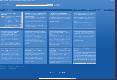
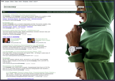
Here are a few of the early submissions to the contest. You can see a full gallery here.


Meh.
this is stupid. That site is infringing on google’s trademarks (i dont care about google but that site will probably get sued)
This is dumb. A company who is not Google is running a redesign of Google? Think of all the cool startups that could have been in this article instead.
You can load http://www.google.com just use Firebug to redesign Google with CSS.
The problem is that you couldn’t include any ajax or JQuery because you’re not on Google’s domain.
So you can’t make Google JQuery cool.
http://img443.i...268/googlel.jpg
OMG, I would love to override function lol&&lol() {}
Somebody at Google clearly has no concept of naming conventions.
Someone obviously doesn’t know about JavaScript obfuscation…
Firebug? Why not greasemonkey – It’s what it does ;P
Jason: “There’s no question about it: Google is great at search, and its huge lead over competitors is well deserved. But the site’s spartan design can sometimes leave “somthing” to be desired…”
“Somthing”?
Why?
lol all the submissions are horrible… just no.
I totally agree with you they are all down right awful. Looks like half of them were (for some bizarre reason) trying to clone Bing.
Ya, that would go over like a fart in church.
Nice idea, if Google picks up one design, what’s the reward then?
I still like the spartan way google is…
Google does not need a redesign. They own that search engine look, it is part of their brand. If they change anything up it should be the typography, but that is it. No color changes, backgrounds, or any other nonsense. None of the submissions add value to the Google brand.
“None of the submissions add value to the Google brand.”
Agree Completely…
But still their is a lot of things that Google can do, the result page can be even more simplified and could still be made more easy to use.
Most of these early designs are aesthetically awful and functionally impractical.
At least those two are eeewwww, I’ma check the others
Done, all of them are hideous, with all due respect to the creators, what’s up with the levi’s one and the rose I can’t read a single word, and the naked woman lulz.
comment
My two cents, this is as far as I would go with a new Google design, as many people have said if ain’t broken don’t fix it, but Google should do a better a job in blending their apps interface with Google Chrome.
http://picasawe...703005494850322
Can’t remember when was the last time I visited the google main page… All I use it’s the right bar in my browser, who still checking the main page anyways?
Actually the point is to overwrite the CSS on the results page.
googles bread and butter is search, would it make sense to alter the design and possibly distract people from the adverts?
Checkout ShinySearch.com, they have this functionality for more than a year!.
I forgot to add, IMO ShinySearch has way better designs than this one or even the themes you see in iGoogle
google have more money than arrington has emails from shitty startups, if they had any interest in redesigning it they’d spend a few hundred k on getting a team of the best designers in the world.
What a silly idea.
A nice idea but I always prefer function over form. Google has proven itself as *the* search engine. Although Bing has made a run the past month or so G will be G independent of how it looks.
This one was the only one worth LOOKING at: http://tr.im/zeeT
Way to whore WebMynd techcrunch. How much did they pay you?
Judging by how much WebMynd spent to design their website: nothing.
Quite underwhleming.
If this is the best of innovation we can expect from this generation web companies, we have a problem.
“WebMynd Corp” also owns RedesignBing.com
Domain registered 2009-06-21
I think it will take long time for the same contest at bing =))
This is blasphemy! This is madness! …
I think it’s a great idea, and I’m going to submit a design but closer to the end date, so I can get noticed.
Anyway, it would be good publicity for my gadget blog.
This is the contest created because Craiglist won’t budge. Leave CL alone. Leave Google alone. What is wrong with people? Does everything on the web have to beep and blink with millions of colours just to make it cool and useful? FAIL. FAIL. FAIL.
If Google actually picked up any of those designs I would start using bing.
The last thing they need is a redesign. They’re always tweaking small things, and the have a certain neutral image visually and it should stay like that.
I mean the good thing about that is that it won’t feel dated a year later. I’m pretty sure they know what they do.
Holy shite just look at those awful submissions.
I think Google is great in it’s simplicity! We use it for its search functionality & not for its design… having a complex esign may actually detract from its features and imply a new learning curve.
Maybe it’s just me, but I really like the spartan design of Google. It’s small and loads really fast, even over a 2G mobile connection, and their search results are consistently more in line with what I’m trying to find.
Leave the sparse design alone!
Doesn’t this come down to the same Zappos/Amazon/Other Successful venture with “bad” UI debate? When it comes down to it a lot of the current design elements in these sites are effective at getting the design done.
If Google was web-design backed community I’m sure this would be a bit more applicable and in return receive quality entries in return. I’m not sure how much more flare you could plop on top of Google’s design to try and make it “better.”
Agree!
If it ain’t broke, don’t fix it.
The simplicity of Google is far greater than the design of Bing or any other search engine. Google’s goal has always been to provide users with information at very fast speeds.
With the submitted designs already, no one deserves that Mac Air.
Agree with you too. When I visit Google, the whole page just makes me focus on the essential part…the search box.
No distracting pictures and graphics needed, at all.
In the web 2.0 fancy website era….Google’s simplicity is soothing to the eyes. Really wont like to see any changes in Google’s home Page.
Firstly,
Google doesn’t need to be redesigned. It’s not Bing, it’s not Cuil, it’s Google. I don’t want to sit there while a distracting background image loads and gives me a headache, I want it to just work.
Leave the fancy UI to Microsoft, please. Also, these submissions are horrible, I seriously hope nobody wins that laptop.
Google totally needs fixing though! A company that is hoping to provide an operating system and complete software package cannot keep up with this dodgy branding. For a start the google logo needs sorting….
bing.com, for when you want to search and break a dangerous monopoly at the same time
(from a user of google mail, calendar, docs, maps, product search and voice when it releases in the uK…oh and total wave fanatic… )
What’s wrong with Google? If I want pretty pictures, I’ll SEARCH for them.
Is it just me, or was it someone’s genius idea to make a bunch of small hard-to-look at thumbnails instead of letting us look at the full images?
so just to be clear, the judges will be people in venture with no design expertise? or will there be actual designers with cred looking over the submissions?
Great stupid idea.
The skins are not that great too.
I really like the Avatar: The Last Airbender design, where someone just took a huge JPEG and put it as the background. And then they covered Aang’s face with Suggested Links.
/sarcasm
One of the main reasons I love Google is the simple and clean UI. Why change that? They are a search site meant to serve up results accurately and quickly. No need to clutter the experience in my mind….
i used to hate the old google (when they were beta) letterform and the layout and background colour but i’m partial to the new way they have things now. i think if they are going to revamp they should keep thinking about a minimalistic route, but their centrified layout is on point. i don’t like the searh results page and the way they have the layout but i’m not sure what else they can do, because it would mean a lot of work for them to make the search redults page look pretty. it’s not too clutered although sometimes it feels like it with the text below the hotlinks, and it’s clear. i think this could have been a good idea but i already don’t like the examples and the layout.
Ok, this contest is good. That Avatar entry is cool, but I don’t think it’s ideal to be the design of the best search engine.
The Big Idea among most of the entries appears to be to clone Bing. Very creative. And the rest just changed the background and font colors.
I think te change Google needs is in filtering search results. On the home page, I would introduce simple tick boxes so you could select search categories (pictures, video, news, etc) before you click the search button.
On the result page, results should be organised into columns, Google’s results page is now an eyesore combining video, pictures, etc into one mass.
I would present search results in neat vertical columns: Web, Video, News, Sponsored, Images, with drop down filter buttons atop each column to select other categories (blogs, research, etc).
http://www.amusis.com
i don’t like the search results in columns idea. i was thinking that they could do it like different conversation boxes and just sorting things that are relatable to each other, but that’s too much on one veritcal page, unless they plan to go entirely horizontal. i think they should either go with your filtering idea (which they do have already ina limited aspect) like how they can allow you to close result links that are not necessary.
google needs to do something with their search results page. i have made my peace with their centrified home page and the google text and colors and evben this month i have had to get used to the stupid larger search box and old people size font, but it’s all about change i guess. i went to the redesign site and this idea is something that would be good for bootb or somewhere else people can work on ideas or give advice on how to improve an idea where the community can vote on the best ideas. the examples on the website were bad. if i could do that with no skills at all, then it’s bad. those are not good examples to endear people to be interested in this redisign google project.
They are all AWFUL!
but this one stands out http://www.webm...signs/by_id/126
wow, these designs would’ve been bad 10 years ago, now they are laughable. it looks like 90% of them were done using ms paint and/or sticking a random ugly image in the background. i still have a hard time believing this isn’t a joke..
Dear Google:
Simple IS Beautiful.
Whatever WebMind and others come up with, please do not add stuff to your home page and search results pages.
Please, please do not make Bing out of Google.
Or, at the very lease, give me, a user, a choice to stay with a cleaner design. Thank you.
Dear WebMynd:
Unless you were commissioned by Google to do a research (or come up) with a new design, why are you wasting your precious startup time? Launching a contest to redesign Google sounds like a cheap way to attract attention; trust me if it sounds/feels like a cheap way, it will be perceived that way.
Do you have any idea how much resources Google has and how much it spends on various user testing?
Just the famous 41 shades of blue should give you an idea:
http://www.goog...6985f0b1643625b
If you do not have any original idea to execute properly, consider moving on and committing yourself to one of the (largest) world problems http://www.ted....priorities.html
First, when you go to the site, and want to add a comment there is no add a comment button even when you login with 1 of your Web IDs. Really annoying.
Second, one of the designs, a naked woman, really? That should do real well for their (Google)corporate image. The person who made the design doesn’t know a thing about business.
I dnt feel like using it .. Google is best like this .. simple and fast .. its design doesn’t matter by the time is working efficiently … And it looks very nice and simple .. the way I prefer it to use it …
Cheers,
Daina
If google is interested in changing anything i hope they go after a fixed navigation menu solution. I hate drilling down into adsense and not having a link back to gmail. The links from one thing to the next are different on every page its maddening. And NO i dont want a google toolbar
Just build a frakkin navigation menu!
I doubt if any of these is going to win any prize….
I have to agree with most of the other comments, google has created its phenomenal brand image through its simplicity. It does exactly what you want it to do, why would anyone want to change that? OK so it may not be particularly aesthetically pleasing but its only used as a stepping stone to other websites, so it doesn’t need to be attractive. I am however interested to see Google’s response to this website, its possible that if enough people choose to redesign then the internet giant may be urged to create and release its own.
.
Google doesn’t need to redesign its interface… it’s not Bing…
.