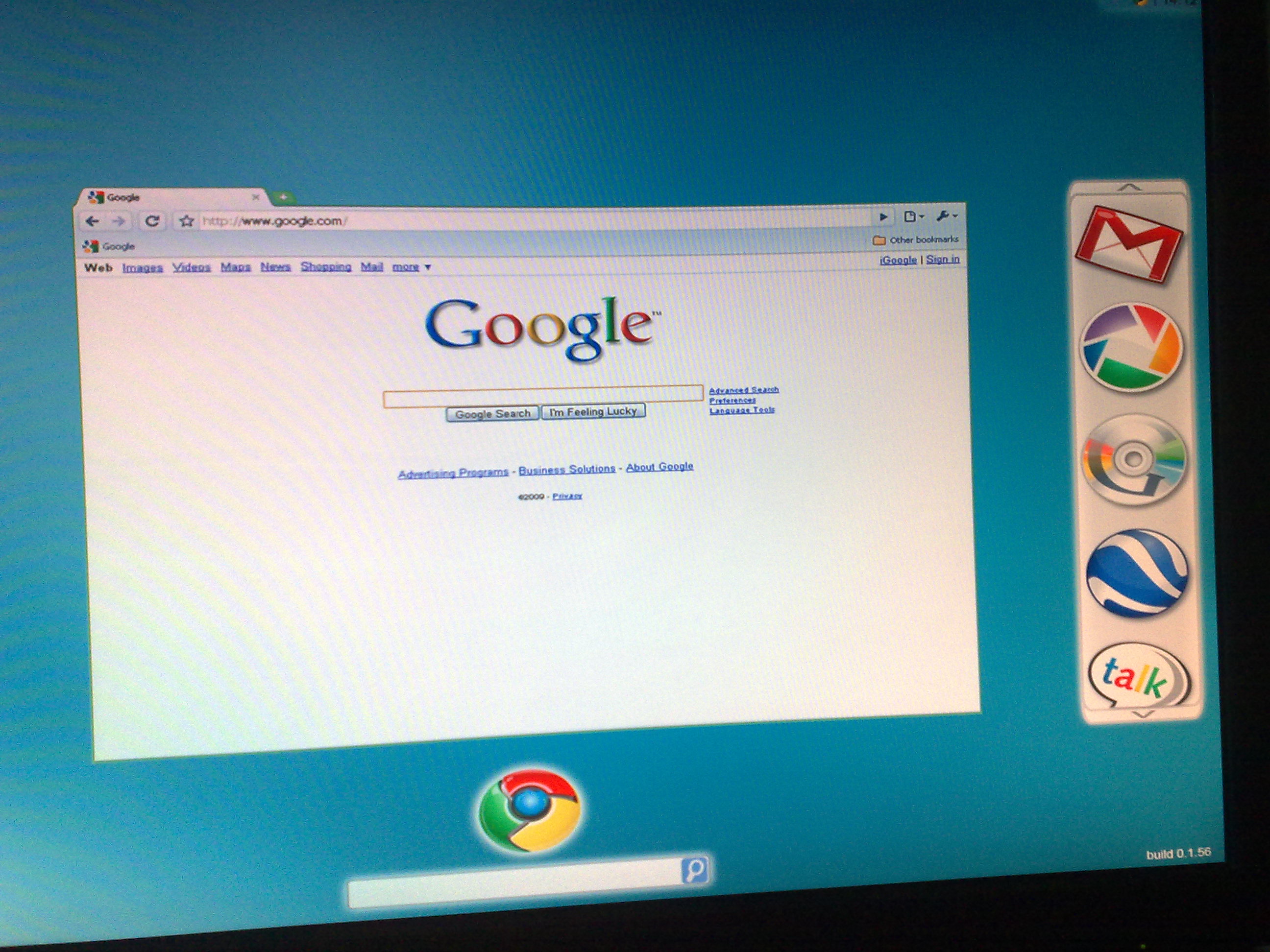
We’ve just received a pair of screenshots that may be of Google’s upcoming Chrome OS operating system. Google announced the entirely browser-based OS in July, and since then a number of alleged screenshots have popped up that have ranged from laughably bad to somewhat plausible. Because we haven’t seen any confirmed screenshots from Google, anyone with a copy of Photoshop can throw together some Google icons and claim to have the goods, so take these with a grain of salt.
The screenshots below depict Google’s Chrome browser, with a dock of unnecessarily large app icons lining the right side of the screen (including what appears to be a Google media player app). Thing is, Google Earth, which is included in the dock, primarily uses a downloadable client, as does Picasa. This doesn’t really mesh well with the fact that Chrome OS is a browser OS. On the other hand, Google does offer a browser plug-in for Google Earth, and you can use a web version of Picasa to browse albums, so they’re still within the realm of possibility.


Google Chrome OS – now why is TC releasing this? In anticipation of Apple event? But these pics are terrible. Google is bad in design, but not so bad.
Simplicity isn’t bad design, It’s smart design
agreed
Over Simplicity is not smart. If there are hidden menus we’re not seeing then this could be really good, but if that’s all there is to it (unlikely) it’s quite poor.
These designs aren’t about simplicity – it’s a horrible waste of screen real estate.
There’s something called ‘White space’
Simplicity is what Apple does definitely NOT this terrible screenshot.
Yes Google is bad at design with their indianish design mentality.
what do you mean by that?
Indianish design means bad, unprofessional and silly design. kabish?
What’s wrong with Indian design? I see no way how you or anyone can correlate the design of an OS to a race. Good Game.
Nowadays people use even TC to display their racist behavior. If you have anything against India, there are forums to express it. Do not do it here!!!
Indianish??? Did not Google originate in Mountain View, CA? I have never read that Google took inspiration from India!!!
That’s what the Indian’s want you to believe. Goddamn Indian’s.
Originated in Mountain View, operated by Indians, hence the bad design
But too much simplicity is not design at all. It is skeleton programming. I hope Google does not come with an OS that looks like in this pic.
It hardly matters! Nobody is seriously looking forwrd to the chrome os
**erm** You are incorrect sir.
Sorry to inform you of your skewed version of reality.
I for one am looking forward to seeing what Google has constructed.
Good day to you!
Yea… But are you looking forward to downloading and using Chrome OS permanently as your stand alone OS? lol @ “Skewed version of reality” Thems some big words ya say there!
@Kevin – Good try but change your attitude.
Let us wait for the OS to release and comment on its design, functionality
i agree.
hutch tunni
looks terrible! Poor man’s OS.
Well it is free …
Free like a ugly couch on the front yard with a “Free” sign.
Nothing wrong with that
No, nothing wrong with that as long as you’re keen on the smell of some stranger’s ass.
Andre Richards:
Do you normally sit on your face, or perhaps you just prefer the smell of your own ass?
Just curious…
With icons that big you start to wonder if its meant to be used on something other then a PC.
Tablet maybe?
Well you know the homebrewers will be all over this. What if you can take Google Chrome OS and port it over to the iPhone? If they provided the touch screen and wifi drivers I could see people trying it out.
It’s the new Jitterbug PC
Lmao!! Hahahaha @ Chris
Their target market is the Fisher Price nitch.
nice! Finally an OS I can give to my kids at age 6months!
maybe the screen res is set to something like 800×600 or less. Or maybe that user just like really big icons. You can icons that big in Windows too.
Photoshop for the win. It looks clean and lightweight… like an XFCE theme
Fake.
Why do you guys publish this stuff?
agreed.
You said it first.
The inside edges between the browser window and the vertical icon bar have different curves: the browser edge is concave and the icon bar is perfectly straight.
The moire pattern evident on the browser window extends into the blue background but not onto the button bar.
The line weight on the icon bar is not consistent with the browser resolution.
I would say marketing mockup, except it’s supposedly a photo of a screen. It’s an intentional fake.
I think Google is somewhat more worried about how it functions rather than how it looks at the moment.
I hope it runs Firefox.
Facepalm.
It’s Google’s BROWSER OS, obviously they are going to use THEIR browser instead of one Mozilla created.
Again, facepalm.
Humor.
Again, humor.
Obviously because its based on linux and is going to be open source you’ll be able to install any damn browser your keen too.
These screenshots are obviously fate, if they’re naming it Chrome OS obviously they would use the same ideas for design on it (such as using all the screen space for displaying stuff, not menus)
Now why would google allow a terrible browser like firefox onto its platform. Next you will be asking if ie will run on it! Seriously give chrome a try and you will drop firefox for good!
You’d only want an icon that big for a touch screen, and even then…
I stand with the crowd which thinks this is fake
Me 2
It’s not a browser OS.
Get with the program–it’s a Google Apps OS.
The whole “browser OS” rot is just a media Trojan horse that Google is laughing its ass off about because the media bought it (as it does all things Google).
ha lol. The OS is just a giant trojan horse, taking your data, knows what you type, search, whatever.
Seems nice, but nothing is going to be revolutionary.
BTW, I’ve an idea of a completely new type of OS. It is a cloud based OS that will turn over the current OS industry.
Hey Google! Consider hearing from me. I bet, you’ll beat Microsoft down in less than 5 years.
Folks, this is the real deal. I know from a first hand source. They are actually thinking of making the icons even bigger.
As if the icon size can’t be changed somewhere in settings? Why the hubbub?
Fake!
isn’t that a lot of wasted screen space for a OS designed for small screen netbooks. Look how little of the screen the browser takes up.
I don’t like to have icons that big … If their size is fixed: I won’t even have a single look into Google Chrome OS!
Maybe the icons get smaller, the more of them you add to the dock.
In any case, this isn’t really news.
So they do only use primary colors, maybe their market is the toddler community. My 3 year old might like it (maybe).
Looks fine to me. I’m sure you could adjust the size of the icons. Other than that it looks wonderfully clean and uncluttered.
For the vast majority of ‘average’ users around the globe the only things they will care about are how fast it is from boot-up and how reliable it is. If it succeeds on those two issues then no-one but us geeks will care what’s going on underneath the hood.
If you can get on the net in under 30 seconds, check your email and open attachments easily then most people will be very happy – hell they probably won’t even know its Chrome OS. They just won’t care. It works – for most folks that’s all that matters.
IMHO
Well my goodness, that’s about the first thing I have read in the comments that hasn’t made my brain lose a few cells. (Or hurt from the sheer typicality of the lot of them)
I very much concur with your humble opinion.
Standard Joe Shmuck user will not care one bit about how or why the damned thing works.
They will care more about stability, speed, and it’s willingness to play nice with most if not all other file formats.
Whether it’s fake or real, what is there to see?
This is totally bare bones. There’s a simple task bar, a search box and the Google Chrome browser.
Big icons are pretty cool, and they give you a good feeling. I like icons in general. It is pretty cool to customize desktop icon size to adjust for how you feel that day, whether small to feel technologically apt or large to make everything easy to see. I think the Google Chrome OS would be good with that large set of icons as depicted.
It’s just another linux distribution with chrome browser and some short cuts to online google apps. I don’t get the fuss – you can download ubuntu or the netbook version and run all of this stuff today.
I also think that if Google really want to challange MS and Apple in this area then the DESIGN is one of the most important factors. Stability (OSX/Win7/Ubuntu) is taken for granted these days and its the UI and features within this area which attract a lot of people because these areas are fun and also increase productivity.
how about some “alleged screenshots” and some “blurry images” of the crunchpad?
seriously
Umm… how is this an OS? What are the application services provided? Hooks? Compatibility?
Anyone can make an ugly shortcut bar. I don’t get it.
If it’s a browser-OS, then why doesn’t the browser window fill the whole screen? Is Chrome now a browser-based browser that you can run in your browser-OS or any browser of your choosing? The head spins.
That’s just what I was thinking.
Why does it look like Chrome if it’s supposed to be a Chrome OS?
I think most of the features in the Chrome window would be placed else where in the OS.
Apple what a nice dock you have… Err. I meant to say Google, sorry!
Google’s designers are bad – but not THIS bad. I have a hard time believing this is real.
A moiré pattern that only affects half the screen?
This is so fake it’s not even parallel to the edge of the screen.
This is soooo fake; I will be surprised if this is anything close to real or even early prototype, this looks like Windows 3.1 or even worse
The search bar at the bottom of first screen shot, is it copied from BING? I doubt these pics aren’t real.
Sigh. Outer Glow in Photoshop Blending options. They didn’t even bother changing the default settings.
Terrible terrible, I’m 18 and I could come up with better fake OS screenshots than that one.
Sounds like a closed world already.
- Bad Office like software with Google Apps
- Nobody is using GTalk
- Single Browser
- …
It will surely be very good and nice. But in the end isn’t Windows the most open system?
look doesnot matter much the working does!
This is the fakest fake thing I’ve ever seen.
First, these are all existing art assets, including the old Google Video Player that you could download for Windows/Mac.
Secondly, why would they have such a Fitt’s Law destroying, useless, cluttered interface when the os is designed for netbooks?
Chrome OS’s UI is going to be Google Chrome with some web-based configuration screens.
A few things to point out about these screenshots:
1. The browser. Just because the Chrome OS is going to be a web-based operating system, does not mean Google is going to make us feel as if we are looking at our Chrome Browser 24/7 to get everything done. They will make the browser experience feel as much like a native desktop environment as possible, especially with products like Google Docs, Music Player, etc.
2. The doc. First thing to point out is the media player. Google wouldn’t go so far as to mimic the iTunes doc logo for their operating system. An image of a CD is outdated as it is, not to mention Google isn’t directly trying to step on Apple’s toes with this product launch. I highly doubt that Google will use any kind of Doc at all that reminds consumers of any kind of Mac product.
3. That massive Chrome logo underneath the browser. Microsoft or Apple have never plastered such a large permanent logo on the homescreen of any generation OS. From the looks of these screenshots, the Chrome logo will be burned into my eyes by the time I’ve finished my work day. Not.going.to.happen.
4. Dimensions, image blemishes. Besides the obvious, these images still contain some imperfections such as the magnifying glass in the search bar.
via tinycomb: http://bit.ly/4A0I7f
Alright, so let me get this straight. Google has spent how many months working on this, and essentially it’s just a bookmark list of google’s websites that sits on your desktop.
Couldn’t one achieve the same thing by installing something that just adds 5 web link shortcuts to your desktop?
These designs suck! Better not be anywhere near final.
I was hoping a browser-based OS would just be a browser window, no stupid sidebars and search bars and no desktop. i was also hoping they would provide extensions for web apps to interface with the user’s data. therefore i pray to the patron saint of technology (really, who is it?) that these are fake …
Would have looked more convincing if the buttons for Google Search/I’m Feeling Lucky weren’t from the XP version
I believe accessibility is very important in software but this is ridiculous. This reminds me of my father’s phone 3” x 3” numbers.
That’s not a media player. It’s the GDrive. Platypus if you like.
Chrome OS means Google is porting full Chrome browser to ARM laptops, with full tabs, Flash and fast Javascript support.
Chrome OS basically means $100 ARM Laptops running any embedded Linux OS can have a full Intel-like browser experience.
It won’t matter if the embedded Linux OS will be Android, Ubuntu, Xandros or any other more or less optimized Linux OS, Google makes sure there are fast and snappy open source HTML5 compliant browsers available for it.
Having a full browser on a $100 ARM Laptop is much harder than you may think. Google needs to use all the hardware acceleration from DSP and GPU chips that they can to accelerate the display of graphics, the rendering of flash/HTML5 replacement for Flash, the rendering of web video streaming and progressive downloading, integrate native web programming and 3D technology.
Yes, looking forward to $100 netbooks is definitely realistic. What makes you think that just because a manufacturer stops buying Windows for their computers, they are going to lower the price? Keeping it the same would boost their margins, and that’s a good idea considering that netbooks don’t have margin to begin with.
If I was a manufacturer touting a netbook with Chrome OS, I would probably charge more for it than for an equal-specced netbook running Windows or any form of Linux. People who want Chrome OS will be willing to pay extra for it, just like people who want the Mac OS X are willing to pay extra for it.
Just so you all know, look at the buttons (Google Search/I’m feeling lucky), look familiar? They should.
The OS is XP, the background is just a photoshop and the bar on the right looks like rocket dock or something.
Fugly.
Wow I wonder what type of Google Hype you will be featuring on 09/09/09 to try and pour cold water on Apple’s same day Media Event.
Not liking it. I use Mac OSX because it is beautiful, nit just easy to use.
I have to look at my OS all day long. I don’t want to stare that this.
You don’t want your product to look too simple…we’re not all babies…and our eyesight is surely better than that
haha ! fake!