New Yahoo Home Page Tomorrow. Here’s What It Looks Like
by Michael Arrington on July 20, 2009

Remember that new Yahoo home page we previewed waaaay back in September 2008? Tomorrow it will go live for many U.S. users, and it will eventually roll out to everyone who uses Yahoo around the world. France, India and the UK are next up after the U.S.

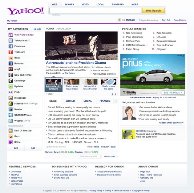
The final version looks a little more like one of the test pages we caught in the wild in March, without the dark background coloring on the left sidebar. But it has evolved further from that bucket test page, too.

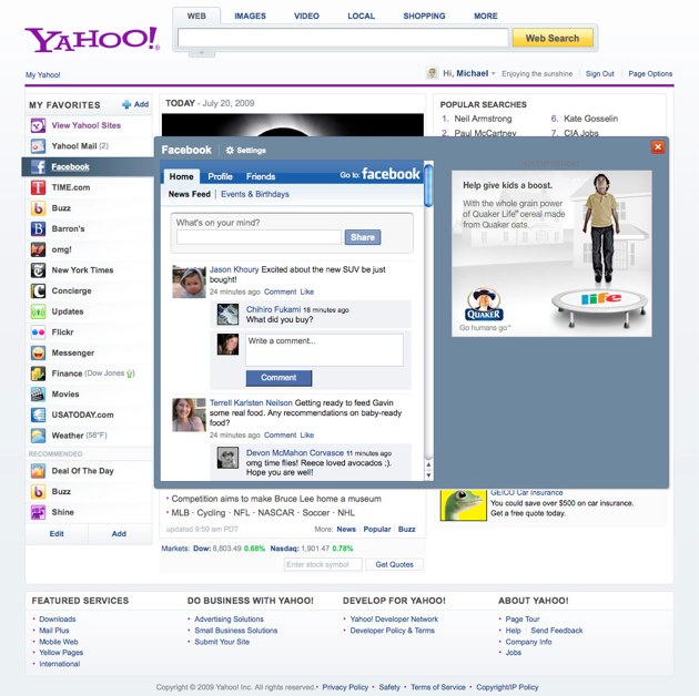
The main difference from the current Yahoo home page is that users can now customize the page with widgets/apps from third parties. Some apps have been pre-created by Yahoo and others. And others can be added as well, Yahoo will make the app based on the URL you supply (they don’t say it needs RSS, although I’m not sure how they create it on the fly without it).

The key change, besides personalized content, is the removal of the tons of links to scores of Yahoo services. Most people only use a handful of those services, says Yahoo, so it’s better to let users decide which ones are present and take up screen real estate.

Yahoo also says they will be letting users sync up the customizations between their mobile and desktop versions of Yahoo starting soon.

Advertisement

Responses

Comments rss icon

  • very netvibesy..

    • Rest all okey, but they should bring that search bar down to exact middle of the page so as to make it look like google homepage.

      • Hey, excuse me, but I don’t see any worth in your point. Why should it look like a Google Homepage? It is Yahoo’s and it should look only like Yahoo’s.

        The design is fine but how long will it take to load with all these apps? And are there any skin changing options available like AOL?

        • Just for a change, things should change in some 10 years of time? Let all content/news of portal be there around, but search bar should be in the middle.

    • IT SUCKS! Look what happen to Kraft when they changed logo…an epic failure. people are use to the old page and it worked. you morons don’t relize it is for more ad exposure so people have to look around more for where they want to go. Changing the sign in to the left side and sign out to the right is just so yo scan the entire page and see all ads. Bull to me! Keep it simple, keep it clean.

  • Why am I not excited with this news?

  • Looks good, and hey check out that ad next to the faceboook popup. People might actually click that (as opposed to the ads running within facebook).

  • Nice move, but not a reason to go *back* to yahoo after having left when they fubar’d 10 years of yahoo account history when I cancelled my @home service.

  • well thank god. it only took them 4 or 5 years to update the look. i do congratulate them for hiding their assets and losing possible revenue during those traumatic years only brought on by super duper management. here here!

  • I feel like every time yahoo releases a new homepage design it, it ends up looking sooo {insert 2 years ago}.

  • This actually shows a lot of potential. Yahoo needs to focus on their portal. They’re the only good one left in that area. And they fail at email, search, maps, etc…

    But, they do win at things like Flickr—Picasa, not so good. Bringing all the webs content into one place actually sounds like a brilliant idea. It’s merely impossible to keep track of everything going on on the internet. But, this could make it easier!

    I can’t wait to give it a try… likely I will end up not using it, but, whatever!

  • I’ll check this out. After years of gmail, I switched back to Y!mail and love it. SMS, chat, email, done well and simple. I got sick of clicking around in Labs, and sms not always working in google.

  • Gosh everyone is going for the blog like look with a social media type features. I still use yahoo email so I’m looking forward to trying it out.

  • I think we all need to start realizing that no matter how hard they try, they are always a bit behind. The reason that they are going through all the redesigns is that whatever they had before didn’t work…(duh) but my point is that if you try to aggregate every web 2.0, or 2.5 whatever you want to call it, service in one place, you are not coming out with anything new. Start thinking about web 3.0 yahoo and take a big, risky, step…who knows, maybe then they will succeed.

  • free fazebk advertising on yawhoo homepage? how much could that be worth. is yawhoo officially surrendering social networking to fazebk?

  • Love the new design

  • Yahoo’s main problem is its search. Their website has a lot of content though. Maybe this redesign is a good step towards fixing its main problem: the search page.

    • Yahoo’s search is fine, but it sits at 20% share. When 60% of the users are habituated on Google, Yahoo’s search needs to be obviously better and differentiated from Google to win back share. And it’s not.

      With a few exceptions, it seems like everything Yahoo has done the last few years was to stop the bleeding, not do anything truly groundbreaking like a tech company ought to do.

  • I actually like it

  • hmmm, don’t think this is enough to keep me around…

  • I wonder how much the lost opportunity of not having this live months ago has cost them. Seems like it has been lost in bureaucracy.

  • This story has been posted on Big Freakin News (http://www.bfn.im)

  • When I Update The IE to 8 I get this new design but in FF not I still have the old one .. :O
    Yahoo! My Home Page ..

  • superb design. any UX folks on here that can comment?

  • I hate it….. mine’s been that way for a while and I really prefer the earlier version.

  • goes away the purple, purple means old yh!

  • i don’t see much change in it, except including facebook and few more news feeds. whats cool is the facebook status updating, which would be a great hit. i think they could’ve added few more social apps

  • Facebook is there. where is Twitter?

  • Now I have a reason to spend a few more minutes at the yahoo home page. I am waiting!

  • Yahoo may change their home page 12 times a year, but that will not increase their share value as people want to feel some internet “charizma” like Google has. Now it becomes one of tens start pages with customizable content + social media features.

    The solution of such situation could be more close integration of all Yahoo services (some are quite old and has millions of users). Google did a great job integrating email, chat, photos, calendar, docs, (still waiting for Google storage service like Yahoo! Briefcase was) etc. what makes THEM leaders of the market even though Yahoo created some services first.

    Anyway, congratulations with the new design :)

  • I like it, but will it work in Opera Browser?

  • Nice new look. I just wonder if that will have an impact on their decreasing market share.

  • Hey TechCrunch – Yahoo! the company name should always be typed with an exclamation point. It’s fine for readers to leave it out, but you’re a major industry resource. It just comes off as ignorant for you to miss it.

  • I primarily use Yahoo! and its related services for the bulk of my online activities – delicious, flickr, Yahoo! Mail, Yahoo! Tool bar, and My!Yahoo. I also use the Yahoo! UI Library when I develop (which admittedly isn’t often anymore since I left the IT Department at my company), and until Bing came out, I used Yahoo! search as my primary engine.

    That having been said, there are two Yahoo! services I could relatively easily bail on (delicious, flickr). I would include Yahoo!Mail in this mix, but I have had my address for so long I am very hesitant to change it.

    I almost never go to the Yahoo! homepage anymore, however. I don’t understand why anyone would want to customize it rather than just use MyYahoo! I am also a bit clueless why Yahoo! has limited MyYahoo! content to 200 modules and why they have failed to create a viable Google Reader alternative for their Web mail.

    I admit I stay with Yahoo! as much out of dislike of Google as anything else these days, but even I’m tempted to migrate from time to time. This isn’t a game-changer Yahoo!

    • “I admit I stay with Yahoo! as much out of dislike of Google as anything else these days”

      I’m glad you admitted it, because I was beginning to wonder. My dad always said use the best tool for the job, and in most cases, that’s Google.

  • What are you talking about Its airing a few weeks like that now in europe.

    You guys are a little late with this info. i’m using YAHOO like this for a while its better , got more options to arrange your search panel allot more with widgets , news or what you want to put there. And I like it very much GO YAHOO you worth it to use for other web stuff keep it up.

    I still use google do for search but thats about it.

  • here’s where most of you fail… yhoo makes billions in cash – not bad… has hundreds of millions of usrs – not bad… and caters to the mass market, where every start up wants to be. if you’re reading techcrunch, you are the <1% of online users who sit at the bleeding edge (supposedly)… the rest of the world barely understands what a browser is; and for them this kind of thins is the shizzle… your comments illustrate how little you understand about mass market technology and businesses

  • What I’m seeing here is a bunch of incremental improvements. The look is less cluttered. You can do more without leaving the site via the use of widgets. That’s all good stuff.

    I’m not seeing a game changer here. By that I mean, there’s nothing here that’s going to draw many more people to the site. That might be okay because they draw A LOT of traffic as it is. If their goal is to keep people on the site, viewing more of their advertising, this may help.

    • Do other start pages sync changes to your mobile device? I’m thinking I might switch to Yahoo if it works smoothly. I’d much rather customize in one place then two like I have to with iGoogle.

      Seems semi-game changing to me…

  • Nice clean look, but not earth moving!

    • Of course it’s not earth moving. It’s the most visited page on the internet. You don’t see Google dramatically changing their home page, do you?

  • It’s a fail. Why are they linking to popular third party sites in the left sidebar? In the pathetic hope that people are going to login to their Yahoo id? The left sidebar of Yahoo is probably the most valuable real estate on the web and they are sending traffic to competitors who are already household names.

    Are they total idiots or what? You think you’re going to win brownie points by displacing your own services with those of competitors?

    Leave the effing home page alone. What you need to do is take the advice of people in this thread and fix all the problems with Yahoo mail and make it as good as Zimbra. Then make your other services better. Why in hell are you sending traffic to eBay, Facebook and MySpace? Who ever got that through should be fired.

    The average Yahoo user is the general public. They are fairly pedestrian in taste. I think the lightboxes when hovering on the left-side menu are disorienting and annoying .

    This is a total fail. Stop rearranging the deck chairs and get the pumps working. Improve your services like mail and most importantly SEARCH at the fundamental level.

    Seems like all that Bartz is trying to achieve is a modest rise is share value so they can go back and get the same offer they had from Microsoft 2 years ago. If that’s her unambitious angle, then she’s a failure too. She may understand package software, I don’t think she understands the web.

    • I don’t get how people can say Y!mail fails…I’ve used both for many years and don’t see what Gmail does that makes it so great? The interface still has the “coded in my moms basement” look to it….The only plus is the premium features you can get for free. And as for search, who gives a shit? Really..Search is not the end all and be all of the internet. There is still a thing called content and many of us do not want to just search for it all today. Yahoo brings a very well integrated experience to its online presence. I get my market/international/local/national news, my email and SEARCH all in one place. What’s Google got? Oooh…I can search, f**king ground breaking. Google News? Fail. Google Finance? Fail. Google TV/Print/Radio ads? Fail. Google Apps such as Docs and Spreadsheet are ok but they still need a lot of work. Google Maps? meh…Yahoo Maps are better, with a much better interface and usability. Google is a one trick pony and that trick is search…granted they do it well but they are not the end all, be all of everything internet. Time to stop doing keg stands with the Google Kool Aid.

  • “It’s a fail. Why are they linking to popular third party sites in the left sidebar? In the pathetic hope that people are going to login to their Yahoo id?”

    Talk about “fail”. Good Lord. You don’t get it – by keeping some page views on their site instead of the other site, they get ad revenue and “popular third party sites” don’t. Seriously, do you really not understand how Yahoo brings in revenue?

  • I like it . It looks very organized..

    http://www.cafe...s.com/beachtote

  • Hi guys, I have been inspired by many start ups online ventures like twitter, facebook, digg and others. For the last 6monthsI’ve been continually researching and studying the success story behind those successful start ups stories while also trying to come up with an idea that will become the next big thing. But not another social network. I am currently looking for online help resource for new start up for entrepreneur. Also I’d like to connect with other online entrepreneur.

  • Complete bull… Now Yahoo wants your cell phone and alternative email address to log into the email I have used since 1999. Utter bullsh*t. I am pissed. I am not giving you my personal cell phone, regardless of what you say, nor do you (yahoo) all of sudden need some alternative email address of mine for this account. I can’t f*ck*n believe this sh*t. I have been a member this long and now you (yahoo) are trying to get my personal info. I can’t log in without entering this information. Even when I put a false phone number then came back with a message stating it was a false phone number. No sh*t. I don’t want the world to have my personal cell phone. I give it to who I want to give it to, and that is not you Yahoo, so don’t force us all of a sudden to do so. Guess I will have to migrate over to gmail. I already have an account but have utilized Yahoo for nearly 10 years so it has been a creature of habbit for me, now Google has finally won my last straw. Pissed, pissed is all i can say. Who do you think you are Yahoo. You should follow the Google rule of not being EVIL.

  • Marc is dead on. Usability on this thing is horrible. So bad that I reverted back to the old site, and I’m dreading the day when I can’t do that anymore.

    Anyone know of another good web portal that has everything yahoo does? I’m ready to switch over.

    What’s amazing to me is this billion dollar company didn’t even bother to ask “average” web users what they think of it, apparently.

    The left column lightboxes are absolutely horrible. If you accidentally roll over them, it’s a nightmare.

    What on earth was yahoo thinking? I know. We’re the smartest web SOBs on the planet, we don’t need to ask anyone outside of yahoo what they think of the new design/usability.

    Incorrect.

  • I don’t notice any difference to the previous one at all. Its not even faster, what the hell are they even on about. Yahoo = Epic Fail *Yes i repeated it*

  • It’s SUCK,I would say. everytime I go “internet explore” my home page was Yahoo(freaking 30 yrs) in sudden in task bar appearing(internet explore provide by my space)ShuH! in 15′ reading I have had more than 10 pop up and 42 cookies.I have re-start my computer if i’m staying more than 15′.Is anyone out there ,please tell me how to get rid of these F%* S*&^% “YAHOO internet explore provide by myspace”Thanks .vuphat5@hotmail.com

  • I don’t like it. As they say, if it ain’t broke, don’t fix it. Now it is wayyyyy too busy. I don’t like the mail on the left hand side. I hate having to search for every little thing now. Is there anyway to go back to the old style?

    • All that purple is making me plumb sick, I wish Yahoo provide me some barf bags each time I open their new Homepage…………………
      Beside that I do not enjoy sidebar search pad, it make page too wide…
      Why do I have to put up with X and Y axis scrolling combined?

Leave Comment

Commenting Options

Enter your personal information to the left, or sign in with your Facebook account by clicking the button below.

Alternatively, you can create an avatar that will appear whenever you leave a comment on a Gravatar-enabled blog.

Trackback URL
Short URL
bugbugbugbug
Techcrunch on Facebook