It’s been more than a month since Google Finance shed its beta label, and finally today it is rolling out some design tweaks it has been testing out for the past few months.
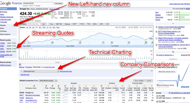
In the screen shot above you can see most of the changes. There is now a persistent navigation bar on the left with links to news, portfolios, historical prices, and financials. In the left column, you also now see streaming live quotes for the most recent stock tickers you’ve entered. It is a sparer version of the left-hand column on Yahoo Finance, with more dynamic and personalized content.
The charting is also a little more sophisticated, with various technical charting capabilities available as an option via a drop down menu below each chart. Finally, the company comparison table is now more customizable, allowing you to choose which financial metrics you want to add or remove. It doesn’t go as far as Wikinvest’s recent redesign, which highlights much more insightful industry metrics for many stocks.
All in all, the tweaks to Google Finance are a step in teh right direction, but nothing too radical.
(Hat tip to reader Michael Konen).