Brand loyalty is a powerful thing, especially when it comes to technology. Consider the battle brewing now between Google and Microsoft’s new search engine, Bing. Even if Bing proves to be just as good as Google, it might not matter because of the strength of Google’s brand. An independent usability and consumer preference study, which we’ve obtained and embedded below, suggests as much. It was conducted by the Catalyst Group, a usability research and design firm located in New York City.
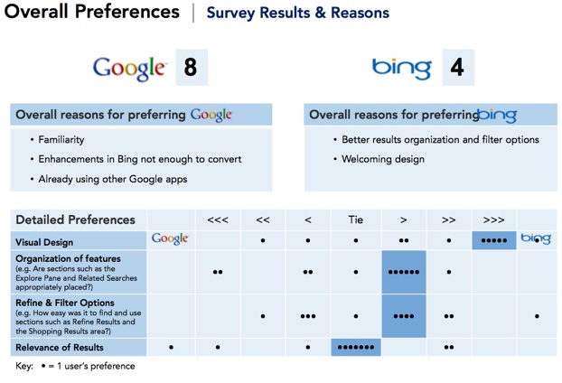
The study was an intense focus group in which 12 subjects were monitored with eye-tracking cameras as they conducted searches. Afterward, they were interviewed and completed a survey. Prior to the test, all the subjects used Google as their main search engine. Following the test, 4 out of the 12, or one third, said that overall they preferred Bing. The other 8 said that they preferred Google because they were already familiar with it, used other Google products, or that Bing’s improvements are simply not enough to make them switch.
What is amazing is that when the test subjects were asked to rate Bing on specific criteria (visual design, organization of features, filtering options, and relevance of results), Bing handily beat Google in everything but result relevance. Arguably, that is the most important criteria, but most of the study participants thought that both search engines tied on result relevance. So even though Bing ranked better on design, and tied on relevance, that was not enough for most of them to switch.
Catalyst CEO Nick Gould concludes that Microsoft “created something as good as Google and that is not good enough.” Overall, the test subjects “were not swayed.” No wonder Microsoft is spending up to $100 million on Bing marketing.
Remember, this is only a dozen people so it is not a statistically valid sample. Consider the survey results anecdotal. What is more conclusive are the eye-tracking results.
About half of the participants found and used the Explore Pane on the left side of Bing’s home page and results pages to aid in refinement and navigation, while all of them ignored the navigation/refinement links along the top left of Google (Web, video, Images, Maps, News).
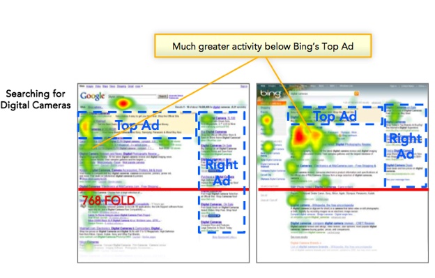
Also because the Explore Pane on Bing takes up the left hand column and then stops, creating white space underneath, people naturally stop there. Heat maps generated by the eye-tracking data showed that people scroll much farther down Google’s search results pages, perhaps because there is no visual cue telling them to stop or they were not finding what they were looking for. It is not clear they got better results with Bing, but if the result they wanted was not above the fold, then they might use the Explore pane to refine their search.
The way results were displayed also had an effect on how long people looked at the ads along the top. The amount of time spent on the ads varied by search, depending on what kind of additional navigation information was presented just below the sponsored results. For instance, a search on Bing for “digital camera” concentrates attention there with navigational links to filter results by top brands, prices and guides. Participants spent 150 percent more time looking at the ads just above that activity zone than on Google.
A search for a local hotel, however, produces similar results on both search engines in that area just below the top ads (a map with local listings). So there was not much difference between the two in the how much time was spent looking at the top ads related to that search. In all cases, the ads on the right were only noticed about half the time.
http://viewer.docstoc.com/
Catalyst Group Bing V. Google Usability Study –