Finance sites like Yahoo Finance and Google Finance haven’t changed much in the past ten years. The fonts are different. Maybe there’s some more real-time quotes and fancier, interactive charts. But at their core they all follow pretty much the same formula: dump as much data on the individual investor as they can and let them figure it out. Wikinvest, which started out as a crowd-sourced investing site, is trying to change all of that with a complete redesign that is being turned on tonight for members who log in.
Over the past two years, Wikinvest has become a great resource for researching stocks but some of its most interesting data was hidden away. It is not a daily habit like other finance sites, attracting only about 500,000 unique visitors a month. The redesign aims to change that by putting all of Wikinvest’s industry- and company-specific data front and center. Each stock page has a chart, key metrics, a news feed, wiki analysis, and opinions from bulls and bears.
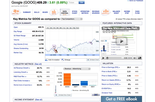
But there is a new data central tab which presents financial data in new ways. For each metric, whether it is revenues, operating margins, or debt-to-equity ratios, Wikinvest tells you whether the number you are looking at is high, low, or average compared to the industry. It also computes trends for you such as revenue growth and net income growth. Hovering over an one of these numbers produces a mini chart graphing the trend over time.
Beyond that, though, Wikinvest shows industry metrics which can give investors insights into the health of the company. For instance, the industry metrics it shows for Google include ad revenue growth, paid clicks increase, and market share of searches. All of these also have their own little charts, each of which are embeddable. Here are the charts for ad revenue growth and licensing growth:
http://charts.wikinvest.com/data/Illusion.swf
http://charts.wikinvest.com/data/Illusion.swf
You can also create charts which compare Google to Microsoft, Yahoo, and eBay across a variety of metric. Here is one comparing advertising revenues:
http://charts.wikinvest.com/data/Illusion.swf
The whole point is to make the data intelligible. If you don’t know what the Price to Sales ratio means, you can click on it and get a definition
In addition to making all the data come more alive, Wikinvest also now has a news feed for each stock. But instead of showing articles tagged with the ticker symbol, which is now overused by every finance news site from Forbes.com to the Motley Fool, it matches words in articles to its own database of 100,000 keywords associated with different companies. Its news feed shows headlines and snippets of text from 200 trusted sources, ranging from Bloomberg and the New York Times to wonkish finance and economic blogs. This casts a wider net and brings back different types of headlines than you might find on Yahoo Finance, although it may be too wide a net. I am not sure why a Forbes story about the hospital where Steve Jobs got his liver transplant comes up on the Yahoo stock page.
Is that enough to make it the new Yahoo Finance? No, but at least it’s something different.