
Yahoo’s new home page was supposed to have launched to the general public by now, but Yahoo insiders say new CEO Carol Bartz wanted to slow things down a bit and conduct more user testing. Testing is currently being conducted, our source says, in the UK, U.S., India and France to a small percentage of users.
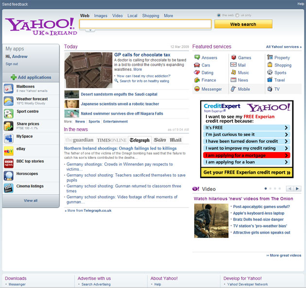
We wanted to get a look at what the new home page looks like in the wild, and put out a call to our Twitter friends. UK reader Andrew Lawson sent in the screenshot above.
This live version of the homepage is very similar to the mockups Yahoo supplied last September. A few things have been rearranged and fonts have been altered, but the layout is largely the same.
All the action will occur on the left sidebar, where users can access key applications (including third party apps) and expand them to take up more of the page. In the mockups the only third party application shown was eBay. The live version also contains a BBC and MySpace module.
The live version also has an “add application” button that Yahoo said was to come later. Given that Yahoo has 82 million daily visitors to its home page, I expect just about everyone out there to be quickly building their own modules for users to add.


I think facebook has had a large effect on how websites design for social media.
When will these fucknuts offer users a simple “revert to old homepage” button.
This new thing sucks hamster sac.
well put. ???
Always simple Home page make merry. Don’t think it won’t work
Actually i redirected to this page yesterday. http://m.www.yahoo.com/ it has a link to old home page.
Yer full of shit. No such thing.
The ad box looks huge and its kinda glaring too
one funny aside – you always know if a Yahoo screenshot is in the wild if it has an ad that isn’t southwest airlines. For some reason they always use southwest in their mockups. Of course they may change that. And people could photoshop a southwest ad in, but its sort of funny.
I’m guessing the designers just use it bc they have it, but these mockups (see our first post on the new home page) get a ton of press exposure. Southwest should be paying a lot of money for the exposure.
Any word on how Yahoo decides which apps get displayed on the bar itself, or what the “jump” looks like after you click “View All”?
Ads? Firefox + Ad Block Plus = No more adds.
still fugly
boy it is ugly. That ad is painful.
yup, seriously. but the best ads are often the ugliest.
I think the last area Yahoo needed to spend time on was their homepage. They have so many other issues and to me while I dislike Yahoo in general I have always been amazed at how easy the homepage was to navigate.
I agree that Yahoo! has many concerns these days, but remember that their home page receives millions of hits a day and is worth millions in revenue per day. Even the smallest differences in usability, click-through, ad rates, etc. translates into big dollars for them and all their downstream services. For a site like Yahoo, sometimes monetization comes down to details less exciting and strategic than cool, new, techy services… unfortunately for us TechCrunch readers!
Hold on chaps, wait a bit – I promise you you won’t be disappointed
Thomas, see my comment above in the post about the ad…
The current homepage and new layout look okay to me, but it has so many features and options it looks like engineers have took over the design – keep it simple Yahoo.
Good idea. I found the release of the new Yahoo email to be rather buggy. Yahoo needs more thorough testing.
Look at that ad in the screenshot and decide for yourself whether advertising has any future. Then, decide for yourself whether the (ad-funded) Yahoo portal has any future.
I started seeing the new homepage a couple of days ago here in San Francisco.
http://m.www.yahoo.com/
Looks like a better use of the header since the current version has a lot of empty space to the left and right of the logo. Looks like they have room at the bottom to add more boxes/features.
A chocolate tax! Are they crazy?
ugly as usual, they really need to hire web designers…
Looks fine to me.
Ok, Arrington – share how you’ve got Friendfeed comments so beautifully integrated into comments…
magic.
I’ve been seeing that home page for the past couple months and I’m in the US I get redirected to m.www.yahoo.com or something like that.
Talking abt new homepages, check out the newly re-designed and faster Tweetizen: http://www.tweetizen.com
I’ve had the new homepage for probably over 2 months now. Generally i like but there is one issue i hope they fix regarding the search box focus.
I’ve seen that before; it has come and gone when I log into my Yahoo account.
appears personalized myapps features are now most important part of the homepage. featured services should not be too the far right. they should be across the top or on the left hand side. the far right is the search engine default adword ad zone. personalized homepages will make this format obsolete.
It seems like all homepages are moving towards a left nav. The iGoogle page and the new Facebook redesign both have left navs as well.
This redesign is part of a big strategy that may significant change the landscape for advertising. Google beware.
Stay tuned…
looks pretty cool! a new air.
I’m confused. I’ve had this homepage for months! Thought it was live for everyone..
I was randomly served the new Yahoo! homepage design back in early February. Like others have stated, it changed the URL in my browser to http://m.www.yahoo.com. You can see a screenshot I saved on 02/04/2009 here: http://www.scrn...eenshots/115047
I like the new look of Yahoo…
It looks more… active
Herb grinders, pollen press, digital scales, and accessories – http://www.Whol...aleGrinders.net
This is a great news that they are working on improvements.
In my opinion yahoo should try hard in makeup their mistakes.Their are lots of flaws in their home and in some product lines.
few mistakes of Yahoo can be listed as
http://www.hone...takes-of-yahoo/
This includes their Members,UI,products and different ventures.(including the fail deal of google)
one issue that often paralyzes a front page re-design at yahoo is the “trough” – the area where yahoo! provides links to its own properties. in the completely broken org structure of yahoo, each of these properties had apparent “p&ls”. general managers would run around saying their “p&l was thiiiis big”. everyone knew, traffic and revenue would rise or fall based on front page placement. kind of a farce, but led to incredibly destructive incentives and, not surprisingly, behavior.
Yah!
Why does Yahoo keep thinking they need to redesign their homepage? I think it’s just dumb to change the logo from the primary color red to secondary color purple. They are targeting the widest audience possible with the homepage. More people will find purple more objectionable consciously or or unconsciously than red. That’s just a rookie mistake right there. Then why confuse the majority of users with the concept of apps. Users are not developers. They aren’t interested in apps per se. They want to click a link and have it take them to the PAGE they use for X activity.
This looks like Yahoo showing up on the first day of school wearing last year’s wardrobe. Yahoo needs to make fads like apps disappear into the background. Why would ‘BBC top stories’ or ebay need to be an app on Yahoo? It complicates things for their core users who have no interest in web gadgetry and don’t want to spend time trying to grok the difference between an app and any other web page they visit.
Yahoo! your visitors want good content and services that are quick and easy to use with low commitment.
Yahoo! your top priority is bringing your PPC ad network up to snuff. That means seriously beefing it up to compete with Google and seriously pushing hard to recruit quality sites into your content network.
Your PPC ad network should be your bread and butter. Not about keeping up appearances. You did well on dropping bid prices because now it’s more attractive to advertisers. Now you have to build your content network fast. You have no inventory for long tail specialized niches on your content network. This has to be the priority. Google’s content network alone makes more than all of Yahoo. Fucking around with the homepage is an exercise in losing friends and alienating people.
I agree with almost everything you have said, especially on the colour change and also on needing to concentrate on the ad network side of the business. However, I noticed last week that Y! is starting to use Google Adsense on My Y!, so it appears they have given up on the “content network” side of the game. See here:
http://busterbl...-windows-whoah/
early yahoo page looked like this {seesmic_video:{”url_thumbnail”:{”value”:”http://t.seesmic.com/thumbnail/9yxxBl5Nc0_th1.jpg”}”title”:{”value”:”early yahoo page looked like this ”}”videoUri”:{”value”:”http://www.seesmic.com/video/ucrxPqJcY3″}}}
Sigh, ‘My apps’ icons now NEED to be rounded corner squares with a gloss, right?
Ive been using this page for a couple of months now. I first saw it on a friend of mines computer, and ever since tried to get it on my pc. Nothing worked, transfering cookies, nor using the m.yahoo domain (it seems to work now). Then i was randomly selected to try it and i have been in love with it since. I switched my Home page from google to yahoo. why? because i have all my stocks, weather, inbox (gmail) all on one page that loads dynamically. Plus theres less clutter and ads are not really a problem (adblock plus?)
The only thing i want is a MyBlogLog widget showing me what is going on from the people I connect with all over the net.
The second thing i want is more widgets for stuff likeTwitter, Facebook and junk
Super super messy… Like being made by a 3rd grader..
[...] interessa invece raccontare come questa immagine sia arrivata sul sito americano Techcrunch. Michael Arrington, giornalista e fondatore della testata online, viene a sapere del test di [...]
Sorry… forgot to say great post – can’t wait to read your next one!
Simple website design is always preferred. Too much experimentation is always detested. Keep the design simple and change only if adverse comments are received. I don’t think there is no problem with Yahoo page as such. it is quite good.
How does this solve the fundamental problem- that Yahoo has no idea what kind of business it is, or what kind of business it should be in?
The idea of a generic web portal is just a geek’s plaything. A grown-up business needs to identify specific business segments that it can make PROFITS in, target those, and exit everything else.
Yahoo’s new CEO has not shown the courage to focus Yahoo around 1 or 2 key profitable businesses and drop the rest. Currently, the display advertising business (in which it painfully lags Google) is subsidising the 100s of unprofitable ‘businesses’ that just add costs without adding revenues.
Is Yahoo a media company, a services company, a software company? Nobody knows.
Too much too handle Yahoo. Learn from Yoda, he knows: “Size matters not. Look at me. Judge me by my size, do you? Hmm? Hmm. And well you should not. For my ally is the Force, and a powerful ally it is. Life creates it, makes it grow. Its energy surrounds us and binds us. Luminous beings are we, not this crude matter. You must feel the Force around you; here, between you, me, the tree, the rock, everywhere, yes. Even between the land and the ship.”
Yoda
wonderfulllllll
Please Yahoo! stop making things less intuitive and cluttered…Although Google is a little too minimalistic for my tastes, I think that is now the lesser evil of the two extremes. At least give users the option to skin the homepage to their liking or you will lose use permanently to GMail.
I frankly can’t stand the new homepage, and would love to revert back. Maybe (probably?) I’m incompetent, but at least 50% of the time that I start typing something into the search box, the new homepage flips out, stops recording what I’m typing, and then I new to re-place the cursor in the search box and re-type what I was searching for. Most annoying thing ever.
That really is one huge ad!
Yahoo’s red logo stands out and it has been their recognizable brand logo. What’s up with purple? ‘Wear color purple’ did not work out, why keep trying? Just because Seth Godin said a purple cow would stand out, Yahoo does not need to become purple. ( Yahoo is not a cow. )
Y’s current home page is clean enough. Move the red logo from the very top to the left hand side and align it with the search field; this will bring the rest of the site up and would give Yahoo more space to fill up. And, leave the rest as it is.
At some recent green tech conference, a smart woman speaker said: “everyone claims to be green now. Do not need to say you are green, you need to be remarkable.” To periphrases that — ‘Yahoo, you do not need to turn purple to be remarkable.’
Here us your fix…hope you like it!
It was hitting my work PC ago. Was not very fond of it then.
http://brightki...cd7003048c10834
The new homepage is a total mess with OFF font sizes, line spacing, color schemes and general look and feel and content orginization. It seems that 5 development groups were working on the project without talking to each other about applying standards, widgets etc. Please take me back to the classic page or I’m gone….nuff said.
If Yahoo discontinues their original user friendly version everybody I know (i’m a computer tech) including myself will be switching over to Google. We are not a lone, there are LEGIONS of people who are disappointed with the new version.
I suggest Yahoo listen up. Their is a negative consensus forming.
LISTEN TO YOUR CUSTOMERS YAHOO!
you cut me off on an inportant conversation,we are concidering quiting your servce.why should we stay with your companyi
Since the new crappy page became permanent on November 11th, here’s what you can do:
Found a link where we can give feedback to those morons at Yahoo. It’s a direct feedback link for the “team who created the new Yahoo! homepage.” Let’s tell them it sucks ass.
http://help.yah...orms_index.html
Please spread around.
LET’S GET THE OLD YAHOO BACK!