
If you like to research web apps, one of the original directories of Web 20 apps just got a whole lot better. Go2Web20 just launched a major redesign in beta. It is an information aggregator for Websites and apps, collecting data from as many open sources as possible, akin to what you find at Quarkbase and the more recently launched Dataopedia.
Except that GoWeb20 is much more social. It is linked to the Go2Web20 blog written by co-founder Orli Yakuel (the other founder is Eyal Shahar), and it is integrated with Google Friend Connect. So you can sign in with your Google password and leave comments and rate any app. Go2Web already has a strong community among developers and startups thanks to Yakuel’s blog, and the directory fits nicely with that effort.
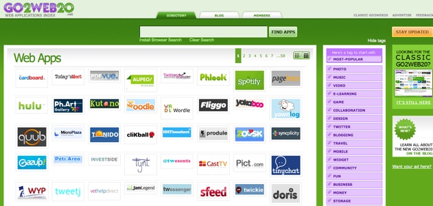
The new Go2Web20 presents logos of Websites and applications in an easy-to-read grid. Mouse over any logo for a brief description, or filter by category or tag. (For instance, here are Twitter apps and mobile apps). Once you click through to a profile page (here is one for Boxee), you can read a brief description of the app, see a screenshot, a list of blog mentions, Twitter mentions, Youtube videos about that app, as well as data from our own Crunchbase. Buttons on the side make it easy to share any app profile on Twitter, FreindFeed, Facebook, Delicious, Stumbleupon, or Google Bookmarks.
As members add ratings, the best apps should filter to the front page. Check it out and tell Orli what you think.


The site is down. Not sure if we crashed it, or we jumped the gun showing up. “Quick! Turn the servers on……”
interesting design looks a lot better.
I don’t see what the big deal is though, the site is a little slow on adding new startups.
Go Orli (and Eyal)! Great re-design!
This is the site i always look-on for new start-up , they are mostly up to dates. great looking designed.
I do not know if I like it. But a good idea.
It is faster. That’s for sure. The old Flash version was to slow.
cool, we actually get a quite a bit of traffic from the directory
Another way to do in-depth company research is through BizShark Search, which just launched on Techcrunch last week.
A great redesign and an excellent resource of information.
Nice Job Orli and Eyal
Not wanting to be a hater….but personally I have always found it to be somewhat bloated compared to some other “web 2.0 / CSS design” galleries.
Call me old fashioned, but give me something that doesn’t scroll and pop-up any day.
Actually, just managed to get on the beta version, 10x better. I will shut up now.
I think you’re right Robin, and the new interface try to go in that direction, more similar to competitor site like http://www.feedmyapp.com
Need a directory of directories.
Really, http://DMOZ.org is the mainstay.
I am going to get a tatoo on my shoulder. It’ll say:
“Web today gone tomorrow.”
Nahh.
much better than the flash interface!
I do think this is an interesting redesign. I find the new sign a bit slower in terms of actually getting information on a specific company. Plus I think there is way too much green in the design.. bit hard on the eyes.
good idea an very nice design
i wonder why techcruch is covering this site so much.
hmm i wonderrrrrrrrrrr
funny, i clicked the link to go2web20 and firefox crashed. more like stayawayweb20…
good idea
I like very much the writings and pictures and explanations in your adress so I look forward to see your next writings.
To provide useful information, please click to view
Bose headphones
ghd Hair Straightener
Women is Dakota
Sundance UGG Boots
Thank you!
I like the design of http://AppUseful.com more hands down. Instead of a screenful of logos it actually show why the app is useful. The apps are also ranked by users.