Aaron Patzer is the CEO and founder of Mint.com, a personal finance site that helps 900,000 consumers keep track of their spending. Mint’s data is a snapshot of the consumer economy. In the guest post below, Aaron parses the data to tell us what the economy looks like from consumer’s eyes.
Consumers are hurting, but if Mint’s data is indicative of the economy as a whole, it is not as bad as you might think.
(Mint was the the winner of our first TechCrunch40 conference, an experience Aaron wrote about in another guest post ).
At the World Economic Forum in Davos Switzerland this week, it’s a somber environment. Nearly every session – at least every session that’s full – is about the global economic crisis. While there is much rhetoric and shifting of blame, there is little mention of hard data beyond stock market declines and the price of bailouts.
As an engineer, and founder of a company where one of our core values is “quantify everything”, lack of numbers bothers me. How bad are things really? Answers like “really bad” or “worst since the Great Depression” just don’t do it for me. What does it mean in dollars and cents?
Fortunately, Mint.com is in a unique position to answer this question – quantitatively. Since the crisis first hit in September, our user registration rate has more than quadrupled, giving us 900,000 sample points on the economy. That’s close to 1% of US households. All told, Mint.com tracks more than $50B in assets & liabilities.
For the past year, we’ve been using this data to help people set budgets using our SpendSpace feature. For example, do you spend more or less on coffee than the average San Franciscan? Or, how does your average purchase price and purchase frequency at Amazon.com, Starbucks, and JetBlue compare to other Mint users?
We’ve discovered this data – in aggregate and entirely anonymous of course – is tremendously valuable in serving as a consumer advocate: the WSJ used our empirical data on bank fees to identify the worst banking offenders. As of late, it also provides a tremendous insight into consumer spending trends, and that’s valuable for all of us.
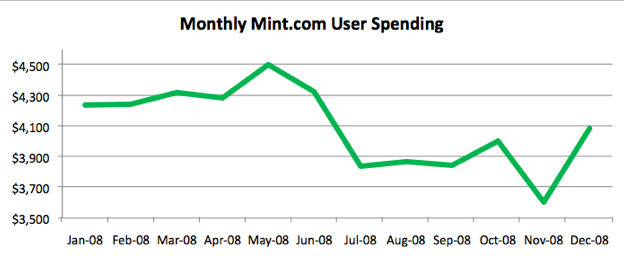
Looking across spending as a whole in 2008, we can see a phase change beginning in the summer. After a bump in the May/June time frame from tax refunds and credits, we see spending declined by $400 / month / household. Spending eroded even further (a $200 drop) in November along with consumer confidence, bouncing back only slightly for the holidays.
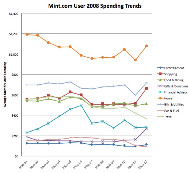
Looking by category from January to November, we see greater than 20% declines in entertainment (-22%), Home – including furnishings, services, and home improvement (-21%), gas/fuel (-32%), and travel (-24%). Spending also declined in food, shopping, and bills/utilities, with the only increase being spending on financial advisors as people look for help during uncertain times.
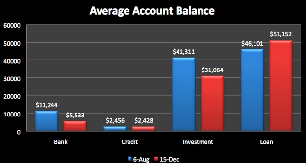
Looking at average account balances is also interesting. From August to December, the average savings account was halved to $5,500. Fortunately, credit card debt remained roughly constant, but investments declined by 24%, while loans (mortgage, HELOC, student loans, and personal loans) increased by 11%.
Is it Great Depression bad? That’s a qualitative question I can’t answer. But what the data, the hard facts, mean for you – if you run a consumer business – is that your customers are spending $400 less each month than they were a year ago, have burned through half of their savings, and on average have taken on an additional $5k in debt.
Good decisions are based on good data. And data – in itself – may be one of the most valuable by-products of any startup.