
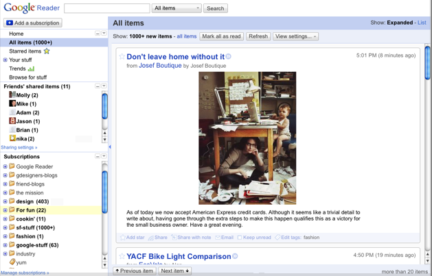
If you use Google Reader as your primary feed reader, you might notice that it has a different look today. The corners are less rounded all the drop shadows are gone. Overall, it has a more featherweight feel, and the sidebar sections are now collapsible. It’s a bit faster too.

Shared content from friends is now given more prominence. (FriendFeed envy, perhaps?) You can hide the counter telling you how many posts are unread, in case that just makes you feel like you can never keep up with everything. Sometimes you just don’t want to know how much you are missing.
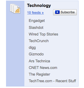
But the biggest change is one hidden in the browse tab. It will generate some feed bundles for you that you can add all at once. And if you select “browse all bundles,” you can see all of the bundles. These are algorithmically generated, unlike in the past when bundles were edited by hand. You can find TechCrunch in the Technology bundle.


See all


Very nice redesign! But I’m still waiting for subfolders. Please Google, I beg you, make my life easier. Seriously, I BEG YOU!!!!!!
Second that motion
+1 I wonder when themes will be added
What are subfolders. Why would you even need them.
Subfolders would be very useful. For example if you had the folder “Politics”, which I have, it would be very helpful to have subfolders such as “American Politics”, “Liberal Blogs”, “Left-Wing blogs”, “Conservative Blogs”, “Europeen Politics”, etc It would just make things a little easier. You wouldn’t have to scroll through a million folders to get to the feed you want.
Just use tags. Hierarchical filing systems are old and useless.
I’m not seeing the change.
Just refresh the page. The old version will continue to function until you refresh the page or relaunch the browser.
I turned off my OSX Google Reader userstyle and Ctrl+F5′d the page but it still shows the old style for me.
umm - u mean less rounded?
You are right.
I don’t get what you mean. Ironic?
Those changes are not from today ; Google reader is my primary feed reader and I saw those changes some time ago.
Regards.
Manu
WOAH!
I like seeing my unread count, but it doesn’t need to be freaking BOLD
Everything else looks fine.
Different, but I’ll get used to it, I guess.
Hey, I didn’t know that you could use HTML in comments… now that’s useful!
What impresses me the most is the subtle ui change that google brings in into its apps that make it look even cooler without making the user have to deal with massive changes.
Actually, disregard that, I’m just so unused to using the default interface that it looked the same as always to me.
On my iPod, I can’t test it but the mobile version isn’t working since the update.
It’s working, but it’s a MESS. Every feed is one line high and about 20 screens wide. You have to scroll WAY over to mark the page as read.
I use the mobile version quite a lot (+10 times/day). I hope it gets fixed quickly.
“The corners are more rounded” … justify this saying. For one thing, they are sharper corners, many rounded corners have been nixed… furthermore, it’s just kind of a *** thing to say.
Per the screen-shots, this app is finally starting to look somewhat usable (from a UI perspective, not from a Scoble-has-too-damn-many-feeds perspective) … though still a clusterf**k visually, at least taking steps in the right direction by getting rid of all that ghastly blue and those nerve wrenching round corners. (though i still see plenty of that immature powder blue all over, at least the folders are a normal color for a change)…
p.s. I f*****g hate Google.
Just use tags. Rounded corners are outdated and environmentally harmful. Tags will imbue rank amateurs with 4th-level Jedi powers. They are the key to yogic flying. But be careful - the power of tags diminishes with each change of underwear.
Disregard my ‘disregard that’. I only checked to see if the feed bundles and roundness in the expanded view were there. Google Reader looks nothing like the official Google Blog’s screenshot.
Way better. Rounded corners are so 2007ish.
Google UI’s always look like a pile. Their stuff is the ugliest most functional stuff on the Web. Google UI’s look like they were designed by eBay for God’s sake.
It still looks like a pile to me, but it’s better.
I’m not seeing any changes either.
testing FB connect
Wow, it feels faster and looks much better. I always had trouble with it, especially in Firefox. Looks like that might be resolved.
testing FB connect.
Much nicer and cleaner. Just need a decent native iPhone app now.
You can find similar changes with Gmail service.
Chandra
http://www.myjil.com
Great post, i love the new look yet nothing much can be said about it. Wish it had themes like Gmail does thats all.
Erick did you forget to subscribe to my rss feeds? You good you! lol
http://tinyurl.com/5oy3ou
Nice updates, but you still can’t rename tags/folders! But seriously, it does feel a bit faster - always a welcome improvement. The algorithmic bundles are a pretty nice touch too.
I wish they honored the skin setting from GMail.
Agreed. I’d like to be able to pick a skin for my account have it go across gmail, reader, docs, adsense, analytics, etc…
Yep
Sorry, this is a test
nice
Nice. I think I’ll start using it.
test
thx for mentioning the bundles, to me the most important change of this little step forward
bundles are a great addition…since they are “algorithmically generated” are they automatically updated as well? Wonder if there are any plans to allow a user to enter some tags or keywords and have a bundle be generated automatically?
It’s way faster for me, keep on the good work
Seriously, did they really require a redesign? I would have rather seen them come up with an iPhone client that works!… Get the users to voice their opinion before you work on your next release! Please!
haha yeah true. i noticed that too!
mee to my brother and also
http://www.eskibirsaat.com
It’d be awesome if Google were to develop global themes that could be applied to everything. Perhaps not business apps like AdSense, AdWords, and Analytics, but for all the personal apps, sure!
And they should start with Terminal.
Thanks Google…i really love the new fresh look in Google Reader…what if there is theme in Reader just like Gmail..and that would be fantastic.
Btw, i recently launched a nice blog about love tips called Cupid Blogger Dot Com - http://www.cupidblogger.com
Check it out and hope you guys would love it. Thanks
this is really sweet
testing out fbook posting
It’s a nice update, but Google really needs to work on their design. Something about all of their sites looks so unattractive.
The iPhone version of google reader is messed up now. It’s wide and annoying
Bundles?
Good idea!
wowㅋㅋㅋ
It’s not so much a new design as much of a clean up, but it’s still nice. The bundles.. great idea.
It would be nice to be able to arrange folders and tags more easily though..
This is waaay better than before.!
Bunch of bundles - why does it offer Sports? I don’t get sports. I don’t like sports!
It needs tweaking.
Google reader is the best! i don’t know what i would do without it! The new GR has kinda got crushed by the FB and G at war over their own friend connect apps.
Love the new look of g.reader. Can’t wait for facebook connect to hit digg too
what a nifty application
Ever since this change (it’s been a few hours now), I haven’t been able to read a post without manually clicking over to the site. I also can’t refresh Reader without manually refreshing the page in my browser. I’m using Firefox and I’ve never had this problem with Reader before.
Not a bad update.
Really like the update - too bad it’s blocked at work.