iGoogle Goes Wide, Introduces Canvas Pages.
by Erick Schonfeld on October 16, 2008

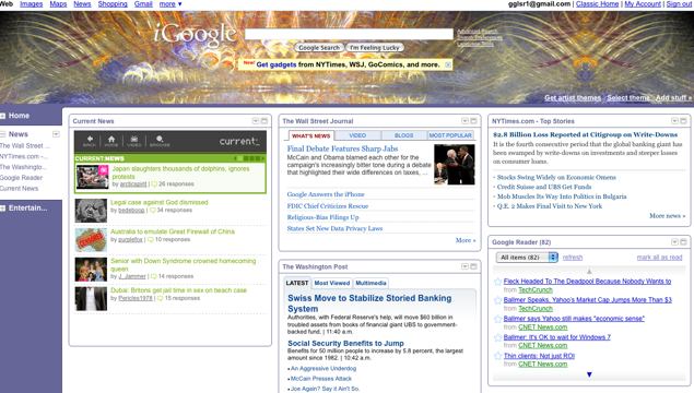
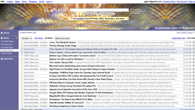
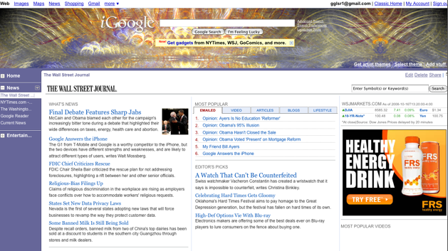
Google’s startpage, iGoogle, is spreading its wings. Today it is rolling out a new design that shifts tabs to a column on the left so that more Google gadgets and sources of content can be accommodated. But the biggest change is the ability for content partners and developers to expand each gadget to take up nearly the whole page.

Partners that are launching with expanded gadgets include the New York Times, the Wall Street Journal, the Washington Post, TV Guide, iLike, CurrentTV, and Go Comics. Google itself has created extra-wide gadgets for Google Reader, Gmail, Google Finance, and YouTube. If you have an iGoogle page in the U.S., you should see the new design rolled out by the end of the day.

In effect, Google is stealing a page from Facebook here and giving Gadget developers their own canvas pages. Within these iFrames, an entire Website can be exposed, with ads and all. Any money from ads on the canvas page go 100 percent to the content partner.

iGoogle thus becomes more than just a startpage that takes you elsewhere. Now this makes it easier for people to stick around and explore their personalized content without leaving iGoogle. (Although, most of the newspaper gadgets are set up so that clicking on a headline takes you to their sites, but that is their choice).

Responses

Comments rss icon

  • Is no one using Netvibes anymore? How do they fit into this new equation?

  • I had one of these layouts during the beta, I guess. I vaguely recall something saying “we’re trying something new!” with the left nav bar. But for what I’m using iGoogle for, that was just width my gadgets couldn’t have any more. And it was less intuitive than the “add a tab” style setup.

    I may not like the location of the nav stuff, but the flexibility of the main section is pretty neat. Of course, if it gets too much more flexible, it’ll be less of a customizable home page than a sort of meta-browser. Not that there’s anything wrong with that.

  • Why can’t I disable this extra column? Why does my layout say 3 columns, but now I have 4? Why did they add garbage like the new york times and movies? Why does the Gmail widget force you to preview email now? WTF is going on Google?

    • I totally agree - I want to determine how I use the space on my iGoolge. At least let the column be resizeable, better be removed!

      • Usual crap with Google - they got too big and now started to abuse their position. Changing something and forcing people to adopt it, because it is better for Google really means “who gives a damn about the users that gave them the market in the first place”?

    • Do not like the side column…….Was happy with my page the way it was.How can I get rid of it??!!!!

  • How do I get it?

  • I’ve dabbled with iGoogle quite a bit. I wish it was a little more friendly for developers as my favorite app called timesheet recorder was pretty much shafted. But the new layout features look fantastic. It would be great to read google reader along side gmail or google notes.

  • this is a ripoff of MY YAHOO??? WTF.. they have been doing this for years…

  • Hm… I visit my iGoogle page probably 50 times a day (and TC is my top RSS feed, front and center), and I’m a bit worried… mostly because I like things the way they are. But, change is good I suppose.

  • Bad day for pageflakes :( I’ve tried them all and popurls and igoogle are just the perfect entry point for news and personal information management.

  • This isn’t bad for Netvibes… or Pageflakes. The new layout sucks. Many have complained - and they have ignored us… making us put up with a layout many of us don’t want.

    We should have the option of where to put our tabs, but they are determined make us keep that left tab. Forget iGoogle… they were on a roll, and are now proving that might doesn’t make right.

  • wow, this looks good. better than the other layout. good stuff.

    http://gatesandjobs.blogspot.com/

  • Hmmm will stick to Netvibes. Still think its the best Start page around.

  • I’ve been using the left panel since the beta release. They “chosen” me for testing and asked for suggestions, its great and the expandability is something I rarely use but the layout is better to navigate with. BTW TC RSS front page since you guys started! avid reader.

  • I wish I could size my gadget boxes to the size that “I” want them to be and place them anywhere “I” want them to be instead of fitting them in to columns….

  • Have been using the new iGoogle layout for a few weeks now. Was a huge fan of iGoogle before the change. Still use it, but I think it’s taken a step back in usability. Viewing and taking action on Gmail items is brutal. The Gmail message view doesn’t show live links, you can’t take action on the message other than mark as read or unread. I don’t save time by having to click through to the primary Gmail view to forward or reply to a msg. Good grief!
    In the event that what I have listed as pains in the rear ARE possible within my iGoogle view, heads up to the design team that it sure isn’t obvious how to do it.

    • Yep. They call this an improvement? Why can’t I change the tabs back to the top. The whole left side is wasted on a stupid column of nothing. Ridiculous.

      • I agree wholeheartedly. I spent hours getting my tabs just the way I wanted them…now I have an ugly navbar instead. I want my tabs back. I really don’t need links to the items on my pages because I spent so much time laying them out so I don’t have to scroll all the time! At least give us the option to go back to the tabs.

  • I never used NetVibes before, but since so many have mentioned it I created my account. I have to say that I like it very much. The thing they do right is as soon as I got to their home page, I had a complete page (that I liked) in less than 30 secs. From there I created an account. Not the other way around. Lesson for me is, if you have a product that you believe is worthy of peoples registration, let them see it first and then they will sign up.

  • Odd. the new layout is not showing for me yet.

  • I thought it had been this way for awhile. Guess they were just beta testing on me…

    • Yeah, I’ve had this page for about 2 months now (at least)? The gmail feature isn’t great, you don’t have the full functionality unless you go to gmail.com

  • Is there some way to activate it? Mine looks the same way it always did.

  • Damnit I want my top tabs back!
    Looks like I’m switching to netvibes, thanks for the tip commenters.

  • Wow! i hasn’t iGoogle for this past few days maybe i should redesign my iGoog gadgets then

  • You are missing one important feature. Now this one has full RSS reader.
    Now I do not need to visit TechCrunch to read articles I can read them all in iGoogle.

  • I don’t like how now I have no control over the amount of text displayed, as its far too much now–for example with my news gadgets, it used to just show the article headlines as links…now it shows a 1-2 sentence preview of the article below it, with no option (that I can find at least) to hide the preview…leaving my iGoogle page look far too texty and cluttered than before.

    The worst thing is that there is no longer the option to hide the preview of your Gmail messages like before … at least one of your emails will be displayed at all times.

    Hopefully they start providing the options to hide the previews, and this might be a decent change.

    • There’s a checkbox to turn it off.

      • Many people (including me) are not getting the checkbox to turn it off. There is another way to turn it off by going to the iGoogle settings page, but it is not obvious.

        But the major difference (which I HATE) is that they removed the “+” for selectively expanding/contracting both the gadgets as well as the individual snippets. I am astounded that they took AWAY functionality

      • Please tell me where to find this checkmark. I was fine with it the way it was. Should have been an option to change. I went to lunch, came back, and it was different. Booooo. And I LOVE change, when its good change.

  • Ok, so am I supposed to use iGoogle or Google Reader now?? Sure seems like there is some serious overlapping in features of these two services.

  • The new iGoogle is horrible. Nothing works anymore. Change it back! Who’s the idiot who approved this crap?

    • Works fine for me.

      You must be afraid of change. Give it a few days.

      • Preferring something that worked fine to something different isn’t the same as a fear of change. I don’t want my start page to be a compelled hobby, I want it to be a stable point of departure. What was for me a major feature, the tabs along the top, is a big enough deal for me to look elsewhere for that feature on my start page. I use a smallish browser window most of the time, and putting the tabs on the left really eats into my browser space.

  • Who are these people that:
    1) never used iGoogle to begin with?
    2) didn’t use the ‘iGoogle developer sandbox’?… because that’s what this used to be called… it’s been out for several months.
    3) think that netvibes is any good? (seriously, give me one good thing that it does better than iGoogle)
    4) like top tabs better than side ones? (or at least give me a good reason. I enjoy side tabs because then I can have a TON more on any given screen)

    • I have 3 tabs, seems like a big waste of screen for me. Plus now my 3 column layout is really 4 which crams everything together.

      • Excactly! 3 tabs. What an absurd waste of space…

        Yess, I have a widescreen monitor. I use it so I can have multiple windows open (2-up, 2-down, side-by side) and see the entirety of each window.

        As it stands, I just lost the right-most column of my homepage thanks to this hosed layout.

        I can understand wanting to add functionality, but *replacing* it? Why? At least give us the option of sticking with “iGoogle Classic”…

      • Totally agree with Jared, my print is tiny now, and having the tabs in the left is counterintuitive. Hate it big time and just want to know how to get the old iGoogle back. Any way?

    • “Who are these people that:
      4) like top tabs better than side ones? (or at least give me a good reason. I enjoy side tabs because then I can have a TON more on any given screen)”

      How about people with different preferences than you, jackass.

  • This looks like garbage. Just one more push for me to hurry up and stop sharing my life with Google/CIA.

  • I don’t like the new lay out. It’s not ‘cos I’m afraid of change, but when I customize something, I expect it to stay that way until I say otherwise. How come there were no announcements to non-testers about this change? It would have been nice to be told something was going to change rather than it just happen one day.

    Now my homepage, which I have had for as long as I can remember and has had many, many tweaks over the years to get “just right” looks awful. If my laptop had a 20″ screen it might no be so bad, but the 13″ is cluttered and uninviting.

    Thanks a lot Google!

    • That’s a good point… I knew about this beforehand because of TC, but a couple hours after reading it, there was the change. I feel raped of my home… I use iGoogle as my navigation hub for the big internet. More like google’sGoogle, eh?

  • There are a LOT of p*ss*d off iGoogle users now…. this sucks !!!

  • See the growing list here:

    http://groups.google.com/group.....0&sa=N

    Mike, get them to fix this, darn it - it s*cks !

  • Oh FFS this is just ridiculous. Did they even test this s*** i’ve used iGoogle for eons now 100 times a day and in the past hour i just can’t keep myself from punching the keybord in frustration…give us at least the f****** choice…i don’t want to stop using iGoogle but i just CAN’T with this left tab…

  • I hate it. Why do software people all think I want more and more JUNK to make my 22″ monitor end up with the same amount of usable space you would have on an iPod screen? Thanks! Thanks for nothing.

  • Ok, after reading the post, I thought I would like this. (I’m a HEAVY iGoogle user) After it was updated for me, I HATE it. You can’t collapse the RSS summaries. You can disable them, but that’s worse. My page is 3x the length it was, but MUCH harder to scan for new headlines. (80% of the stores on my page are noise… I’m looking for the top 20% to expand… then the top 50% or so of those get clicked.) That’s all fucked up now. Surely they’ll have an option to revert it eventually.

    • Okay, they reverted it back. They must have saw the stats on their iGoogle-settings.xml export skyrocket. I personally just got it set up in netvibes when they changed it back. At least I’m ready to go if they pull that shit again. I would rather them charge me $5 a month for the page so I could actually complain to a person if something like this happens again. As a free service, they have no outlet for this at all. :(

  • What exactly is the point of being able to see two lines of a news article…

  • Time to switch to netvibes. Oooh, it’s a cooler interface, too!

  • I use iGoogle constantly. This is annoying. At least you can turn off the preview descriptions for links in My Account > iGoogle > Settings, so you can actually visually scan headlines normally.

    – For me, the left column is 99% wasted space. I see no option to change to top tabs.
    – And no expand buttons for headlines? Those were useful.
    – It’s very annoying of Google to suddenly force this upon loyal users; I was a loyal user for a reason…

  • I’ve had the tabs on the left side for over a month already! Perhaps I’ve been in the test group :-)

  • It’s stupid + arrogant without giving the user a choice to keep what he has now. And why the height of the theme image can not be changed (reduced) also?

  • Tabs on the left suck. I’m sure some people like it so making it an option would have been OK. I use iGoogle for my homepage and pass through many times a day all day long. I saw no notice about this, no warning and now iGoogle sucks. If you change something then make damn sure it is better AND your users actually want it. Who the hell thought this was good enough just to spring on users. If this doesn’t switch back quick then I’m gone for sure.

  • Didn’t ask for it. Don’t want it. Can’t stand it. Won’t use it.

  • This makes the IGoogle sidebar gadget for firefox worthless. I used be able to see the IGoogle content in a single column on the browser. Now all I see the stupid home tab. They don’t even offer a way to actually have a single column. This was poorly thought out. Thanks for nothin Google.

  • WTF!!!

    I want my tabs back.
    I don’t want everybody and their mother to be able to read my email.
    New iGoogle sucks.
    Whose idea was this?
    Did they actually beta test this?
    Did they receive any feedback?
    If so…Did they listen?

    Awful. Just awful.

    • One of the discussion threads at Google is titled Experimental iGoogle Features and has 798 posts dating back to July 8 2008. “Test-subjects” hated the new layout from the beginning and all complaints and questions have been completely disregarded. Netvibes is MY new homepage!

  • Really bummed about the new igoogle layout. please, google guys, give me the option of having the old look

  • it’s actually a google reader with different layout + extra features to support widgets

  • I don’t like the new layout at all. Mostly - why are my feeds all summarized - I only want a title not 3 lines of teaser, give me back the control.

  • Just opened iGoogle. I wondered if my browser was messed up. It’s okay, I guess. But I do hate that they changed the feeds view.

  • I really dislike when something changes without the option to go back. It really frickin pisses me off. Think I’ll try Netvibes.

  • these new updates really wonderful. This makes igoogle more useful and user friendly.

  • I just lost a whole column of space on the left for nothing - bad design Google! There is a big waste of vertical space at the top, too. Spare me all that whiespace for goodness sake and give me my content. What happened to simplicity?

    • Oh yeah - and now my Gmail widget traps me inside the widget when i want to go to Gmail - give me a break! This is the beginning of the end. I loved iGoogle until today. Now it’s getting complicated and borgish, I am very much not so sure.

Leave Comment

Commenting Options

Enter your personal information to the left, or sign in with your Facebook account by clicking the button below.

Alternatively, you can create an avatar that will appear whenever you leave a comment on a Gravatar-enabled blog.

Trackback URL
bugbugbug
The CrunchBoard
  • MediaTemple Logo
  • QuickSprout Logo
  • OpenX Logo
  • Cotendo Logo