
Israeli blogger Tal Siach, one of the authors of the Walyou blog, seems to be one of the few people who can actually access the new, toolbar-free version of StumbleUpon. The new version was set to launch to everyone on Wednesday, but so far everyone I’ve spoken with is still on the old design, which requires the downloaded toolbar to function properly. Lucky for us, though, Tal is in, and wrote a review of what he sees.
One nice trick: if you want to see the new javascript toolbar in action, click here and it should work. You can stumble on to other pages from there.
Tal’s post is below:
I use StumbleUpon on a daily basis, so I was surprised to see a brand new design and face on one of my favorite social networking sites. It also came as a shock since TechCrunch recently reported that Ebay showed their interest in selling StumbleUpon.
Since it came so sudden, I spoke to some of my friends and realized they do not see the same new face that I see on my monitor. I assume that StumbleUpon must have wanted to slowly bring it up on various users, test it, get feedback and then provide it to their massive community. I am extremely fortunate and lucky to be one of the selected to test the design.
I am still not sure what all the changes are, but here are a few I noticed immediately:
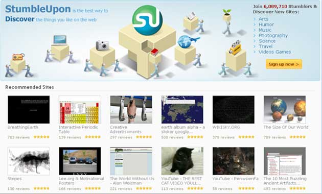
New Homepage Look
Once I enter the new StumbleUpon Homepage, I noticed that it has had a complete makeover.
As you can see in the screenshot below, there is an innovative header to the site and all of the sites that are featured here have 5 stars.

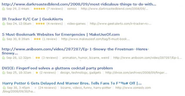
Stars for each Discovery (Submission)
Every time a story has been discovered it ranks on a 0-5 stars scale which makes up the score of the Submission. This of course will be based by the number of thumbs up, reviews, domain popularity and several additional parameters within the StumbleUpon algorithm. You can get some additional insights on the latter in Tim Nash excellent post - Stumbleupon mathematics for stumblers (http://blog.venture-skills.co.uk/2007/09/19/stumbleupon-mathematics-for-stumblers/)
In the second screenshot below, different scales are presented, and the number of reviews do not decide the popularity alone. You can see that the last submission received 24 reviews yet still did not rank well and has 0 stars.
This refers per submission and doesn’t necessarily say anything about the domain itself; the same site can have additional posts with varying stars rank.

Discovery Page
Seems like StumbleUpon gives a Featured Icon to any post that has been discovered. At first glance I thought it is a mark to show if posts have become hot or not; however after a second look I am fairly certain its just a mark to show the URL has been discovered, and the number of stars are the real indication whether a post went popular or not in the StumbleUpon algorithm.
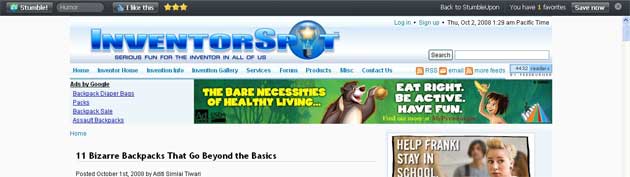
I just recently stumbled an interesting post about Kwiclick.com via Orli Yakuel’s blog.
Below you can see the discovery page of that submission with the Featured Icon and the user who discovered on the right. Underneath that Stumbler who discovered it you will see others who liked it. Since I just discovered it, it is only me ;).

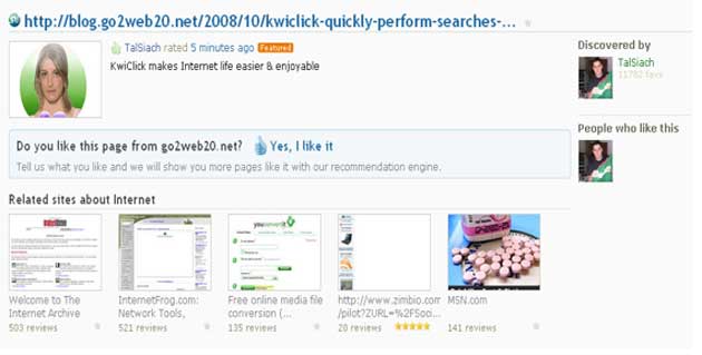
After people review the post they can add the specific site as a place for cool resources and with that get more similar stuff they like in the future - improving the recommendation engine.
For example, I clicked the question above, and marked Go2web20.net as a source I would like to see more from the site. The picture below shows the changes on what happens where the “do you like this page from…” is.

Featured Posts in Categories
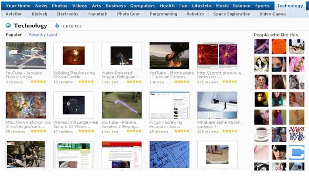
In the new StumbleUpon design, the Categories are listed on top, while the ranked posts based on stars rating and enough algorithm popularity are listed within their category.
In this screenshot example below: all the technology related posts that were featured have subcategories like Electronics inside technology. The items listed here aren’t necessarily new ones, and you can find links that are rather old but with good rankings from the StumbleUpon community.
StumbleUpon users can now check the selected articles, pictures and videos that the community marked as Popular. By placing the categories on top of the page, StumbleUpon encourages users not only to stumble random stuff directly from the toolbar but actually go and choose a list of popular stumbles themselves of what they would like to read, see or watch.
If you ask me, maybe StumbleUpon wants to encourage users to use the site more like other social bookmarking sites like Digg, Reddit or Mixx.

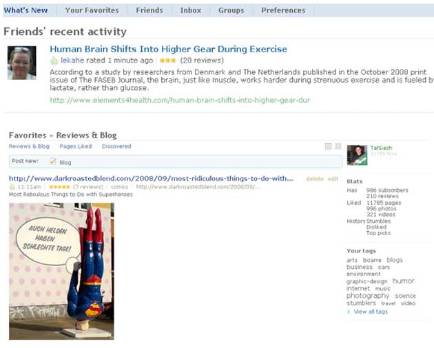
Transparency Ranking in your Subscriptions and Blog Page
From now on, you and others can see the number of stars on your own discoveries and vice versa. Moreover, you can see the star action in actual sections as well, so it may encourage you to check additional stumbles.

Well, these are some of the changes I saw so far and there are probably others. With time, additional information will be revealed, and as I mentioned not all users can see the new design in the beginning. I am not sure what the reason is, but it is probably to beta test its effectiveness first.
Another addition we may see is what Tec Crunch (http://www.techcrunch.com/2008/09/30/stumbleupon-set-for-resurgence-with-web-toolbar-partner-program/) mentioned of StumbleUpon’s desire to develop their toolbar for the web instead of an install toolbar. They must be missing a lot of users by requiring the installation, which many want to avoid.
My own new design assumptions have not been confirmed by the StumbleUpon staff and are my own opinions and beliefs. If there is something you have found out which I have missed, I would love if you would share in the comments for all the readers to read as well.


See all


I also see the new version, since yesterday and it’s great. It seems better, especially that I don’t need the toolbar anymore.
well it looks like it’s rolling out. I certainly don’t see it.
I know, I told yesterday to my friends about it and they also can’t see it. It seems we are special
where do you live?
I also live in Israel and I cannot see it yet. Perhaps they’re doing it based upon user ranking?
I can’t see it either. I see the new design on front page but thats about it. Have you tried to uninstalling the toolbar? Because on front page when you click sign in , the toolbar pops up with the login screen.
I haven’t tried it yet , @ work..
TTYL.
In Romania
Na, don’t like it. One wrong button click (like “home”) and the toolbar is gone.
Nice find by Tal!
I think anyone can see the new interface though - if you simply log out from the StumbleUpon toolbar and website then you get to see it! You can perform any actions you like and see all of the above, although they won’t be tied to your account… I’m not sure if that’s what Tal was doing.
Got it, Guy… This is great for the people who aren’t so interested in the social part of social bookmarking, I suppose (then what’s the point?)… but for signed-up users, it looks pointless.
Update/correction: if we would have actually read StumbleUpon’s blog announcing the new toolbar we’d know how to see it
. if you want to see the new UI on your account, join their Beta group - http://beta.group.stumbleupon.com/. This automatically rolls out new features to your account.
It makes too much sense to go read the blog… who would actually do that? Who here actually reads directions before trying to set up a program or build a piece of furniture? hehe..
Yep Guy thanks, thats the reason why i saw it… all the stumblers that will join the beta will be able to see the new design ,I checked it with some friends and it is working for them now. Thanks for the heads up!
Well, if anyone was going to be there and see this, Tal’s the man!
Not seeing it myself…
I think you need to arrive at the stumbleupon homepage while NOT logged in then click on a general category - or try this http://www.stumbleupon.com/too.....right.html
I’ve been able to use this feature for nearly 3 weeks.
Great Post Tal……You Rock Brother
Great post, I can’t see the new design as well.
I was shocked and surprised to find I had this version as of 2 days ago. I am still getting used to it and dont know how to do certain things yet. This article comes as a welcome surprise because I thought I had a messed up SU. Thanks for the article and the tips. veronicaromm.stumbleupon,com
I was able to see it right after yesterday’s TC post by going to http://www.stumbleupon.com/toolbar/
link takes you to the wrong site
Sorry, but this isn’t really news. Anyone can join the Beta Group on SU to get this functionality immediately activated and leave the Group to have it deactivated.
The emphasis on the Venn-diagram/similarity metric is nice but I don’t like the way a user’s numbers (favorites, subscribers, etc.) are now below the fold, so I think that many people will switch back after a tryout.
It is news to a lot of people.
Thats cool that Tai and Starskii see it. Also cool that Lekahe is featured on the site as well. Can’t wait to see it pop up on my computer..
I saw it a while ago. Accessed it using Firefox with no Stumbleupon toolbar installed. When I installed the toolbar, it returned to the normal format
thanks for the heads up
I enjoy using the toolbar much better, but I would imagine those without a toolbar will be happy with the changes. I hit stumble waaaaaaay too many times a day!
http://jwojdylo.wordpress.com
Stumble User worldwide UNITE!!
The Church of Cowherd
Join the Church of Cowherd!
added some pages to new SU, hope it good work.
How does StumbleUpon benefit publishers?
Pageviews
Only initially.
And only if many users don’t thumb it down and drive it down into the cesspool where it belongs.
Or if users report it to the staff, who will block the site from SU.
We do that a lot.
Great stuff -
As a daily stumbleupon user, I can say that they were in DIRE need of a homepage redesign. I’m now excited to see it in action.
Any other music bloggers looking to connect on SU? My username: YoMrAHolmes
It’s possible to hijack stumble-sessions in the new version.
Try this link for an example: http://www.stumbleupon.com/too.....hkopp.com/
Nice improvement they had. This would make their services more and more popular
With spammers, yes.
Well I have been seeing it since I read about it on TC. I have been using Chrome and it works great inside Chrome.
I’ve been able to log in to stumbleupon.com and then use this bookmarklet to stumble in Konqueror for over a month:
javascript:window.location.href = ‘http://www.stumbleupon.com/demo/#url’;
If you can’t see the new StumbleUpon, toolbar free version, check out http://www.spinsnap.com
We have been toolbar free from the start!
I’m in North Carolina and saw the redesign as soon as I read about it going live.
Strange, no new design for me too and I’m in the USA. Hope it rolls out soon.
Correction - read through all these posts, joined the beta group, and it’s working fine. Now just gotta see what is / isn’t new.
For me the most important improvement is that the U.S. has removed the limit to your friends, an option that expect when I joined. SU brings such a new improvement and see that put in front of his user experience. I ♥ SU!
FitnessSocial.com saw a huge traffic spike from SU yesterday and continue seeing it today, is it because SU’s new design? I certainly wish more people come from other channel.
righttttttttttttt
One thing they seem to have done is to remove the ability to view, or hotlink, so easily, images from codes that appeared when you reviewed, or Stumbleupon Blogged them…Making SU more like other social sites is a huge deficit to me. The image of SU as a more artistic, sophisticated site (to me anyway) was one thing that drew me to it…If it becomes another MySpace, I will bow out…It is the only site I subscribe to.
There was a reason for that…
I don’t like it…I know that hits by the spamming, commercial-type self-promoters asking for “friends” status has surged upwards…
Many people think like you, including myself.
I can’t speak for my whole “fanbase”, but many of my 5000+ fans are sick of the way SU continues to spiral downward.
Don’t even get me started on the whole “friend” status thing.
That’s a joke and an annoyance.
As long as you’re logged out of your toolbar when you visit the StumbleUpon homepage, I think you’ll see it. …..I’m liking it. Actually have a reason to visit the homepage now, which will probably happen, at least twice before I revert back to my old ways.
You can access the web toolbar by typing: http://www.stumbleupon.com/toolbar
I’ll try it. But I like the toolbar. I hope clear options don’t vanish.
I like the new design rather than the old one. T
Webmob-ad, is a new start-up that just came out . It is a pioneer in the automation of mobile and web advertsing by creating the only self serve and fully automated marketplace for CPC and CPM advertising . It supports all types text ads, banners and video ads. PUBLISHERS EARN THE HIGHEST SPLIT OF THE EARNINGS.
. Register is FREE. Our matching tools offers a new approach to real effective personalized targeting. Please check it out : http://www.webmob-ad.com.
Great discussion you got going on here buddy!
Stumble is doing something right that is for sure. Even if some feel it is going downhill, it is getting more attention lately, which is good. I think new is generally a good thing, and to be expected in the tech world. I find it amusing how many folks get all worked up when a site makes some changes.
For the site, it seems to me a good thing, cause people start talking. I bet Stumbles traffic has gone up quite a bit in the last little bit here. And how many of you folks would agree with me that they (stumble, and other sites that have undergone sig change) expected to get hit with more traffic, activity, new sign-ups, etc. Smart marketing, create controversy and make people talk, change er’ up….remember Facebooks last little controversial time in the sun? I think these guys know exactly what they are doing and my thought…hats of StumbleUpon, your in the spot light for now.
Cheers all!
Jeromy (AKA Hillbilly)