

Yahoo will begin bucket testing a new version of its home page this evening with small percentage of users. The company’s last home page redesign was more than a year ago, and earlier this year Yahoo began integrating third party content onto the site via their new Buzz product.
Any changes to this page ripple broadly through the Internet - 314 million people visit the Yahoo home page world wide each month (Comscore, July 2008). 82 million visit it daily.
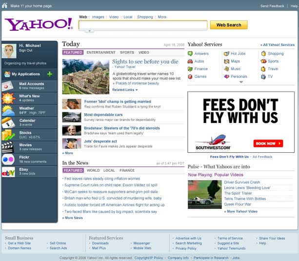
The new page combines what Yahoo calls “broadcasting” elements, which are the same news and resource links for everyone, with “narrowcasting,” which are highly customized home pages made popular by My Yahoo, iGoogle, Netvibes and others.
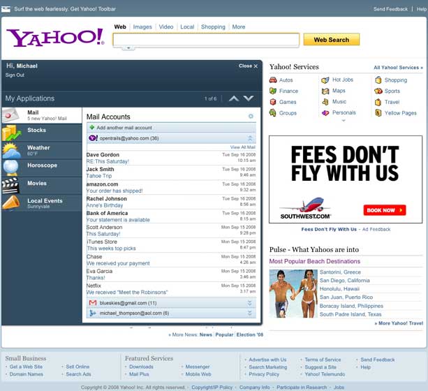
A key addition is the introduction of third party services to the Yahoo home page. For now users can log into their Gmail or AOL Mail accounts and view emails right from Yahoo.com. This is similar to what AOL unveiled last week. And like AOL, Yahoo has chosen to leave Microsoft out of the party.
The rest of the changes being launched tonight are largely cosmetic. But Yahoo has plans to roll out new features over time that bring even more third party content to the site.
The rollout begins tonight to a small number of users in the U.S., UK, India and France.
Upcoming Changes

In a briefing today Yahoo also showed a number of upcoming features that may be integrated into the home page over time. These are just prototypes at this point, but they show an inclination to bring even more customization options and third party content onto the site.
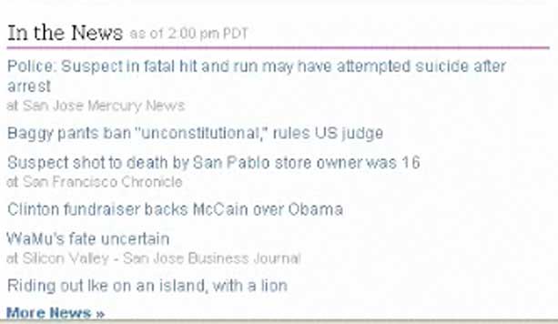
The first is integration of news items on the home page from third party sources. Today all news sources in the “In The News” section point to internal Yahoo news pages. But the internal prototype shows links to outside sources like the San Jose Mercury News and the San Francisco Chronicle. Whenever this launches, look for massive butt-kissing by media to get themselves on the home page.
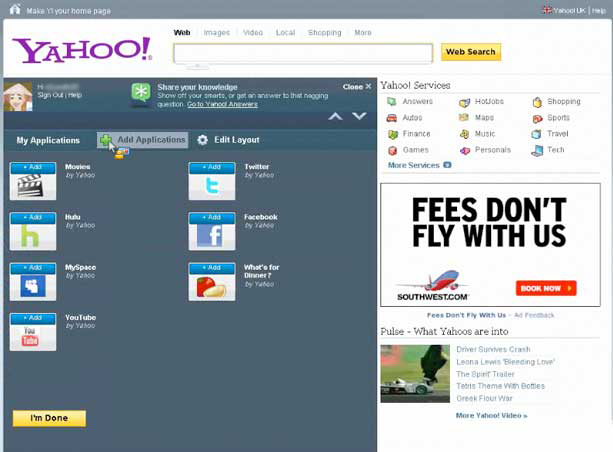
I also got a look at the soon-to-be-released “add application” function that lets users add apps to the left sidebar. The mockup included widgets for Hulu, MySpace, YouTube, Twitter, and Facebook - all third party services. Screen shot:


Looks like AOL 3.0
This thing is like a wet fart…tons of anticipation building up to a disappointing and messy climax.
Can’t wait for the Google TP to clean this thing up once and for all.
15 years of innovation and this is what search has come too. this is a sign that the end of innovation is near. Today Goog ceo states the show must go on for yahoo and google to walk down the aisle of search love in holy matrimoney.
better than before but highly charged.
New look is okay but not very impressive
That looks horrid.
huh. I sorta like it myself.
I really like it too. I’m more for the minimal Google look though, but Yahoo has never been about that.
I definitely think it serves Yahoo’s purpose. It’s a portal, not a clean start page. The new design makes it definitely more useful as a portal.
It’s funny though that people are so resistant to re-designs - even if they are better. Can be seen with Facebook, where the new design isn’t really perfect but definitely a big improvement - or here, where Yahoo improved their portal big time.
This is a bull shit design and TMF who did it should be F..ing fired. But I am so happy though, as it will make my Web3.0 portal look like the shiiiiit. WOW, I hope this is the best bull crap they can come with. Pleeeeeeeeeeeassssssssssse make it so.
TC you are the f—ing greatest website there is on the f—-ing planet. If only you were a girl, I would kiss you right now. Of course you gots to be slim, pretty, and between 18 and 24 to qualify.
f— yeah. At least the second paragraph anyway.
can’t wait to see your kick a– web 3.0 portal! f—-ing kick a–!
I love my readers.
We love you too Micheal…we love you too.
Haha, quite classy. I await the web 3 showcase.
it is really lots of stinking shit,
packed tightly in a new bottle
huh, because your site “http://www.indie911.com/user_browser?uID=94479″ kicks f—ing As–??? You should be f—ing fired dumb as- I love how people that can’t do complain about those that are doing….
Jerry, I am still for hire dude. Just give me a ring on this portal. US$250K per quarter will do.
After all it is here all the I.Q resides when it come to the web. So do not fcuck yourself in thinking otherwise.
lean mean innovation machine .. good first step .. their customers are mainstream, not jaded 2.0+ users
We forget that regular users are different from us in the tech world.
this new page is confussing,i need a manal to find eney thing,and i belive that it has enterferd with my yahoo.messager,i can scend message,but i see when somone typing a massage but i dont recive thear massage.this has ben going on for at least two month’s know.and i have very little computer training,so if you can help make it as semple as posable. think you.
Change is always good, and I’m glad to see Yahoo! is moving in that direction!
“Change is always good” - are you stoned or just stupid?
LMFAO!
Will be interesting to see how it is received (can anyone say ‘New’ facebook backlash!) I agree change is good, keeps things interesting!
Like newspaper websites, the focus on the homepage is mindless. When the majority of users deep-link into the content, through search, RSS readers, bookmarks, and reference links - spending time to reduce the clutter on the home page - still leaves a cluttered page.
Money would be better spent on fixing broken services. I spent hours looking for the domain registration, got sent to AT&T’s hosting service, finally gave up and registered via Google.
Fix the problems deep in Yahoo. A face-lift does little.
could not agree more — there are way too many resources focused on yahoo.com front page — somebody needs to figure out how to pull all these services together.
Some kind of “portal.”
dj chang,
umm… domains.yahoo.com?
my.yahoo.com / finance.yahoo.com / search.yahoo.com / billing.yahoo.com / startwearingpurple.yahoo.com / video.yahoo.com
kind of see the pattern?
Looks like a win…brings the look and feel of the iphone with the personalization needed to stay relevant.
This is the best portal page design i’ve seen to date. hats off to the team. really.
ouch — lame. again yahoo compromises and overloads users with too much information! product design by committee usually breeds information overload and yahoo is all about design by committee
wow - awesome design!
I like it! change is good
Somebody needs to tell msn/live to get with the effing program.
Why I get the same old portal? is this a beta for limited user?
It’s much sharper looking than their current page.
This thing is like a wet fart…tons of anticipation building up to a disappointing and messy climax.
where was the anticipation?
Just about everything that’s been hyped up has been disappointing to date.
I’m anticipating this redesign & am hoping for less of a letdown. I don’t have too many more pairs of underpants left.
For the record, this wont change my default startpage from google.com
You need a girlfriend… and a diaper.
less cluttered, love it
looks like they are really trying to push the purple logo aren’t they ?!
I kinda like it.
I used my yahoo for 10 years before they pulled the rug out from under me with this trash. Just what everyone needs, some ajax, some flash, and a few web 2.0 addons to render the page a total waste of desk space, unusable on old machines, distorted on portable devices, and a slow-loading CPU and bandwidth hog. Thanks for the good years Yahoo, you stink now. Should have taken MS’s offer. Then the two most bloated homepages on the web, msn and yahoo, could be one.
Yahoo started smelling years ago…you’re just noticing now?
I’m loving it. Its what you’d expect from Y!, taking their homepage to the next level. And honestly, 1yr is not to shabby for Y!.
Webmob-ad, is a new start-up that just came out . It is a pioneer in the automation of mobile and web advertsing by creating the only self serve and fully automated marketplace for CPC and CPM advertising . It supports all types text ads, banners and video ads.For publishers , it offers the highest split of earnings you can find out there and much more. It caters to web and mobile Publishers and Advertisers . Web and Mobile Publishers can earn money easier than ever and registering is FREE. Please check it out : http://www.webmob-ad.com. We would like to hear your comments , please drop us a line .
Better than the older design. Digging it.
Nice work, way to go Yahoo!
yay! ads.
It looks great, I like it
Let’s see how it goes…btw i don’t visit yahoo front page often but if i get to have twitter,FB and other similar facilities from Yahoo as an easy access gateway then i might change my habit…
And looks like AOL and Yahoo had already fixed up a deal for mutual mail access
I like it… I never liked going to My Yahoo! so having the Apps feature will make the Y! homepage more useful…
Wow. this is just plain bad, and I am saying this as an ex-Y! User Experience Design person. I really hope this is not the final design.
Vertical left hand nav with large icons and rounded edges is so Web 1.0. I am shocks the current UED folks are bring that back. It reminds me of some of the old @Home design. So sad (for Y! that is).
I know Y! tried hard to push the color purple as the corporate color, but using purple for the Yahoo! masthead (product color)? Give me a break. User will never associate the Yahoo! brand w/ purple. Yahoo! the masthead logo should always stay red. That’s not my opinion. That’s what Y! users told us in the past in UE studies…. And not to mention the fact, purple is a bitch to work with as a Web color.
Again, I really hope this is not the final design. The current page (we used to called the Spirit design) is not perfect, but it works. Someone in UED really need to speak up. This is crap.
The more the Yahoo users will get third parties services, the more they will like Netvibes, the only indepentent personalized start page … Not from Google. Not from Microsoft. Not from AOL. Not from Yahoo. Not from ….
it looks cool, nice work
I am an ex-yahoo. The above ex-UED person obviously missed the point of this redesign. If you notice, the applications on the left are custom applications that a user would be able to choose themselves. This whole page is much more interesting than the previous yahoo home page, where the only interesting thing to a regular user were the two news sections in the middle.
In this design, the list of all the Yahoo services is not so prominent (why would a user need a list of all the yahoo properties?). The user is put first by really being able to feel that they own the page. Yahoo has always been about leeching traffic by putting links to themselves everywhere…but this page is different, and its a welcome change. The next thing that needs to get stronger is Yahoo Toolbar which today is *totally* useless. It is basically just an advertisement for yahoo sites, instead of adding some real value to a users’ browsing experience.
This will also make the launch of Yap (Yahoo App Platform) very interesting…since the Apps have such a prominent placement.
Lastly, I’m happy to not see the BS “Marketplace” section that has been on the front page for 10 years.
Over all, I would give it a 7/10. Good work and good luck yahoo.
Even though I still don`t have access to this re-desgined Yahoo! HP, from what I can see from screenshots it looks pretty nice and much better than the current one.
Keep up the good work Yahoo!
good^_^
http://19201080.cn
Clean, Simple, Impressive. I Like it
it looks very nice
ENTERTAINMENT FOR EVERYONE : http://trinitylab.wordpress.com/
From the looks of it, the new YAHOO.com is what AOL.com should have done with their redesign.
nothing groundbreaking here… this accomplishes Y!’s biggest problem; ‘updating’ the design and usability while maintaining the easy to find content that their wide ranged demographic has come to know and love.
for a portal, i dont think this looks all that bad. as a MyYahoo user, the apps feature and customization probably means one less click per day for me
Much better than the current hp. But who uses yahoo.com anyway? Well, my parents do. However, don’t most of us use my.yahoo.com??? I agree wtih the above comment that the purple branding is a dramatic a departure. Never understood why consumer was red and corporate was purple. Perhaps now is the time to consolidate? Who was on the team that did this UI redesign??
I can’t imagine this is going to work. It’s missing a classic Yahoo! trademark: a bunch of ads.
The marketplace ads are gone. The only ad left is the ginormous 300×250 on the left side that I imagine is going to sell for a left leg and right arm.
We’ll see but I’m betting on black.
They just can’t get their act right
and so has Flickr.. yahoo’s better half.. Flickr has slightly redesigned user’s homepage and stats page..
I loved the mail application, its neat, simple and rocks (Thank god not Yahoo! Like)…but i would also like to see see application like iphone with lot of fun element, hope they open it up for 3rd party developers…please just don’t create one more MY Yahoo! on home page.
looks web 2.0ish
dude - that design is great. well done y! the haters on this thread are a bunch of run down, bored, jaded super users who’ve lost their connection to the zillions out there that have never heard of ajax.
It’s like the same deal with facebook. It’s hard for people to except the change when they are so used to a certain format. But it does look pretty cool and give it time, everyone will not even notice that there was even a change made.
Craig
http://www.budgetpulse.com
I actually think it looks nice. To the hates (oh, the irony) - put yourself in Yahoo!’s shoes and all of the markets and niches they have to serve. This is the best any company would have done; much better than AOL, Google, and Microsoft.
Never use yahoo.com and won’t, but My Yahoo is my homepage - much better than igoogle, since with better finance, more useful modules and much better bang for screen space - so I just want that multiple email account checker moved to My Yahoo, since that’s a major new convenience.
I’m impressed with the Yahoo! Home Page. I get real tired of hearing the Google homers treat anything else as if it’s just horrible when truth be known, if Google had released it - katy bar the door - it would be the second coming.
On another note, with Yahoo! incorporating more and more 3rd party applications, it makes me realize how our desire for customization and niche content has really been a full circle, of sorts, to the much vaunted, old-style “push technology” circa 1996. (Think Pointcast.) They were so close then without realizing it.