Designed and conceptualized by just one person, Buffer.me is the epitome of what can happen when a talented designer tries to do something to improve an experience that seems less appealing by the day.
Buffer.me uses the YouTube API to populate the site with videos, but it totally changes the way you view them. As the company’s founder explained, Buffer.me aims at “giving the user a better experience, faster results and a more intuitive design.” And although it isn’t as fast as I would have liked, it performs extremely well on the other two counts.
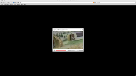
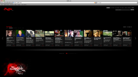
The first thing that will strike you about Buffer.me is its unique design. Unlike practically every other video site on the Web, it doesn’t show blocks of videos anywhere you look. Instead, it sports a simple design that’s dominated by a black backdrop and videos placed prominently in the middle, which you can scroll through with the help of arrows on either side. Once you click to watch a video, the border and related videos box disappears and the only component left on the page is the video itself. It may be simple, but it’s a nice feature that actually improves the quality of the service.
Buffer.me is still in its infancy — it hasn’t even reached private beta yet — so it’s tough to fault the company with some buggy performance and slow results. That said, it suffers from both and it did detract from an otherwise rewarding experience.
Running on YouTube’s API means Buffer.me is facing stiff competition and won’t allow users to upload videos and make it a destination away from the auspices of Google’s monster. And although considerable work needs to be done to get Buffer.me to a place where a high number of people would want to use it, the site looks like it’s well on its way.