Yep, We Redesigned
by Mark Hendrickson on August 27, 2008

As many of our readers have noticed (and noted) already, we rolled out a new design for TechCrunch yesterday evening.

We’ve been watching as the initial feedback has rolled in through Twitter and in the comments to our other posts. And while we’re still making lots of small changes, we wanted to take a second to write a proper post explaining our intentions and soliciting your feedback.

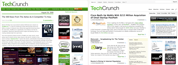
Our overarching goal was to clean things up, both on the surface and under the hood. TechCrunch had become bloated in many ways, with the homepage taking way too long to load and the scroll bar going on forever and ever.

So the first step entailed switching over to an “excerpt” format with which readers could get a taste of our posts on the homepage before diving in to read them in full. By cutting down on the amount of content on the homepage, we’ve reduced load times and made it easier to skim our headlines for the news and editorial you care about most.

We’ve also taken a minimalist approach to design that uses lots of whitespace and gives priority to our main content with a wider post width and a larger font size (no more squinting on that high resolution monitor).

As far as particular features go, a new “featured posts” box sits adjacent to the second post on the homepage and in the sidebar of every single post page. It’s intended to highlight some of the content you might otherwise overlook, with a tab for the most recent posts and another for those that garnered the most comments in the past few days. We’ve also started to measure the traffic to our individual posts more closely and will add a tab with the most popular posts as well.

So what’s next? We plan to roll this design – with minor customizations – across most of the other blogs within the TechCrunch Network (CrunchGear, MobileCrunch, TechCrunch UK, etc). We’re also going to launch a new search implementation using Yahoo BOSS Custom that lets you search by keyword across our entire network of blogs, plus CrunchBase.

But before we get too far ahead of ourselves, let us know what you think in the comments below.

Advertisement

Responses

Comments rss icon

  • this was the design until may 2006.

    • I like that one (your screen shot) a lot better than what has actually been implemented!

      • i love that old one too. Fred Oliveira from webreakstuff.com did it. we still use it on mobilecrunch and techcrunch france. but when we went to 125×125 ad units, and added a 300 px ad unit (an industry standard) we had to change to a different layout. it’s also nice to change things around every once in awhile too.

      • It’s unfortunate that design decisions are driven largely by ad placement. I wish TechCrunch would just charge more per ad rather than bombarding us with so many of them. TechCrunch must hold the record (or be close to it) for ads per page or viewable area. :)

      • I like the screenshot much more too. What’s implemented is alright, but I think would be much better if you used different background colors for different sections, so the articles are placed over a green background, the ad units are placed over a grey background, etc…

      • While this layout is definitely cleaner and a notch up from the previous one, I hate how much whitespace there is. One of the things I liked about TechCrunch’s previous design was how much I could see/glance over without scrolling as much or having to click ‘Read More’ for each post I was interested in. Also, it seems like the general meat of the front page has been pushed down 400px or so to make way for that banner.

      • too much white and worse: before I had to roll a lot and now I have to click and roll a lot! it isn’t not make sense, my friend

      • @physio: Just use adblock then!!

      • No more white backgrounds please! How about a dark grey or grey. I think most ppl would agree with this. Save our eyes from the strain.

    • yea sorry to say but this design, to be blunt, sucks

      • hornelius Bennett - August 28th, 2008 at 7:56 pm PDT

        The new design also makes TC less influential.
        “exerpt” format => less click through => audience reads smaller portion of posts => TC has less influence.
        Hope it doesn’t hurt their bottom line.

    • Personally, I like the design you had until May 2006. Why waste so much space on the left and right? You have way too many ads per page. Kudos on the faster page loads, and even on some other minor stuff too (i.e. larger font size, small comment icon, etc).

    • I’m reasonably confident you had a more default / barer one even than that at some point (2005?) – that wasn’t the first design, right? I seem to recall a much more default looking one when you started.

      • By the way, forgot to mention – this new design is absolutely excellent. This is definitely the sort of design style that’s just starting to come into vogue, so even if there are plenty of people here whining about it, they’ll consider it the standard in 6 months’ time! Remember the whining over the naming of the Nintendo Wii? Now no-one thinks it’s a dumb name.

    • Seems to me that the “excerpt” format is just to generate more page impressions cause people have to click on every single item to get the juicy details…

      • Seems painfully obvious.

        thanks for the new web design that you did for us. Although I don’t remember requesting the ability to give you more pageviews and look at more ads.

        i like the design style/look. Just wish you would have thought of us the user more rather then yourselves. Follow the advice you spill onto the sites you review.

      • You Hit the Nail on tHe Head - August 28th, 2008 at 11:37 am PDT

        nuff said

    • Ronald Williams Jr - August 27th, 2008 at 11:29 pm PDT

      I understand the motivation but i really preferred having complete article available without clicking link, reading and then clicking back to main page…

    • Cant find the company index page.. please help! that was the most useful feature for me…

  • Bravo, love the new hotness.

  • its pretty busy3 (the page design / above the fold that is). honestly, you should consult w/ mike davidson in seattle about this redesign. currently it just looks…busy. there are good things about it too -its more concise – it seems your trying to make it easier to read through the posts. But at the same time…it seems more like a traditional “site” and not the insider “tech crunch blog” experience that made this site special in the first place

    • Kind of agree that ‘floating’ second column on the homepage needs to go, to make things less busy. Not sure what all that stuff is anyway. But otherwise I totally disagree with you. My goodness, what is this ephemeral ‘insider tech blog experience’ you’re referring to? sentimental hogwash. This is a website man. All websites are the same.

      • I love the redesign. And I have to agree with Randy, the second column makes the whole thing look bloated. It would be nice making the page resize according to the browsers viewable area, since I have a big monitor a lot of space is wasted because it’s not used at all.

        Good job!!

      • I totally agree that the second floating column creates unnecessary business. Its gotta go. If I was to chose where I would say above the ads, but we know thats not going to happen. Maybe make use some web 2.0 goodness to make it dragable to a different location of the reader’s choice.

        And the extra bright white is scorching my eyeballs.

        Otherwise, change is always hard but we adapt to it.

    • as far as i can tell mike davidson spends most of his time on a boat these days.

  • Love the new look. Menus are screwed up. Enterprise = TechcrunchIT, More|TechCrunch50 = UK.

  • There is a big white space at footer, it might be ad space. Anyway, i liked to new look. It looks cooler, and a lot of closer to a news site… Congragulations guys…

  • I like that the stories are much shorter on the front page because to be honest, typically I only read about 1/3 to 1/2 of the stories posted. Sometimes you guys go crazy and post 15 stories in a day and it took forever to scroll through all of that, looking for what I wanted to read. The new format condenses the headlines much closer together so it’s much easier and faster to find what I want to read.

    I also highly appreciate the larger font and wider article space.

    • My exact Sentiments !. Well , either way i am here for the news or the blogs ; as everyone is. A better site layout and a change is always welcome and i would consider it a bonus . Anything which is a standard now was not exactly accepted in a day ! ;)

  • Awesome, much cleaner looking.

  • Forgot to say, the change also makes it feel much more like a news site, instead of a blog. I think that’s cool. Some may not, but whatever :)

  • I like the direction of the page, but I do feel like it is indeed too busy. I like the active comments and video responses. I’ve ever been using them for the first time on techcrunch. But it clutters up the posts right on the front page.

  • yikes – PLEASE go back to the old design. No problem on less content on hm but hate the layout – and I never use such strong words. Thanks!

  • I’m sure I’ll be the minority, but I preferred the full post on the page. I’m a keyboard junkie, and with all the links you guys have getting to the “Read Post” link takes a lot of tabbing. Maybe if you had a shortcut label for each one that would help. The tab order seems odd as well. Going directly to the page and start hitting tab. After about 10 tabs, you end up going through the techcrunch job board BEFORE you go through the articles.

    But the redesign finally did get me off my butt and subscribed to your feed instead. Hopefully that will stay full content.

  • It looks good, but I dont like having to click to read a post. Makes it seem like you’re just trying to get more pageviews. Also, the comments dont seem to work in Opera. I get this error after clicking add comment: 411 Length Required
    nginx/0.6.32

  • Totally Love it…. Cleaner…. Easier… and TechCrunchest :)

    http://www.givemebeats.com

  • look good, but the N and C of ‘crunch’ in the logo need to be kerned better.

  • I like the new layout. The one thing I noticed is that post images on the homepage are “forced” into a smaller placeholder, so the resolution suffers. You should dynamically generate a smaller image instead so it doesn’t look pixelated.

    • We’re working on this – the dynamically resized images look better on some computers than others.

    • you might be relying on the browser to re-render the images too much, if you look at the site with IE6 you might see how bad the image looks. A lot of the modern browsers will render resized images so they don’t seem too ‘pixelated.’

      Of course it also depends on the methods you’re using to resize the images and compression, I assume you’re using the GD Library (or whatever Wordpress uses, can’t think of it off the top of my head0. Personally I prefer the Magick Library and it’s a lot faster and better quality. Make sure the physically created thumbnail images are the same size as the image shown on the page -> don’t rely on the browser to render the resized image for you.

      Just a tip !

  • i didnt like the colors. So Cold i think.

    (: i love TechCrunch’s Green.

  • It’s a little too white for my tastes (curse you Google!), and I miss the old TechCrunch logo a little (the new one is growing on me though, so ignore that complaint).

    Overall, I like it.

  • Violates a lot of traditional usability and HCI “rules” and while I agree that rules are made to be broken – in this case I think the results are overwhelmingly negative.

    Not clean, hard to identify any hierarchy and very cluttered.

    Much of what has been added is “extra features” that provide little to no value (think Microsoft).

    Reminds me of the nightmare of the Portal design.

  • Much, much better :)

    Quick catch – feedburner image in the bottom right has a black background instead of a white one.

  • Is there any way to check the old design.. like in fb you can toggle between to see which one you like…

    • I have been looking at the old site from an archive search (archive.org) and comparing it to the new site.

      http://web.arch...techcrunch.com/

      Always interested in seeing how sites have evolved. It’s obvious why the site was redesigned (more page views), but I think they are making a great decision with the new site, content wise and business wise. While we all probably like the old styling with the ease of use, I’m sure all of us would make the same decision as Michael if we were in his shoes (these guys are not running the site as a hobby).

      Kudo’s guys!!! (and nothing could keep me from coming back as the writing is just phenom).

  • It looks like a wireframe mockup. There’s nothing there to draw the eye down instead of across. I find that this makes it hard to read.

    Maybe add some columns around the actual content.

    • Agreed with this comment.

      Groups of links (above, to the right and right/below from header) are lost and strangely grouped. Subscribe, Email, Crunchbar, RSS and Twitter links look almost like tabs for the ad column.

      Ads pop out strongest. Perhaps this was the intent…

  • didn’t like it at first, but beginning to like it.

    let me ask, why the change? be honest, as i’m sure we can all learn something from your rationale.

    thanks,
    matt

  • Unfortunately, the first logo type was much more elegant. The second one looks like Helvetica, which is ugly.

    • I don’t think elegant is the right word for either the new or the old TC logo typeface, it has always been clunky, but I agree, the choice of Helvetica is inappropriate for the site’s audience, looks particularly unattractive in this form since it’s a direct skin from the old logo and generally comes off as downright lazy. Props on whoever figured out that kerning was important though. :P

  • Thank God for Google Reader…I don’t have to go to the real blog sites anymore

  • Congrats, it looks much better, but I like being able to read a longer story without having to click again. For me TechCruch is all about the writing, the opinion and insight behind the headline, and the original format seemed to reinforce that.

    Did you want to be able to track more carefully what stories were being read? Or generate more page-views? That is certainly understandable but I loved being able to scroll forever.

    It’s hard to say whether I am being curmudgeonly. Whenever you make a change to a beloved site, people will complain because they dislike change. I’m sure I’ll get used it, and it looks very nice.

  • I prefer the old font for the headlines.

  • I really like the new look. Very sleek, yet also more functional than the previous design. My only suggestion is to put a few more menu items up at the top that you are hiding in the “More” drop-down menu since you have the room. Sometimes I like to easily click over the UK site or the Gillmour Gang, and that would save a click or two. Great job again Mark and the rest of the TechCrunch team.

  • Who did the redesign? An Agency? I’m a big fan of TC, don’t get me wrong and perhaps I’m simply used to the older design – but the new design is a step backwards. It makes TC look like venturebeat, is that the goal?

    You biggest TC fan…

  • Don’t like it because I cant just easily scroll through and read all the stories. I don’t want to click through to the full story over and over again. If I wanted excerpts of stories I’d use your RSS feed, not your website.

  • Helvetica Rules! I really like the use of white space and moving the search box to the top of the main navigation. I didn’t like the fact it was buried in the middle of the right sidebar.
    R

  • Don’t like the new font. Its too thin and too much space between letters. The old font was good.

  • Two thumbs down on the re-design. Like other people have commented it’s too busy. I get what you’re trying to do, increasing exposure to other parts of the site is good but there are less obtrusive ways and places to get it done just as effectively and I’m sure you could get the extra page views by trying other things. It really takes away from the blog articles which is mainly why I come here and I’m sure I’m not alone on that. It really constricts the articles and is somewhat unattractive to me as a general reader. My first comment, don’t take it as bashing :D

  • The redesign is just ok. I think I see what you’re trying to do here, but I think you came up short in a number of places.

    Placing the active/jobs bar in the middle of the page and squashing the posts beside it down isn’t a very elegant solution. I’d also add that now the ad boxes on the right are significantly less visible because my eye never gets over the gulch created by active/jobs bar.

    I’m not sure why you changed your logo too… this version’s kerning is quite sloppy… particularly the “crunch” part.

    It also has a pretty generic feel to it… somewhat cold imo. The previous green bar definitely added some personality.

  • Looks pretty slick. Though it’s slightly annoying to have to click on the stories now to read them, completely understand why this makes sense for you business-wise re: ad impressions, so can hardly complain.

  • It would be nice if you would leave an option on how to display the Homepage (via cookies). Just 2 simple links: Full stories | Short description

    Why is it more user friendly to read full stories (or almost full, like before): screenshots, videos – they are all more useful sometimes than the content of the post itself and makes it faster to read and find the post you’re interested in.

  • There are a lot of nice elements and the layout & user flow will certainly increase pageviews but there are a bunch of usability no-noes as well… e.g., I count at least 8 different stylings for links on the same the page and while I know one goal must have been to maximize revenue-producing ad space, between the ads and menus, the space above the fold appears to have less than 40% of the real estate devoted to true content which I think is contributing to some of the complaints…

  • Congrats on the redesign. Looks great. One small suggestion: I think the position of the # of comments on the homepage should be beneath the article excerpt, next to the “Read Post” link.

    Positioning these two more closely together will help drive clicks to read the full post because there will be a clearly indication of how active the discussion is on the full post page.

  • Sorry, but two thumbs down on the redesign. It’s still way too narrow (check out engadget for inspiration!), it’s busy, and I’m not drawn into the articles at all. At least it doesn’t have all that idiotic Crunchbase stuff muddying up the waters on the main page though.

    • No, its just under the fold in the middle widget column still taking up space.

    • I actually found the crunchbase snippet quite useful and I actually used it to determine whether or not I was going to read through a long post or not. I think it is a big differentiator for TechCrunch and I hate to see that go. Its nice to be able to quickly tell, who and what company is somehow connected to the subject matter before actually deciding to read the entire post. Now this adds an extra two clicks (to and back) to get to the crunchbase goodness. I already know I wont be doing that and will be scanning the top level page as usual.

  • I’d prefer some more advertising down the right hand side. Couldn’t you guys have spared another 100px or so to add in another three or four square graphics? Come on, maximise that revenue opportunity!

  • Oh my god. It looks SO much different. Not.

  • On a positive note, I like the neutral colors and clean looks. As for the possible flaws, the column for the news at the top part of the site seems too narrow. The pictures leave very scarce space for text. You should probably give more priority to the actual room for the news as you do at the bottom of the page.

    “Active/Recent” and “CrunchBoard” blocks should probably be relocated for the sake of wider news column. The news stories are more important than a list of recent items or available jobs.

    Also, the header font should probably be Arial because Verdana makes the headers take two or three lines when the headers are long.

  • Sooooooo much better :) I love it. Nice one!

  • I don’t like it.

    1) The grid of the main column is messed up by the ‘Featured Posts’ box. Move or remove the ‘featured posts’ box.

    2) The images with each post seem forced now, and take up valuable room. I think you’ll find that you end up with images for the sake of having them, regardless of their necessity or relevance. Look at the way the thumbnail for this post looks – completely useless.
    Now I have to click on each story to read it.

    3) It really seems like you’re doing it for the ad space.

    4) Can’t get over how busy it looks. Until I get down below the Video comments it looks squished.

    5) (I know this isn’t new, but while Im at it) I don’t care about the ‘lastest video comments’.

  • Michael Griffiths - August 27th, 2008 at 10:32 am PDT

    Oh, thanks god. I can finally load the page without fearing that my browser will crash.

    Looks better too, though that wasn’t hard.

    Good move on shifting the RSS subscriber count to the bottom.

  • I love the new look over the old much much more. — BUT–. Is it possible to give the site a more branding gravitas by having the design express to a greater extent what the site is about. The Business of Technology. Here’s the question. If we were to look the site minus it’s textual and ad content, what about the site would express “The Business of Technology”?

  • I’d say it’s an improvement, but how the advertising fits within the design is pretty lame. Even in your screenshot in this post you ignore the fact that the banner ad on the top has destroyed what would have been pretty solid. Other than poorly addressing your ad real estate it’s pretty nice.

Leave Comment

Commenting Options

Enter your personal information to the left, or sign in with your Facebook account by clicking the button below.

Alternatively, you can create an avatar that will appear whenever you leave a comment on a Gravatar-enabled blog.

Trackback URL
bugbugbugbug
Techcrunch on Facebook