
Warner Brothers has resurrected its defunct WB television network as TheWB.com, a hub for its television shows that launches tomorrow. While a number of networks have offered ad-supported streaming shows for some time, TheWB.com is significantly more feature-rich than its competitors, offering an advanced search engine and allowing users to mashup selected clips from each show.
The most impressive feature found on TheWB is its video search, which allows users to search across many shows on the site for mention of any word or phrase. Digitalsmiths powers the search, automatically transcribing and indexing dialog in each episode. In practice the search seems to work only decently (perhaps around 50% of the time), but when it does work, it’s pretty impressive. I tried testing the search on the show Smallville. While it seemed to have problems with non-dictionary words (Kryptonite got no matches), it did fine with just about everything else (common names like Clark Kent worked well).

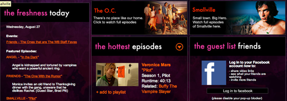
The site also allows users to modify selected portions from a number of shows using an embedded version of Adobe Premiere Express. While I could see some avid fans having some fun with this, the editor is clunky and not very intuitive. Still, many sites are hesitant to let viewers create embeddable clips, much less modify them. As for content, at launch TheWB.com includes seasons from Friends, The OC, Veronica Mars, One Tree Hill, Gilmore Girls, Buffy the Vampire Slayer, Angel, Smallville, and a number of other shows, both from The WB and other TV networks. The site will also introduce a number of made-for-web TV series.
While TheWB fares well in terms of features when compared to its competitors, its content still falls well behind the multi-network selection offered by Hulu. That said, it’s always nice to see more (legal) free television on the web, and the advanced search alone could help set TheWB apart from the sites offered by each individual network.


Finally, legal digital episodes of Smallville!
Seriously! I heart Smallville
layout is about as personal and unique as a number 2 pencil. hopefully not paying anyone for this. the old was better. too much wht. looks like one of my geriatric sites. welcome to the family.
Like ClownCo, “theWC” is US only. I guess they just want those other 5.700.000.000 people to hang on to youtube & TPB.
Aside from the content, Facebook integration seems like a top feature!
I think it’s safe to say Hulu was Arrington’s biggest mistake of the year. Hulu is great, and I don’t think that it is safe to call this a competitor
stay tiny, stay fresh.
somebody appears to have rolled out a new wordpress theme….
This new CSS is nice.
agreed. way cleaner and faster loading
Gazillion x better = new theme.
I’d like to see the full articles back on the front page, but otherwise I like the new layout…
Agreed about seeing full articles on the frontpage. Greatly disliking the “Read Post” links. Other than that it’s a good change.
I love this theme, How much did it cost you Mike ?
Wow, great new layout! I like it a lot.
wow the site design looks ugly
Nice Project I think, It’s very informative, Thanks
TechCrunch redesign!
Sorry to spam this post with comments on the redesign, but it’s very refreshing. I was getting really sick of the old look and especially the tiny font.
This new layout sucks. You are trying to cram way too much stuff in the right column.
Try this. It makes TechCrunch a lot easier to read, and more pleasant.
https://addons....efox/addon/1865
Mhmm. This layout sucks.
Actually it was made so that they can add more advertisement too, therefor generating more money.
More Pageviews = The more they earn through FederatedMedia
Too much white…
you didn’t just deployed this redesign. or did you.
congrat on the many to come additional pageviews and revenue.
too bad it sucks for your users
I see a slap in my face as a reader. Bye bye, Michael.
Wah.
Looking forward to the new site, and checking out the new video search.
I really like the new TC design!!!
Check out search again tomorrow when the site launches…
Get an add in that leaderboard. Actually, just get rid of that leaderboard!
‘ad’
Please see more competitor…
http://www.city...s.asp?dq=Cities
Oh wow! Maybe I’m late on this, but TC finally got a new theme. I say finally, because I think of this as the equivalent of Arrington’s CEO (mom) telling him to clean up his room and pick up that stinking pile of rotting start-ups in the corner. And change the water in the dead pool. Good god, it stinks… and new startups are growing in it.
Yay! He finally did it. It even smells better in here now.
Mike, you should move the leaderboard ad (728×90 ad directly under the green line) from there to be under the search box and to the right of the TechCrunch logo.
The grey bar the currently only has “previous post” in it should then be made 100% the width of the whole header and the links “About”, “Advertise”, etc should be floated right in this bar.
By doing this, it would move the entire page up 90 to 100px and would likely show the first two 125×125 ads that are in the right column.
You could also just get rid of the 728×90 ad up top period. I doubt the clicks are worth keeping it. Oh, and the design looks pretty sweet with it gone and the grey search bar right up against the thin green line.
Either way, I like the new design.
wow full episodes of Friends. Hulu only has clips.
Mike, you should change the logo to red and blue, go with a 2 column page layout, re-design the logo and move your advertising to the top of the page. Also translate the site into Mandarin, rebuild the site in Flash and get rid of pagination – just have all articles on one huge scrollable page thingy.
Either way, I like the new design too.
I really like this new layout, it’s much, much faster than the previous one. I find it interesting that you have moved the Feedburner icon to the bottom of the page… trying to remove attention from that? (BTW the text bg for ‘By Feedburner’ is black now.. may want to make it white)
Anyways, the design is fresh to death and me likey.
Like the new layout. It is clean.
I don’t like the layout. There is too much going on
time for a open marketplace single domain internet tv guide.
The new layout is just fine. In fact, I think it looks great. TC readers are so picky, and love to hate on anything they can hate on.
Please go back to having the full post on the home page. I know that you get better stats on reads per post this way but I for one may switch to using other means to get my tech news. Too many clicks for me…
reminds me of Gawker sites, but anyway………………
Ever hear of RSS?
Yeah – except that feeds seem to be down at the moment. Commenting is a pain in the **** via feeds, among other usability issues of that medium.
While this layout is definitely cleaner and a notch up from the previous one, I hate how much whitespace there is. One of the things I liked about TechCrunch’s previous design was how much I could see/glance over without scrolling as much or having to click ‘Read More’ for each post I was interested in. Also, it seems like the general meat of the front page has been pushed down 400px or so to make way for that banner.
read at a glance is what this lurker liked as well.
This is pretty sweet. I can’t wait to watch Buffy the Vampire until my eyeballs fall out…. look at this amazing thing I found … http://www.goth...te.blogspot.com
Mmmmm… new ‘blog’ layouts remind me more and more of portals… AOL anyone? oh I forgot that’s not cool anymore
content div is too narrow, too much space given to the right sidebar.
I like the old ¨design¨ but i think i can get used to the new one if you move the Active/Recent and CrunchBase panels to the right. under the ads. the tiny posts looks like cuil results.
you like it or not, but as per me this new look is not good. i like the earlier one.
how about having a poll
tinycrunch looks way better. Less ads, less fat, and easy to read. Its the ’same great crunch with less fat’, literally. Check it out and compare.
its about time for a tech crunch newswire. Thanks tinycrunch. Are u going to launching any new blog coverage soon?
@ Peter. We will be launching two new verticals to the tech blog newswire this week. I can’t disclose which blogs will be getting coverage but they will be great. Tinycrunch has grown at 100% each day this week. Keep reading.
Imagine if this technology was applied to other forms of spoken audio. News broadcasts, college lectures, etc. In a world where Google wants to organize the world’s information, why wouldn’t they want to organize spoken information?
I don’t give a flying F about the new TechCrunch Theme. Please move these comments off this post.
So back to your article: How about someone over there at TC put together something about all these folks moving back toward delivering content. Seems like studios are warming up to digital delivery where they have previously resisted.
Then there’s the Joss Whedon, Ashton Kutcher/Katalyst mumbo jumbo too. When did delivering original content become attractive again?
CG
You can find The WB, Hulu and lots of other internet television and movie sites at Zipityzap
Opening the site from Europe, we get the following welcome message: “It looks like you’re trying to visit theWB.com from outside the United States. Unfortunately, due to complicated domestic and international entertainment law, our website is restricted to viewers within the US. But please write to your local government representative if you want to fight this injustice, so hopefully one day, fans like you from all over the world can enjoy theWB.”
The restriction itself is not a surprise, of course.
However that WB makes foreign governments responsible for this restriction (”injustice”), rather admitting that WB’s own licensing policies in international markets are the problem, shows quite a bit of chutzpah.
It’s interesting that TheWB.com is trying to add in more interactive elements, but for most people the only real interactivity they want with online video is the ability to chat with other fans online, and post comments. Lycos Cinema for example is especially popular with teen audiences who use Lycos’ online video player for ABC Family shows including ‘Secret Life of the American Teenager,’ because they can chat live with friends and fellow fans while watching the show online together.
I don’t like the wc layout, too much noise and in your face stuff. Hulu kept it simple and that why its the best. I hear Joost is working on a new browser based rollout so I’m looking forward to see how that goes.
Wah…no KidsWB programming…it’s not the WB without the KidsWB shows…won’t be interested in TheWB.com til I can watch Men In Black The Series and Animaniacs and Freakazoid…stuff I can’t get anywhere else. Stupid WB for launching without these shows.
They really need to run their audio through a normalizer. The commercials all seem to be about 50% louder than the show itself, at least for Angel.