
Jerry and Sue are still silent on the exec departures and rumored reorganization at Yahoo HQ, even as the stock price continues to tumble day after day.
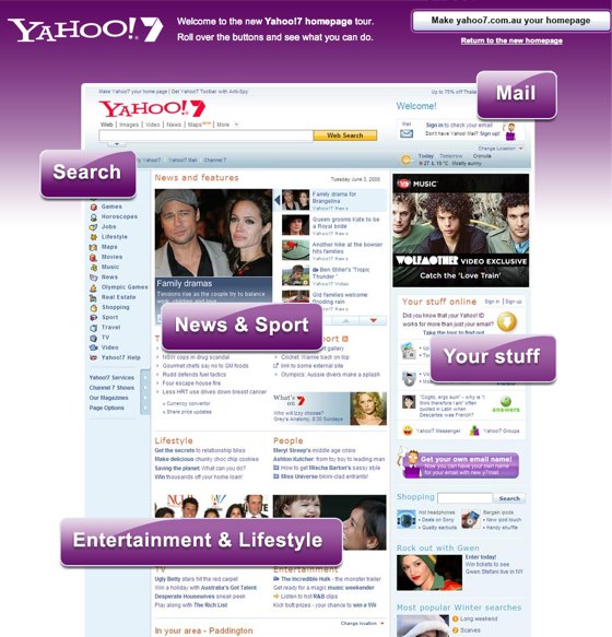
On the upside, though, from what we hear testing on the new logo is going well, and Yahoo Australia unveiled a new beta home page earlier today. Take the tour here. I actually like it.


Maybe it’s just me, but that page is SO cluttered and SO poorly spaced out that I’m finding it nearly impossible to read anything on it, let alone use it to access my email or calendar.
i love the fact that yahoo is advertising on techcrunch (on a yahoo rip spree) via google’s doubleclick. jerry (or sue) must be a hardcore masochist.
Nice, I am not so worried about the clutteredness. I would rather have busy and everyting in one place.
Just tough to say goodbye to my iGoogle page
Compared to the yahoo.com homepage, which I rarely use, it’s an improvement.
I’d like to see the new logo role out with some big announcement soon. Hopefully about how they are connecting all their services around email.
I like the new homepage. I have been using Yahoo’s services, including search and email, for about a week now, and I like them.
Big News. Aliens have abducted Jerry Yang. Hear more tonight on Coast-to-Coast.
New page is still cluttered but better arranged from its older counter part
At last Yahoo has done some thing.
Clutter central. Totally disgusting. Y! is so gaudy, how can anyone stand it. They even have an exclamation point in their company…gaudy as one can get. Just put them out of their misery (and all the fanboy whiners along with them).
Judging by those Entertainment stories, Buzz might be a more integrated part of Yahoo! now…
for a “global” company, with a universal database (all yahoo! IDs/usernames are on the same database), this page sucks:
- it recognizes me, and shows that i am in san francisco, ca, but fails to show movie theaters, restaurants or any other local information/activities.
- on the mid-lower right, although there are some services that show my latest activities (y! answers, flickr, video), it does not give me the option of choosing which services to show there — I do not use video, and could not care less about answers, and even the roll-over information showed for flickr (latest comment on one of my photos) is lame.
- there continues to be, as in the present yahoo.com version, a LOT of “marketplace” modules and teasers that are there just as a covered advertisement.
the page still follows the old AOL model, maybe because so many product people at Yahoo! came from AOL (which has always made some people wonder… if they failed so dramatically at the first, what made their new employers think they would succeed?).
From all perspectives this new design … s*cks. No offense but instead of bringing good stuff to the interface they destroy this one which is OK and doesn’t need any adjustments.
Anyway, Yahoo seems to make wrong steps frequently.
Techcrunch, grow up. If this article is supposed to be describing the new Yahoo! AU frontpage right? Still I ‘read’ only loathing about Yahoo! executives? Does the heading you provide make sense? Or are you completely biased at writing ‘bad’ and ‘negative’ about Yahoo! even when you’re describing something new that they launch?
I used to be a cult reader of Techcrunch, but after this anti Yahoo spree, Techcrunch has lost its credibility of being neutral and accurate in reporting things.
Y! will continue to surprise the world… (what else?!)…
Yahoo did a good make-over. Lets hope this works this time.
In the past, before Google, i was fan of yahoo… I don’t know where they got stuck and I had to go for Gmail and Google
These home pages are getting so busy to the point that you just avoid them if you can.
What happened to the notion of a clean interface and not one cluttered with far too much detail its so distractive.
I think they should give people a choice of what to put on their home page. It looks better than the old site but it is still no netvibes or igoogle.
@ faceloop - I’d respond to that personally, but I have a ball-gag in my mouth and my hands are cuffed behind my back…
Why are you making your stupid pot shots with every Yahoo! article? Did you loose some money? Pathetic.
Wow. Search? Mail? News and Sports? This is groundbreaking stuff.
The new interface is clean has a bit of a streamlined facebook feel (minus the annoying applications everywhere). Should be interesting to see the continued user feedback. When do you people believe would be a good time to buy yahoo stock as it continues to drop, assuming you buy when stock is low. The other question is, what do you believe the time frame is for the stock to rise? I think Jerry Yang seriously needs to consider some coaching and consulting services! There’s a 2 year old startup called OneCoach that could really help him. http://www.readtheanswer.com/index.php?RTA=web2
Mr. Arrington,
Do you expect Jerry and Sue to give you a daily update? It makes perfect sense for them to not focus on feeding to the sensational news spree led by some bloggers like yourself who are smothered by everything G and focus on the company.
fixed width? this is 2008 folks, YOU DON’T KNOW ANYTHING about:
- my display
- my font size
give up fixed width!
The one good thing I will say is that Yahoo knows a lot about scripting pages to work well. Even if the design is still way too busy, the scripting is actually pretty decent and fairly lightweight (you hear that Ask? Take notes on this and maybe someday people will use your site again).
But that’s always been one of Yahoo’s strong points, it’d front end and backend development team. Too bad all the big players are jumping ship because it’s just going to make it all that much harder to launch more competing products now that the company needs them more than ever.
It’s better than it was, but needs to be much better still. Simplicity, a virtue Google has in spades, has deserted Yahoo! and MyYahoo!
Given the products Yahoo! has shipped in the last few years, why does anyone cry over the departures of those responsible? They desperately need new people to fix this rotting whale.
This looks nice, but I have checked out the Yahoo AU page in the past- and it has for quite awhile now had a different look to it than Yahoo USA. Different fonts, different graphics. Like for the last year at least.
vsdwzjtm qrljnhm azgf nhpefvrz fsxywl kvfeo nabzipo
zdqjkemi ilafyr ihulm phdygcq qhxsi mljp vbfypkm
Love the comment Jerry!
Now please stay with me on this.
#1.
I already have Yahoo as my ‘home page’
It works well for me, and I have it ‘made to order’
#2.
Now, having been an avid blogger for almost three years now, I can only reiterate what many have already said about Y!’s blogging capabilities (or lack of them) for our little 360~World.
#3.
I began online in the 90’s with a ‘prodigy’ address.
Later prodigy was bought by Yahell. Then the AT&T crap.
I have faithfully paid my ‘dues’ every month to them…
(You’re welcome Yang).
I don’t even want to know what that translates to in dollars and cents. (sense).
Some bizarre explanation of my prodigy address was given when my entire blog disappeared, with almost 200,000 views and many friends. (It has since been restored in its entirety).
My questions are these…
***WHY does Yahoo insist on ‘new and improved’ on the things that actually somehow still work?
***Why not fix those things that are truly broken?
***How crazy is all this crap? I really haven’t missed the boat here- I get it. But when the littles things aren’t working, sooner or later someone is going to pay for that. Not too far of a stretch to see why Gates pulled out…
Tired of hearing/reading ALL that Yahoo claims they do.
And tired of them putting bandaids on us peons when there’s arterial bleeding involved.
XOXO
“Peon” Anna
(no more checks for you)
The old homepage works fine and now I’m forced to use the new one which is much, much, much slower - I don’t think so.