Redesign A First Step In Bringing Order To The MySpace Chaos
by Michael Arrington on June 12, 2008

Los Angeles based social network MySpace, which has 115 million monthly visitors worldwide (Comscore, April 2008), will be launching a redesign of its site next week. The first phase of the project, internally called “MySpace 2.0,” will launch on Wednesday June 18.

The changes affect five major areas of the service: homepage, navigation, profile editor, search and the MySpaceTV Flash player.

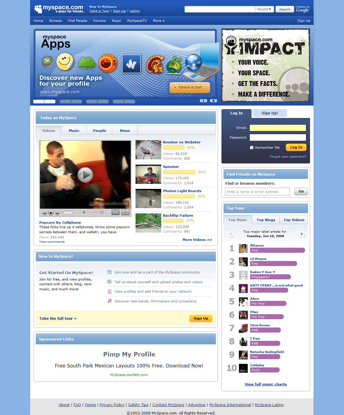
The screenshots above show some of the changes. The homepage will be significantly less cluttered, with the barrage of navigation links across the top whittled down to just five key links (home, mail, profile, music and myspaceTV). Other less used navigation functions will be available under a drop down menu. The 28 additional navigation links currently on the top half of the page will also be moved to the drop down menu.

Search is also being redone with a tabbed results page, reducing the need to search multiple times for different kinds of results. People search results are also being ranked, with friends first, then results for people you’ve worked or gone to school with, and then the remaining results. This makes a search for “Jeff,” for example, return meaningful results v. the mess you get today. MySpace’s new search technology is based on the open source Lucene project.

The other interesting area of the redesign is the Flash MySpaceTV player. MySpace says they will now offer 480p video when available. New features include a true full-screen mode and easier controls.

MySpace worked with San Francisco-based consulting firm Adaptive Path on design and information architecture elements of the project.

MySpace cites Comscore statistics in saying that 25% of all Americans visit the site monthly. It is the most trafficked website in the U.S., and 12% of all online minutes are spent on the site. 300,000 new users sign up daily.

MySpace has recently started to reap the benefits of focusing on the tech/developer crowd, a strategy that began last year. Big media, and blogs, are noticing the new and improved MySpace.

Comments

Much needed for Myspace, in face since a long time ago!

Good for everybody! :-)


Those look…great, really. I like the direction they’re going, the filtering boxes are very intuitive, and the refinements in their site search definitely look like the right direction.

However, if I had the largest site in the US…wouldn’t I bucket test first? You know, do some sampling, etc…?

Or have they already done it & you guys didn’t cover the bucket test while it was in progress…?


Search definitely very much needed. Poop at the moment.


You know Facebook is about to kill MySpace when you can find the door guy at the local night club on there. Everybody’s switching to Facebook.

MySpace is a cluster fuck of perverts, losers, and rejects that don’t want to commit to the “social order” that Facebook has become.

Facebook has purpose and future.

Good luck MySpace.


Speaking of which, TechCrunch needs a redesign….

..yesterday.

I’m wondering why a blog with such revenues, who also happen to consult Pronet, and use MT’s dpv, does not get a redesign in ages.

Why?


still *butt* ugly


MySpace, hokey as it is, still has critical mass. Very brave to write it off at this point: they have ludicrously large established base.


Myspace is/and should be just for music… Facebook has dominated the “social graph”.


Sometimes you have to forget trying to convince village idiots (as seen in the comment thread in this post) and just keep working towards a better usability experience. I think this design makeover looks fantastic. Can’t wait to see what else is in store.


In my RSS reader I have this snippet leading the post:

“Los Angeles based MySpace, which is now tied with Facebook as the largest social network, will be redesigning its site next week. The first phase will launch on Wednesday June 18.”

I guess that’s not the case judging from the revision?


Still below Facebook’s design


I don’t care what the site looks like when it crashes every other click. Seems like the system is continuously struggling and fails operations constantly. MySpace is a complete failure from the scalability and IT perspective, and Facebook has been a home run.

 
silicon valley dropout - June 13th, 2008 at 6:26 am PDT

yet myspace still has more traffic


MySpace is number one.
Warning, fakebook astroturfers on the loose.


Oh so Myspace 2.0 = gradients and a drop down menu plus a little more organized.

They went from 1998 -> 2003

Myspace 4.0 might be worth a look.


dMix, and you say what in regards to facebook’s drop down menus + a little more organization?


@Don Wilson, theres face more to a good UI then the menu and a *little* organization.

Facebook is clean, consistent, and highly organized.

Lets just say myspace tooks its first step in that direction and is a few laps behind FB?


Its about time. Although their most recent redesign was significantly better than their original layout, its still way too cluttered. They have not found a visually pleasing and non obtrusive way to integrate their advertisements. Its like an eye sore. The key is to utilize tabs for organizational purposes. I expect we will see this also with the new facebook re-design. Check this out below…
http://www.readtheanswer.com/index.php?rta=blog


Ahhh. It looks so much better than before! =(
This won’t help me at all in convincing my friends to switch over to Facebook.


I personally like the chaos of MySpace, but for those that can’t take it… this is a good move.


we say to them: “welcome to the new century” :)


This is awesome! I’m really looking forward to MySpace “cleaning up” the site!


Ya! howdy,
I cain’t wait ta sink ma teeth into all that!!


Oh dear. “Facebook is clean, consistent, and highly organized.” Someone just doesn’t get Myspace here.

Myspace is all about NOT being “clean, consistent and highly organized”.


flawed. you got i. myspace ist about looking different. crap but different. another thing is: there are lots lots of people who are much more into shiny bling bling themes then beeing into some very nice designed sites like facebook is. if myspace is trying to follow facebook they will fail.


busy australia english no no


this sun speed boy australia head watch google no green me woman watch bag


I came across this blog the other day and you got some great info here - thanks.


student frog go sun england


Leave a Reply

Create a Gravatar for your comments.
« Back to text comment