Not Sure Whether To Rent Or Buy? Check the Heat Map.
by Erick Schonfeld on June 10, 2008

rentbuy-heatmap-ny-small.png

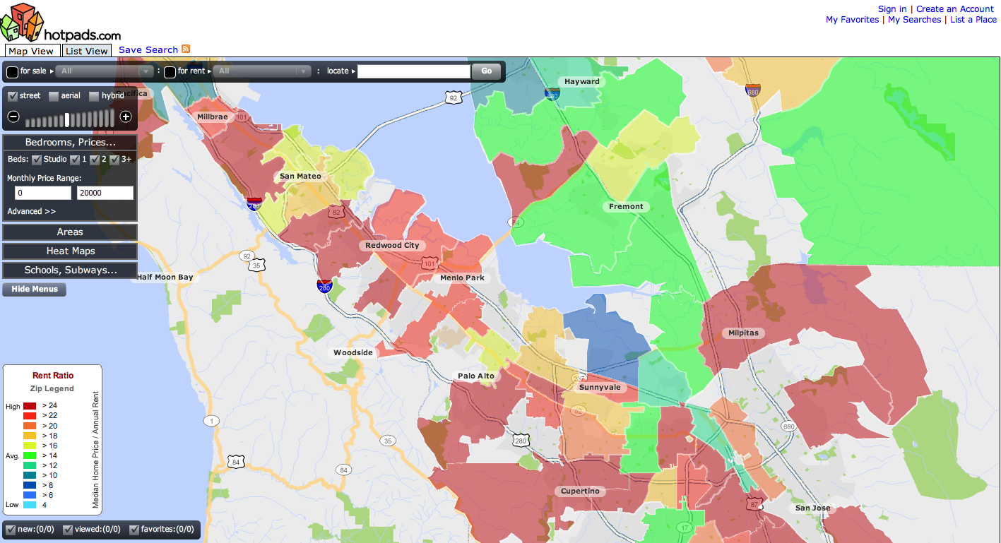
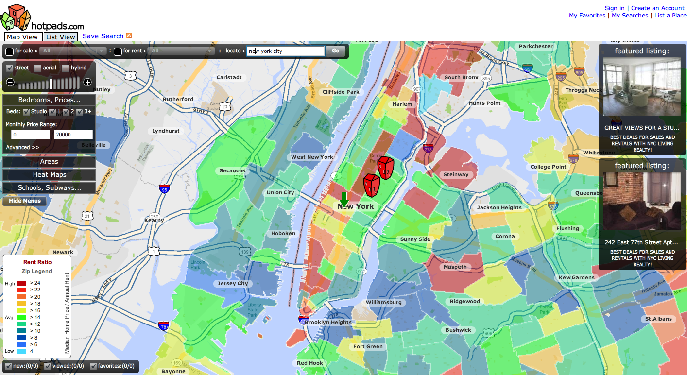
I can’t resist a good heat map, especially on real estate sites. HotPads, which brought us the foreclose heat map, now offers a handy rent ratio heat map. The rent ratio is a home’s sale price divided by the annual rent of a comparable home in the same neighborhood. Looking at the rent ratio gives you a quick sense of whether it makes more sense to rent or buy in a particular neighborhood. If the ratio is high (red on the map), it is usually a good indication that you are better off renting. If it is low (blue on the map), you are better off buying.

In the map above for New York City (click on the image to make it larger), it shows that people are better off renting in Tribeca and Soho and buying in the Lower East Side and parts of Brooklyn such as Brooklyn Heights and Williamsburg. For Silicon Valley, you are better off renting just about everywhere except part of Sunnyvale.

The Rent Ratio heat map is part of a soup-to-nuts redesign for HotPads that includes improved search.

rentbuyheatmap-sv-small.png

Comments

Great. Thanks for the information.


Now if they could just allow one to include/exclude an overlay for crime areas, etc. from (http://www.familywatchdog.us) or (chicagocrime.org), etc. That would really be cool.


I just tried it for a house my family is about to sell and it just kept zooming in and out obnoxiously and I wasn’t even doing anything. It was basically unusable. Is it not working right in Safari?


@Jesse

Same thing happened to me in Safari 3.1.1 on OS X. Clicking around on the map while it was zooming stopped the zooming, but there weren’t any heat map overlays displayed.

Switched to Firefox 3.0 beta and it worked.


I like PolicyMap better for this kind of information. Lots off additional map overlay types, plus it doesn’t have a clunky and slow flex/flash ui.


Interesting. My wife and I are up deciding whether or not we want to headache of being 1st time buyers in this economy in the DC area. So technically I’m not procrastinating by reading this post.

The rent ratio map is telling me that rents are high vs. home prices, and I’m seeing the opposite in practice here. Still, this is an interesting tool to add to the quiver.


you can’t turn off the damn streets. what’s the basis?

and the checkboxes are actually radio buttons.

poor. interface. design.

but who cares about usability? as long as it looks cool.


Odd how much of the San Jose doesn’t have an overlay at all, particularly around 680, where foreclosures are at their highest and real estate prices have plummeted.


Very neat. I am assuming they are pulling data from Craig’s List. It would be helpful if there are filters built-in so user could easily sort listings by post time, etc. In NYC particularly, the rental listings go out of date very quickly, and I see too many listings on there that are probably long gone.


Its been said, but Step #1: Make this thing not go f-ing crazy with the zooming in Safari.


tons of trouble in Firefox, including w/IE viewer. needs QA!


the reason why Sunnyvale is blue is because the median home value in that area includes a disproportionate amount of mobile homes and little available rental stock.

Remove those units and you will find that it is BS.

That said, So. SJ is legitimate.


Yes but what does this have to do with twitter bashing?


This site is so buggy it should not even be in release mode


Cool graphic concept, though not currently very helpful for NY. Seems they are not including the maintenance fees, taxes and common charges in the purchase cost analysis. Not an insignificant amount in NYC…Also, very limited screening criteria (e.g., can’t screen for doorman, outdoor space, elevator, etc.). Probably not important factors outside the City, but in the city, critical.

The NY Times Real Estate section would really benefit from these mapping capapbilities. Streeteasy would be another great partner.


Define “better”. Rent would have to be pretty danged low before I consider renting. If you can sell a house for the same amount you bought it for, then rent is free. Right? In the end you’re paying property taxes, utilities and maintenance.

Ignore the present economy (where you may not be able to sell at your purchase price) for the moment, because this is not normal.


Thanks for the heads-up regarding the Safari issues. They should be fixed now.

Matt Corgan
Director of Technology for HotPads


so according to this if you live IN central park, you should rent.

credibility lost.


Looking at the rent ratio gives you a quick sense of whether it makes more sense to rent or buy in a particular neighborhood. If the ratio is high (red on the map), it is usually a good indication that you are better off renting. If it is low (blue on the map), you are better off buying.


Rob Mowery said…
Now if they could just allow one to include/exclude an overlay for crime areas, etc. That would really be cool.

One can use spatial data-mining and Kriging algorithms to achieve that.

I believe (I read it somewhere) that there are already commercial tools (or proprietary ones) that are already being made available to various law enforcement agencies around the world, but they’re not available for the general public yet via webistes such as Hotbed.

I came across the following abstract which briefly describes the use of spatial datamining is analyzing urban crime.

Exploratory Spatial Data Analysis Techniques for Examining Urban Crime

I am tended to develop something similar as a hobby using spatial & kriging , but the apps is to target the real-estate industry, so users who are buying and selling can estimate the prices in any area they wish to by from or want to sell.


Rob Mowery said…
Now if they could just allow one to include/exclude an overlay for crime areas, etc.That would really be cool.

One can use spatial data-mining and Kriging algorithms to achieve that.

I believe (I read it somewhere) that there are already commercial tools (or proprietary ones) that are already being made available to various law enforcement agencies around the world, but they’re not available for the general public yet via webistes such as Hotbed.

I wanted to develop something similar as a hobby using spatial & kriging , but the apps is to target the real-estate industry, so users who are buying and selling can estimate the prices in any area they wish to by from or want to sell.


Erick Schonfeld, please delete 2 of my messages above, as I kept pressing the Submit Comment and the Back buttons 3 times , when I saw my post disappeared.

Sorry, I didn’t realise that the messages while they disappeared went into the moderation queue.


Yahoo does something similar that people in the UK can use - http://uk.houseprices.yahoo.ne.....deMap.html


the statistic that they use to color the map (purchase price / rental price) may be correct based on the data they collected. The problem is the quality of the data and the conclusions you draw from that. It is so hard to do comparables in NYC b/c you can have a $5 million dollar apartment in the same building as a $500k one and because there are huge variations in costs for a given criteria.

Also, square footage is rarely reported in transactions in NYC and it is a huge factor in price. It’s not like suburbia where you can get a good idea of a homes worth based on lot size, number of bed rooms, square footage, and zip code (all of which are readily known). Also, skewing things are facts like that in the west village, virtually all the buildings are coops which typically don’t allow renters. This means that the places that are for rent usually are in either lesser buildings or are limited duration rentals for like 1 to 2 years. Both of these factors tend to a lower rent rate which makes the ratio used for the map more red.


I’m a renter in San Mateo, and my current rent is lower than rent in 2000. Here’s my post about it and the history of rent in San Mateo in the past 7 to 8 years:

http://baglady.dreamhosters.co.....s-my-rent/

I don’t understand why anyone would buy a 800k home here right now.


If one really wants to know whether to rent or buy, crime is another indicator of how a neighborhood is doing. SpotCrime.com is the largest crime map mash-up on the Internet. SpotCrime offers crime maps in over 120 cities across the United States, and a email and text message alert system for our users. The best part is: all of their services are totally free to the users. Know Your Neighborhood.


As far as I can see on any of those maps, you are NOT better off buying anywhere at all.


Hmmm, pretty suspect data, it shows the median rent in Los Gatos to be $1225, maybe you could get a room for $1225….


“In the end you’re paying property taxes, utilities and maintenance.”

And mortgage interest, which for most buyers represents far more than the principal (and only a third of which can be deducted from your taxes).

The only way that this works out is if you can afford to buy the house outright. In Silicon Valley that means having somewhere between $500k and $1m in your pocket.


i rent in soho… i don’t have the choice to buy.

$2,700 gets me a small, but nice, 1 bedroom in a walk up building. there is no such thing as a $2,700 mortgage payment for a place in soho. this tool, though nice looking, makes no sense for the manhattan market.


Leave a Reply

Create a Gravatar for your comments.
« Back to text comment