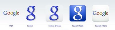
Recently people have been noticing that the Google favicon, the small icon in your browser’s address bar when you visit a Google site, has changed from the familiar upper-case G to a lower-case one. Google has not changed this design in over eight years, so the change caused speculation that more design changes might be afoot. Well, it turns out that the new Favicon is part of a new family of icons Google has designed for use in different situations, from its logo to the browser favicon to mobile applications. Marissa Mayer explains on the Google Blog:
The reason is that we wanted to develop a set of icons that would scale better to some new platforms like the iPhone and other mobile devices. So the new favicon is one of those, but we’ve also developed a group of logo-based icons that all hang together as a unified set.
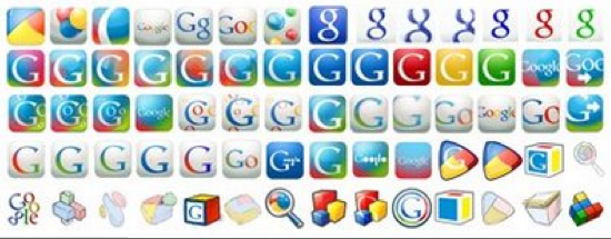
Above are some of the different candidates out of the hundreds that Google tried out. And below are the current five. I’m just glad Google didn’t go with the rainbow theme. It would have been way too unicorn. The favicon could still change and Google is looking for feedback as the design process keeps on evolving. Maybe it should try a crowdsourcing approach/contest to coming up with the new icon, and allow people to actually submit their own entries.