![]()
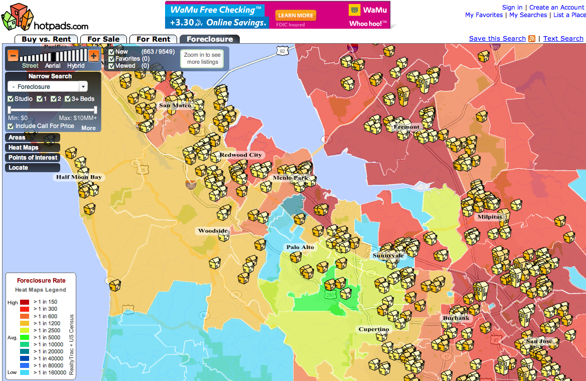
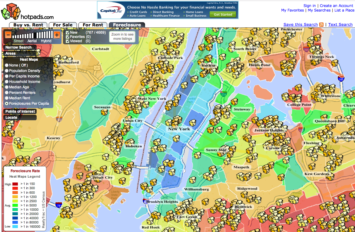
If you want to see in stark colors exactly how the mortgage credit crisis is spreading across the country, go to real estate search site HotPads and look at the foreclosure heat maps in your area. These are map mashups that take foreclosure data from RealtyTrac and overlay them on a color-coded map. Red indicates a high rate of property foreclosures per capita, and blue indicates a low level. Since foreclosures are now hitting record rates, there is a lot of red on these maps. In Silicon Valley, for instance, only a few pockets like Palo Alto and Sunnyvale remain in the blue. A view of New York City shows the foreclosures beginning to close in on Manhattan from the outer boroughs.
In addition to the 500,000 foreclosures you can find on HotPads, the site also lists 1.2 million homes for sale and 130,000 active rentals (which co-founder Douglas Pope claims is the second-largest rental listings after Craigslist). These are culled from real estate broker sites and submitted directly by property owners.