LinkedIn Revamps Design, Adds Status Updates
by Mark Hendrickson on February 27, 2008

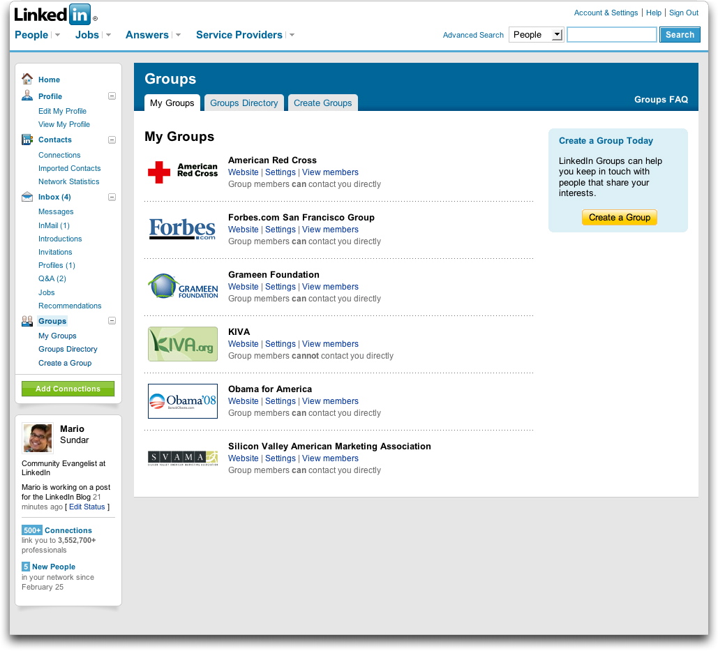
Thursday morning LinkedIn will roll out a new site-wide design featuring a tab-less header and a persistent left column with personal, account-related options.

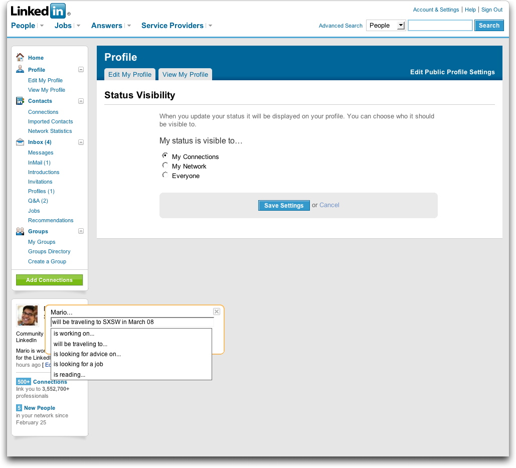
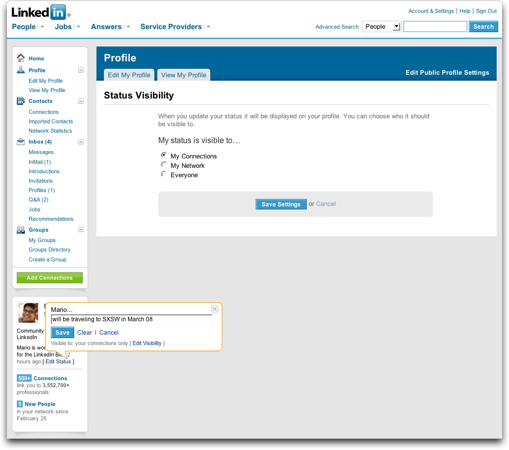
LinkedIn is also adding status updates with which users can broadcast their current activities (professional or otherwise) to their connections and/or networks.

Just as when the company added portraits, these updates feel like an attempt to mimic Facebook. The new design bestows upon LinkedIn a similar layout to Facebook’s, with the page divided into a header, a thin left column, and a wide right one. Facebook has also had featured status updates for quite some time.

There are differences, of course, between the two. LinkedIn has decided to place a box at the bottom of the left column that continually reminds you how many connections you have, how many people have recently joined your network, what your status is, and more. The homepage will also have modules that you’ll be able to drag around to reorder.

Advertisement

Comments rss icon

  • Not sure what to say about the new look. It just looks weird more like imeem

  • They are trying too hard. I am sorry..this is not working. For some reason, the focus of the site is all over the place.

    Bring back the old design and take the new site through a better focus group.

    Oh..another thing..You are not FACEBOOK!!!

  • Bill Gates left facebook for LinkedIn: www dot linkedin dot com/in/billgates

  • Yeah, this looks like crap. What did they do, hire away Google’s design team?

  • Thanks Rambo,

    I didn’t know it, but one of my acquaintances is actually one of Bill’s three LinkedIn connections.

    I never would have guessed that one phone call to him could possibly put me in touch with Bill Gates. An interesting thought (that I don’t think I will ever be following through on).

  • Joel, you’re more likely a phone call away from Bill’s personal assistant, but still it’s nice to know that the profile is legit:

    http://ap.googl...krup8QD8V341NG0

  • Nice to see it get a facelift …

    Linkedin is going places!

    Darin

  • Bad design – it looks like the new design for Orkut. It is not about innovation but c’mon – we are tired of rounded corners

  • People come to LinkedIn and Facebook for different reasons and it’s a risk for one to attempt to copy the other (in this case, LinkedIn attempting to be a little more like Facebook). It will be interesting to see how this plays out.

  • How can linkedin and Facebook not look alike? They share the same VCs – Founders Fund ;)

  • I like the new design and I’m no Facebook lover (I deleted everything and de-registered some months amidst the Beacon issue and a torrent of Zombie and BoozeMail invites). I find the new design a little more modern and easy on the eye, although I’m certainly not a power user of LinkedIn.

  • When digg meets facebook…

  • today morning when i signed in linkedin i noticed the change.looks much better.

  • The screenshots posted don’t realy do justice to the new redesign b/c of the lack of content (assuming linkedin didn’t want to reveal screenshots of the home page/profile page as to protect the profiled member’s info).

    I just logged into my account and viewed my new home page. Not bad.

  • “Just as when the company added portraits, these updates feel like an attempt to mimic Facebook.”

    As if facebook was the first social network to allow its members to post photos.

  • Meh…new UI’s are tough, everyone’s a critic. The fact is LinkedIn didn’t WORK right with the old design. You had to click three places just to see your new invites, etc. Hopefully this is more functional, Facebook / imeem / DIGG / Orkut comparisons aside.

  • It’s interesting. I hate Facebook but really like LinkedIn. Much to their dismay I do not view Linkedin as anything beyond their original purpose, no matter what they change.

  • Who cares about design when it comes to LinkedIn?

    All I know is it’s just a great tool for me to keep in touch with people I’ve worked with or met professionally over the years.

    They can make it purple and green for all I like and it’d still be a great tool.

  • Nice, but not enough.

    I’d really like to be able to share content from this platform, such as: recommendations, basic information about myself, resume etc., with friends on other networks.

  • the thing that REALLY bugs me, is the stupid beta on your LI home page that posts news from old employers. no way to turn it off. no way to set it up or configure same either. been emailing support for an answer on how i can get rid of same, and their customer service just don’t care. wish seth godin ran the company, that way i’d get an answer on what to do. oh, i also then tried to delete an old employer to see if that would take off that stupid news header – nope. looks like they don’t update their dbase either….sigh…makes me wonder why i bother!!!!

  • TechFaceCrunchBook - February 28th, 2008 at 6:23 am PST

    Don’t know if others are experiencing this but my news feed on LinkedIn has turned into a ghost town. I have only 1 action in the last WEEK! 3 actions in the last MONTH. And I have about 70 connections too. Is LinkedIn traffic dying off?

  • @ Jim Rudnick – Yes, that news feed really bothers me too. First of all its news about an employer that I don’t work for anymore. Not that I have anything against my old employer but I don’t really care about their news anymore. I’ve even tried to contact LinkedIn to ask if it could be taken off and they couldn’t help. First fix this flaw, then worry about your design flaws (which I think there are a lot of on LinkedIn). I think the site has a lot of potential (and I know it’s been around for a while and has lots of users) but I think there are many things that could be improved. It seems like communication is at a minimum on that site, which is ironic because it’s suppose to help people network. I understand there should be some restrictions because people would start spamming, but then need to rethink some of their processes.

  • I like the new design, but I don’t think I prefer it over the old one either. Seems to load a little faster than the old design, which is a plus.

    I don’t think it looks like Facebook either. It is much cleaner than their site.

  • @ Jim Rudnick & @ airj1012 – Agree with both of you. The news feed (on old and new home page designs) was not implemented thoughtfully. At a minimum during their beta, they should have (and I’ve posted as much):

    1. Ability to hide/turn off the News module during the beta

    2. Allow us to move it lower in priority on the home page. (they have some of this functionality on the new beta home page — but not for News)

    3. Allow us to reorder the list (the most recent companies are the ones I’d be most interested in)

    It would have been nice to have *some* control over how that module behaved during the beta.

  • Yea, I saw this design a few weeks ago from a guy I work with. He sent out an email to everyone about the UI change but no one else got the new design…it turned out that he was chosen to get the new UI as a tester…when I saw it my stomach turned…They had some basic flow problems with the old one, but I think they would have been better off to fix the current issues versus throwing everything to the wind and going with this “facebook” style…now everyone has learn a new UI…not good….

  • Interesting to see what will happen with the new design and features. Could be promising for LinkedIn, and will hopefully get more people to actively engage in the site.

  • The site now has a cleaner look and I commend LinkedIn for the effort. I do agree, however, with the previous comment about the redundancy of the rounded corners.

  • If it is not broken…….. I personally feel the old tabs are better.

  • I have no issues with the cosmetic changes. People always complain when any website changes their interface, it’s almost an instinctive reaction.

    As for changes, LinkedIn is about to foray into the expert services market again (like Gerson Lehrman Group.) I wonder if their user base is going to be asked to sign on to this service or if we will just start getting emails regarding relevant consults?

  • I agree with some comments above … I really do not like the new look. It is a little confusing.

  • It’s amazing that a site with such crappy design and user experience is growing as fast as claimed. The concept of Linkedin is sound but the execution…

  • Personally, I love the new site design.

  • The old design was very nice, sometimes i don’t understand why those web 2.0 companies have to show that they are doing something all the time and change their design now and then…

  • strange for the first sight, but after 10 min you get used to it, and now I like it

  • I like that they are changing things around to see what works. Although I miss the simple look and feel.

  • All I’ve seen over the past 5 years from this company is:

    1) Website Redesign that resembles a blog template
    2) Photo Upload feature (amazing it took so long)
    3) Answers Section – glorified version of 1990’s Forums
    4) Status Update – idea taken from Facebook
    5) Ineffective Mobile App (you can’t connect with new people, you can’t edit your profile…. and ironically, you can’t even “call” your existing contacts!).

    There’s a real opportunity for another business network to come along and pass these guys up.

  • David in comment 36 seems enthusiastic ( joking). Although I agree with him that there is room for competition, the improvements go far and will help the site become more popular.

  • Лучший сайт о забавных вещах Мнго всего полезного этот в и чтиво для проведения свободного времени. На нашем портале Вы найдете множество различной халявы, В.
    Мы учли все Ваши пожелания, только у нас регулярные пополнения базы, присоединяйся к нашим посетителям.

  • I think that could be useful to let users decide to switch from the old and new interface clicking a button. Plaxo did …

Leave Comment

Commenting Options

Enter your personal information to the left, or sign in with your Facebook account by clicking the button below.

Alternatively, you can create an avatar that will appear whenever you leave a comment on a Gravatar-enabled blog.

Trackback URL
bugbugbug