I met up with Robert Scoble last night at an Orange party in San Francisco (my photos from the party are here). He brought along his Amazon Kindle and let me and others test it out. It was the first time I’d held one – the Kindle I bought hasn’t arrived yet and my co-editor Erick covered the New York launch.
Anyway, he took video of me giving my opinion of the Kindle (thumbs down). The problem is the UI is completely non-intuitive and the screen is unreadable in medium light (it was much brighter in the room than the video suggests and it was easily bright enough to read a normal book). I was trying to simply pull up the browser and go to a web page and I couldn’t figure it out. The scroll wheel on the side is obviously designed only to frustrate users. And without any sort of mouse, I kept touching the screen to try to get it to do what I wanted (which of course doesn’t work). I also compare it in the video unfavorably to the etch-a-sketch.
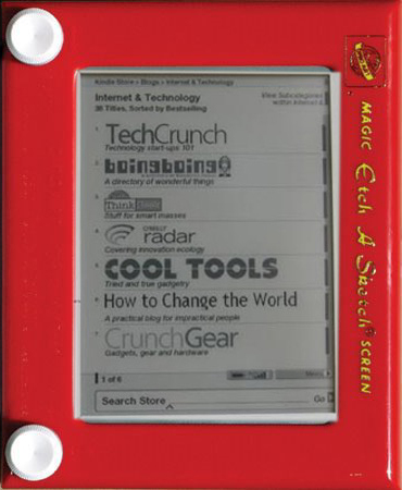
I asked Robert to pull up a web browser and load TechCrunch. He did it once and it took so long I asked him if I could video it. He agreed, and did it again. It took him 55 seconds to pull up the browser and enter the TechCrunch URL. I then pulled out my iPhone and did the same thing in 14 seconds.
The Kindle can be given some slack since web browsing isn’t its core function. But web browsing on the iPhone isn’t the key feature of that device, either. Amazon just didn’t design a good device (the user interface, keyboard and screen are all very flawed), and they had all the time in the world to get it right. Hopefully v.2 will be an improvement.
Of course this is just my opinion after trying it out for a few minutes, and I’d had a couple of beers. Don MacAskill wrote up his own review after a day with the device and says its wonderful.