September 13, 2007

MySpace Getting A Little Less Chaotic?

Michael Arrington

41 comments »

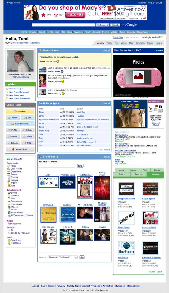
Interesting blog post by MySpace co-founder and president Tom Anderson this morning. He’s proposing a new default layout for MySpace pages that has significantly better organization of user information, and moves from a two column to three column approach.

So we’ve been working on a new home page design here. Thinking of launching this in a few weeks, but I wanted to see what people thought about. Take a look and tell me what you think

The page certainly has more of a Facebook look and feel than the existing default theme, with clearly delineated content areas and modules, and a new horizontal navigation bar across the top.

Unlike Facebook, MySpace allows users to customize the CSS of their profiles. If you really don’t want to leave MySpace but love the clean lines of Facebook, there are templates to customize MySpace to look just like Facebook.

  • Sphere It

Trackbacks/Pings (Trackback URL)

  1. MySpace Getting A Little Less Chaotic?  »TechAddress
  2. share.websitemagazine.com
  3. Profy.Com
  4. Justin Tadlock » Facebook-Mimic Theme Gets More Attention
  5. Make Your MySpace Profile Look Like Facebook 2: An updated, revamped, and revitalized Facebook theme for MySpace
  6. Facebook Gets More Orderly: Multi-Tab For Profiles | DistrictSource.com
  7. Facebook reorganizes profile pages | 325i.org

Comments

RSS feed for comments on this post.

  1. barefootmeg

    “significantly better organization of user information”

    this has been, imo, the biggest pitfall of myspace. i don’t care how many teeny-boppers use the site. i can ignore them. but i can’t ignore the fact that the usability of the site is hindered by it’s cluttered design. (and the ads flashing about in the middle of the content areas drives me nutty as well.)

  2. Ed

    First thing going out in mine is the bulletin space thing

  3. Calvin

    reminds me of ICQ website 8 years ago.

  4. Mikew

    Yes - the ICQ web site was a serious disaster, and, like myspace, achieved so much success that people couldn’t help but continue to use it despite its [lack of] usability.
    http://web.archive.org/web/200.....b.icq.com/

  5. myspace

    i can not tolerate myspace, well, its more the myspace users that i can not tolerate, most pages are out of wack, i cant tell what is what someitmes.
    i have 1.5mb download speed and sometimes it takes minutes to download just one page, not to mention that my browser gets confused at some of the content on some of these pages. god knows how many times my browser crashed on myspace.

  6. BeingParents

    Facebook is the second most visited social network and that is a good enough threat for Myspace to improve their interface. To stay in the games we must seek continuous improvement. Users love simple interfaces.

  7. Don Wilson

    Blind negative opinions and comments about MySpace in 3, 2, 1……

  8. Arnie

    Judging by the 150+ comments on the blog it seems that the majority of MySpace users seem to like the new design.

  9. Ryan Merket

    Wow, it only took them 10 years to learn information heiarchy, not let’s see how long it takes them to learn contrast.

    Note to Myspace: HIRE A DESIGN FIRM.

  10. Phillip Nguyen

    I saw Tom’s blog and love the new home page design. They launched new mail pages recently and last night I saw new photo pages briefly. I’ve enjoyed MySpace for 3 years and appreciate the new design.

  11. Danny

    This is a new default HOMEPAGE, not a new default PROFILE page as you suggest. The homepage is the page you get after you log-in, so this is not the default public facing profile page (that does need lots of work too).

  12. coda

    Too little, too late.

  13. Word Hugger

    Agreed with 12.

  14. Matt

    Still looks quite messy to me.

  15. Music Man

    Somebody inside MySpace really needs to tailor specific designs for the creative communities - bands, musicians, artists, etc. This one size fits all approach blows, especially for bands.

    Good reporting once again, FacebookCrunch.

  16. Matt

    just like facebook? uh, not quite. ;)

    somehow even when someone tries to make ugly-old-myspace look like almost-sexy-facebook, it still looks like garbage! lol (although some other links through that one sport nicer myspace pages than the facebook pile.)

    also, way to throw “FaceBook” into a post about something that was surely loosed to bring about some attention for MySpace… (I would expect nothing less form Arrington himself, lol) ;)

  17. Tokyotronic

    Any change will be an improvement. This is long overdue.

  18. Andrew

    Mike, what do you use to take screen shots? Yours always look good.

  19. Marcos

    150,000,000 profiles using the old layout - now that’s what I call a legacy issue!

  20. bob cobb

    no API no care

  21. Kanute

    Well i think it’s just time they give it a real face lift.

  22. Sam Donaldson

    you seriously think they’re not working on their api platform??? of course they are.

  23. steve ballmer

    Jjust wait until you see MSNspace! WOW!

    http://fakesteveballmer.blogspot.com

  24. pwb

    Hate to tell everyone, but MySpace is successful *because* of its (supposedly) crappy design, not in spite of it. The mass actually *likes* chaos.

  25. Yelp Sucks

    sorry guys, facebook is a freakin organization mess. I can’t find a thing on it and the font is so freakin small you can’t read a thing.

    MySpace is much more user friendly and easier to use than facebook.

  26. Joe

    As Danny said, this is the HOME page, not the PROFILE page, and for better or worse, the existing HOME page had been very successful. So.. it didn’t look pretty. That being said, it was usable and unique.

    What’s material here IMO is the prominence of status (a relatively new feature for MySpace and a major “app/activity” on Facebook) and the introduction of freestanding compose (akin to Facebook). Furthermore, they are enhancing the viewing of newly added content and sections (books, videos, ringtones, etc)

  27. David Mackey

    The cleaner organization is a great move for MySpace, and something I’ve actually been noticing. Now if they clean up their ads they might be getting somewhere.

  28. Rob

    The article is cool but you guys are supposed to be up on all this tech stuff yet you still don’t know……

    Tom Anderson is NOT the co-founder or President of Myspace. He is a publicity figure thats it. Myspace is owned and run by NewsCorp. and was started by one of the internet’s oldest spam companies…not Tom Anderson.

  29. Mike Dragan

    Well - it certainly has some delimited focus points and some clear interaction areas but c’mon - it still looks like hell.

    Probably having such a huge userbase they can’t change too much or they’ll be having users running away.

  30. Zane

    @Rob: Actually, Tom Anderson is both president and co-founder of MySpace. Also, pigs do not fly.

    MySpace not ugly? Say it ain’t so.

  31. Chipshop

    I agree with 25.
    Just try adding and viewing photos :o

  32. Omadsense

    give me a break - myspace is trying to look like facebook and if you notice the layout helps them bring the ads that are at the bottom [ rarely noticed ] up to the top of the page.
    if they want to do something for it’s users stop being a pain in the a**. They block videos players that are not google and youtube - my newsfeed video does not lead visitors away from myspace it keeps them comming to my myspace page..

    example: http://presidential-election-news.blogspot.com/

    they should think of the user and not themselves for a change…..

  33. Water Subject

    will the old custom layouts, themes or whatever they call it work with new design?

  34. digitalTRAFFIC

    cool news - time it had a base facelift - although the customisation feature was good on myspace - the facebook page does look abit messy - especially when you add the extra modules like the music ones - hope they add more tracks to the music player on myspace too. agree with above - tends to be users posting huge images in comments that distort the pages - I delete these of course…anyhoo - where else can i promote my music….. :-)