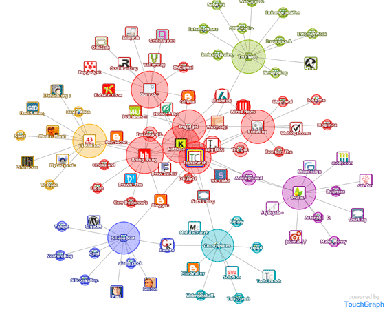
The TouchGraph Google Browser shows connectivity between websites in a visual fashion.
The service pulls in data from Google’s database of related sites, delivering an interactive visual map of interconnected websites or search terms.
TouchGraph also offers Amazon and Facebook browsers as well as providing the visualization technology to companies on a per job basis.
Whilst its immediate overall usefulness may not be that obvious, applied to corporate data it could have more use than just delivering eye candy.
(via Servant of Chaos)


Almost completely useless.
The idea is good – but everything hinges on the validity of Google’s RELATED websites SERPs.
There seems to be much left to be desired with their algos…..as of now, it appears to center around backlinks or mutual backlinks. Does anyone find the RELATED operator useful?
I like it, but how an it help me?
Wow, a whole new way to find porn.
I think it is really cool, but I do not see an actual need for it, other than to dink around with it for fun
Duncan, as you may have noticed, Quintura pulls out favicons from websites and displays them in an interactive tag cloud. For example, see Quintura tag cloud for search query ‘TechCrunch’ http://www.quin...=1&savelink
Maybe something to while up time when there is nothing else to do. But I still it looks really cool.
not so usefull
rc
trading tennis
This is kinda cool, “a picture is worth a thousand words” I guess it can help in some ways…..
How about corporate intelligence? Who’s linked to what could give you some companies to follow up on.
OK, so at first I thought “this looks awesome!”, but when I tried it out…ugh. It uses Java, and it’s extremely slow – Also very ugly. Brilliant idea, terrible implementation. It should be AJAX instead.
I have seen this guy on facebook as well so this is nothing new. Duncan, seriously, you should start posting some “good” stuff. First, you screw up with that Alexa post and now this.
let me try to give you a glimpse into my brain. perhaps that will help you understand why i am mad here:
a) this is techcrunch. news about startups and cool products they launch. but you continue to talk about all bs that gets manufactured out there.
this brings me to my second point
b) do some homework. Don’t just dump the PUKE the S**T you see out there on this blog, without a proper analysis as to why you are dumping it on us. Seriously dude, what kind of statement is this, “Whilst its immediate overall usefulness may not be that obvious, applied to corporate data it could have more use than just delivering eye candy”
Although 90% of your readers would understand my interpretation of that last statement, since they are smarter than you i.e. they have more than half a monkey’s brain (that is, YOU!), let me try saying it for you.
Duncan: “I really have no idea what this site could be good for, but I am going to dump it on you so you can figure it out and educate me. And oh, btw, I am getting paid to serve you with this crap that I call journalism”
No wonder blogs get a bad rep in the marketplace!!
so, are they ready to battle vs http://www.walk2web.com ?
And what exactly is wrong with fun? lighten up a little, for heavens sake.
The interesting thing about this tool is not the links that it shows but the fact that it aggregates and illustrates influence and connection. It gives us some idea of whose concepts, writing or content carry weight across the web and via which closed and open networks. And, yes, it is a bit of fun … but there is some serious technology there that has yet to be adopted by content publishers. Scrape away the pretty colours and there is a business model ready and waiting.
Seems like a pretty cool idea, and would be useful for competition/market analysis.
Not very useful, too slow to be a practical searching tool. However, it might be a nice fit for when I like to surf more randomly, so I thank the blogger here for pointing it out. Not every site has to be 100% perfect to be worth mentioning, I think.
I think it’s pretty useful for market research.
You don’t see that sort of interconnected relationships between websites from regular search results and it’s easy to see in one go, what each website is about.
I think it’s brilliant.
Even though it seems like eye candy, I think that data visualization is a trend. I have a database and I’m interested in finding unique and *helpful* ways to explain data in a visual manner.
We have a muuuucccchhhhh better tool! Wait for it! Coming Soon!
http://fakestev...er.blogspot.com
It’s meaningful to see structure, it creates a sense of place and hierarchy. This kind of data visualization may be more useful to folks that are not heavy users and could benefit by seeing visual connections in a search result. Just as many heavy users prefer to get things done with the command line rather than using icons and a mouse. Some readers of this form may simply just prefer linear search results; this does not negate the usefulness of new ways of perceiving information. I personally like clicking icons with a mouse and I’m glad the GUI was not dismissed as unuseful.
I just started looking through this tool. Personally I think it will work great for Search Engine Optimization. I can now print off some nice looking charts to clients to show them exactly what links to other website might ‘look’ like in Google’s algorithms. It might not be all numbers like hard core SEOers like, but I personally think it’ll be great for showing clients numbers in a colorful way.
Just cool to play with..