Google Testing New Search Results Layout?
by Duncan Riley on May 5, 2007

google.jpgA tip in today pointing to Beyond Teck, a site that claims to have a screen shot of a new layout for Google’s search results page.

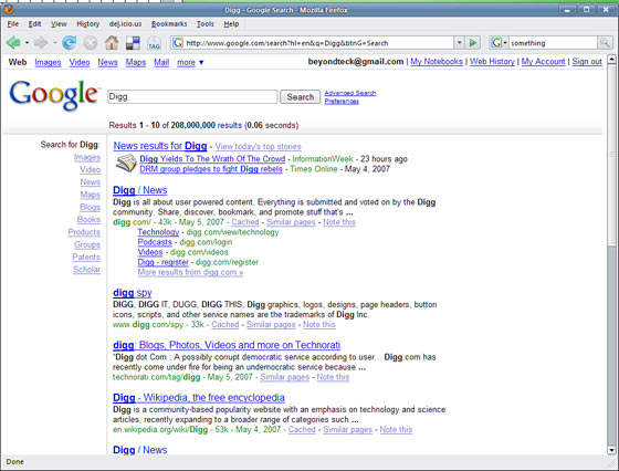
I can’t confirm the veracity of the screen shot, if it’s photoshopped then it’s a very good effort.

The screen shot purports to show Google testing a new layout for their search results. Of note is the introduction of a left navigation bar that directly links to related Google search options, with aesthetically pleasing gradient dividers breaking up the search results from the search box and newly listed options.

Google has a track record of testing new features on an unsuspecting public, and this isn’t the first time there have been reports of Google testing a similar layout to this. Ars Technica reported a similar layout in February 2006 and a thread on Webmaster World in September 2006 spotted similar changes, although without the use of gradients.

After a little digging, I found that Dan Baxter has also spotted the new layout and provided a screen shot that would seem to back up the shot from Beyond Teck.

Google has been shy in tweaking a service that has famously worked so well for it, so these tests may never be rolled out permanently, however in the continuing evolution of Google they could do worse.
google2.jpg
google1.jpg

Advertisement

Comments rss icon

  • I get the same top menu, but not sure about that LHS menu.
    The top bar I get 50% of my random searches.
    Google Doing their stuff

  • I would much rather that than the current options for photos and other things near the search box. I would guess they’re doing some rather intensive testing before they roll out. It’s definitely hard not to be conservative with success like theirs.

  • I have noticed that in past few days they’ve changed the left hand side of BLOG search to look a lot like what’s in the above screenshot.

  • The above screenshot is real. I’ve observed it on and off for a non US ip address.

    http://www.ebizmba.com

  • No ads? That’s interesting.

  • Adam
    I checked the ads part, indeed it was one of my concerns about whether the shot was real or not; from here (in Australia) Digg only results in one ad next to the search results, I’m guessing depending on geographic location that a search for Digg could result in zero ads. Dan Baxter’s shot includes an ad right hand side though on a search for “dealcatcher”.

  • For sure, they have to evolve their lay-out to keep up with new trends and user preferences. How far can they really go?

  • No ads when I search digg.

  • Well, at least they start filling up the whitespace a little, since a lot more people seem to be browsing at 1024×768.

  • Rehuel
    you should try it at 1680 x 1050 :-)

  • I prefer the current version.
    If they want to use the white space and add the sidebar, then it should be a right-sidebar rather than a left-sidebar. That would ensure that the main content (search results) is visible even when I have the browser in windowed mode or using low resolution.

  • This doesn’t look like a huge change, and if Google’s going to make changes I would assume that they’d be incremental. I think these are a step in the right direction, making more use of the sides. I don’t like seeing image results above my search results. I didn’t search for images!

  • I can confirm this. I’ve had this page randomly appear sometimes when Im using Google.

    Its a pain in the arse. Definitely prefer the current format.

    Google – if you listening DONT CHANGE THE FKING PAGE!

    :D

  • Google Blogoscoped gives hint to test this new result pages yourselves.

    It’s not really like the redesign ArsTechnica presented in early 06 : it seems more clever as Google is testing the categorization of your search queries, in order to show their verticals where the results would be optimum.

    For instance, “Product Search” is put as first result, if you search for “digital cameras”, “canon eos”… See screenshot on my website.

  • wow people. for a bunch of geeks yall didn’t notice that google is testing its new history viewer. you can turn it on after you search for something

  • musicmixingguru
    you seemed to have missed the crux of the post, the history stuff is old news, we’re talking layout.

  • Oh my god, this is amazing. They are geniuses. Searching the internet is going to be so much better now. It gives me an idea for a new HTML feature I’m thinking of patenting. I’ll call it “frames”.

    Did they use FrontPage 98 themes to create this?

  • Here’s a shot for you Mike :)

    http://img247.i...chcrunchkb8.jpg

    By the way, it shows like this for me now, both in classic mode and igoogle.

  • Photoshopped? Why would someone think something like this would be easier to create with Photoshop than with just creating the, obviously minimal, HTML and taking a screenshot? Now “photoshop” is a verb that means “manually modified”? Are we going to start calling genetically modified plants “photoshopped plants”? And a custom tailored suit is “photoshopped clothing” now?

  • here is another screenshot, with adblock, filterset g, and costomize google extensions… perhaps one of them is blocking the left bar

    http://www.imag....php?pic=gn.jpg

    (yes, i am trusting enough to not black out my email :-)

  • I saw this new google a month+ ago on my sisters PC, I was like whoo, but didn’t think it was techcrunch worthy :-) .

  • I think the overall design looks promising but I think it still needs just a little work to make it look nice.

    I’m glad to see Google offering a little change I just hope they don’t get too carried away. We all use them because the site is a straight forward minimalist design with other worldly abilities.

  • Josh: you sound pretty tough without having a web site. You prefer, I assume, that everything stay the same all the time, without experimenting?

    I don’t get you, mr. anonymous.

  • Hmm.. This is old. They have tried this before some years ago. Do an image search for “new google layout” or if you are too lazy, see following links:

    http://www.mode...ng-new-layouts/
    (that’s from 2006)

    http://images.g...google%20layout

  • I’ve seen a slighty different SERP a couple of times for the last few days. The ‘related searches’ are moved to a different spot as well. Don’t think it’s an improvement btw. See http://www.joch...an-improvement/

  • Hello Guys ,

    No more questioning you can see it live in Google Switzerland .

    take a look at :
    http://www.goog...earch&meta=

  • I have yet to see this new layout when searching from iGoogle.

  • agouram: I followed that link. Didn’t see any radically new interface or layout with sidebars, etc.

  • Those are horrible screen captures. What tool are you using?

  • The above design is real, here I wrote an article how to get this layout.

    To create this new interface, click here: http://tinyurl.com/2nxg5e

    To create the sidebar, click here: http://tinyurl.com/3dt9u8

    It works great and is a much better interface than regular search results.

  • Here is a way to see the new layout according to this site :

    http://blog.out...-05-04-n11.html

    Not tested though.

  • For a site like Google its good to introduce changes gradually. From the screenshots it appears there will be minimal changes to the current setup which is good but its hard to tell what the final product will be if this is just testing.

  • Akeru’s method works for me.
    I much prefer this new look. I was thinking google was looking a little dated and needed a little redesign.

    -Tim

  • this layout has been around for a while. the big change seems to be the introduction of a gradient – if that’s good enough new for techCrunch now, then I’ve got a whole bunch of meaningless crap to send in.

  • A decade later, 12000 more employees, countless investments & acquisitions, and all Google can come up with is this?! I’m not impressed. And that’s an understatement.

  • alex mcroberts - May 6th, 2007 at 6:43 am PDT

    ive had that layout occasionally for the past few months….only seems to happen every 100th search or so…

  • It’s a interesting new layout, but it will cause problems if they roll it out to the general public in it’s current form. It is visually strange having had the new layout as the seemingly default layout for all of my google searches for the last two days.

  • I have seen the exact same thing in thepast days on Google.com.The interesting thing is that the left navigation bar is not static but contextual, meaning if you search for a book (e.g. Harry Potter) Google Books shows up first in the navigation bar (on the left hand side). If you search for a CD the (Google) music category shows up first. If you search for a product, Google product search (formerly known as Froogle) is one of the top categories.

  • I see that the About Google page also has a new look already!

    Look at http://bp2.blog...bout-google.jpg

  • Google goes web 2.0 (layout theme)!!! yah I saw that too, I thought because I changed my firefox theme LOL

  • Hello everyone,

    sorry for my last post , the link i gave was not exactly what i wanted to give , if you follow the instruction in the Url proposed in the original post and be patient a little while you will definitely end up with the new Google Search Interface.
    (http://arstechn...60326-6460.html)

    here is a pic from my browser:
    http://www.flic...8366&size=o

  • This LHS layout search result page has appeared a couple of times when I’ve searched. So I would say it is very much possible that they are trying to bring that out.

  • ask.com have been a lot more innovative than this in SERP design. this is just an imitation of askx.com, and a poor one at that.

  • I can also confirm this. I’ve been seeing the new result layout for the past week on one of my computers pretty consistently. Another computer displays the traditional layout (haven’t noticed the new layout on it at least). I’m on a 1680×1050 display and this does help to fill the screen a little more – lots of whitespace on the right-side in the traditional layout.

  • Nice to see my post being featured on techcrunch. And just to confirm, this screenshot is not photoshopped. I wouldn’t dare photoshop something like this. But to me it looks like Google was just testing out a new layout, and it was only available for a limited time for people who used the new “web history” feature (or signed into Google when searching not quite sure about that). The search results pages have returned to normal now.

  • I have had this exact layout and i have had a new google images one

  • It would be great if they had a randomise results option, where they did the search but all the results were tossed up and given to you in random order rather than in the order of what they calculate to be relevant.

  • Yeah, I observed this way back in January on my flock browser. http://www.mano...ults-pages.html

  • Seems like google is fixing to copy http://www.clusty.com/

    Clusty.com even has a search page set up for the Nintento Wii – http://wii.clusty.com/

    http://clusty.com/about —>
    About
    Who we are
    Clusty got its start in Pittsburgh, PA in 2004 when the search software company Vivísimo decided to take its award-winning search technology to the web.

    Vivísimo was founded in 2000 by three Carnegie Mellon University scientists who decided to tackle the problem of information overload in web search. Rather than focusing just on search engine result ranking, we realized that grouping results into topics, or “clustering,” made for better search and discovery. As search became a necessity for web users, Vivísimo developed a service robust enough to handle the variety of information the everyday web user was after. The result was Clusty: an innovative way to get more out of every search.

    What makes Clusty unique?
    Clusty is a whole new way to search the web.

    Clusty queries several top search engines, combines the results, and generates an ordered list based on comparative ranking. This “metasearch” approach helps raise the best results to the top and push search engine spam to the bottom.

    But what really makes Clusty unique is what happens after you search. Instead of delivering millions of search results in one long list, our search engine groups similar results together into clusters. Clusters help you see your search results by topic so you can zero in on exactly what you’re looking for or discover unexpected relationships between items. When was the last time you went to the third or fourth page of the search results? Rather than scrolling through page after page, the clusters help you find results you may have missed or that were buried deep in the ranked list.

    And with a name like Clusty, it’s gotta be good!

Leave Comment

Commenting Options

Enter your personal information to the left, or sign in with your Facebook account by clicking the button below.

Alternatively, you can create an avatar that will appear whenever you leave a comment on a Gravatar-enabled blog.

Trackback URL
bugbugbug