Wired Relaunch This Week: (fuzzy) Screenshots
Michael Arrington
19 comments »
Wired Magazine has been working on a back and front end site overhaul since the print and online versions of the brand were reunited last year by Condé Naste. Deeper integration with Reddit, which was acquired in October 2006, is also expected.
We expect at least part of the new design and functionality to be released later this week, and have obtained rather fuzzy screen shots of how it might look.
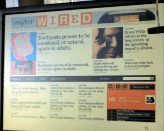
The first image is the new home page for Wired. The focus is clearly on better story placement on the page (Wired currently simply lists stories in reverse chronological order), with more and bigger images. There are also only two ad units on this page: a stereo ad surrounding the Wired logo and a larger unit at the bottom right (the current Wired home page has four ad units).
The top ad unit is unique in that it breaks the ad up into two pieces and puts the Wired logo in between. The New York Times also publishes these “stereo” ad units, although the ads are clearly broken out from the logo. In the screen shot below it all kind of mashes together - this should drive CPMs they can charge way up.
The biggest change, however, is the navigation and search bar, which is located in the middle of the page instead of at the top. This allows the eyes to fall immediately to the top story.
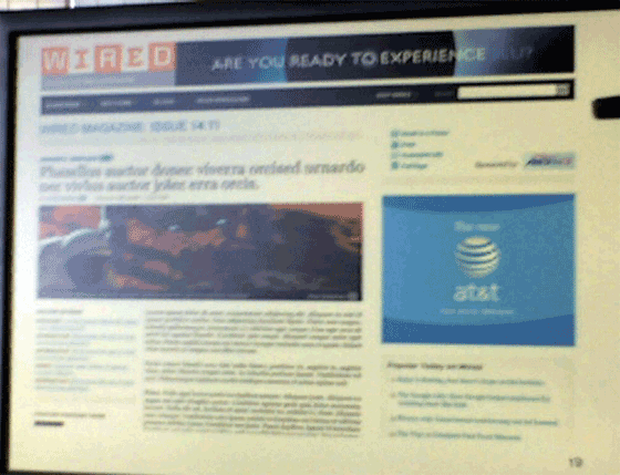
The second screen shot is an article layout. The biggest change here is the long headline and better use of images with the story. There are again only two ad units on the page.
This is almost certainly the work of Wired’s creative director, Scott Dadich, who just completed an overhaul of the print magazine. He’s known for his heavy and creative use of images to fill out the visual appeal of a story.


Current Wired home page:


I think it looks great, although I always find it amusing when a site redesign is news
I don’t get their current site design… they had the same design for what, 4 years at least? Then they have the (current) interim one that’s been around for a very short amount of time, now it’s going to be replaced. I really liked the old design but it is time for change, definitely. It was starting to feel old.
Its been a long time since the last redesign. I remember when Wired was the posterchild of a CSS layout.
Looks nice. Now if they could just redesign their content.
a big yawn and a big who cares. wired should do the noble thing and admit the obvious - it has become was it always derided…boring, overcommercialized, and overdone.
i’m willing to bet the mag still dedicates 50% of editorial content to gadget guides. i think they managed to promote the motorola razr in like five separate places in one issue. but wait, they reissue the same crap product placement in a special standalone gadget guide.
Wired could do much better when it comes to content. I have free subscription but the magazine comes across as if its too focused on technology that basically attarcts teenagers.
Personally the masthead would make me suspicious that editorial content was disguised advertising. It tells me the site is not getting the clicks it needs.
the design looks better than before…
Design looks sick, really looks like a magazine website now. Looks like they’ve figured out what CSS is, also!
It was just last week you were denouncing wired for hammering digg?
now your covering them to the tune of 3 pages of editorial for what amounts to having a facelift at 40. Whats the story? Cause this is not it….
Cool , if you could write another article when the new version is online (for my RSS reader) Thanx Mike!
design looks cool, it really make the content shine!
Wow - you deleted my original comment. I know it was a bit sarcastic…but it was not anonymous…what gives?
That first screenshot looks like a giant leap backwards. Four columns? Headlines with no summary? Where did they get their web designers?
I like the online version of that magazine moreso than the print. The print edition kind of gives me a headache. I’m glad to see the redesign. It’s been forever for them.
Wired has long since needed a revamp of their online property. With the exception of the occasional in-depth journalism or interview, it’s hardly cutting-edge anymore. I cancelled my free subscription long ago - reading the print version has almost no value and like most CondeNast publications, it’s become one big advertising billboard. Is Wired aware of their current status? If so, that’d probably explain why they’re now starting to print cover headlines ABOVE the masthead. That’s usually a pretty good sign of the lack of value of your magazine’s name when it takes second billing to the month’s cover story. I’m also not at all impressed by Mr. Dadich’s interior redesign. The lack of magazine flow and coherence feels as if it was based on a hyperlink architecture. Small tidbits are sprinkled over, under, and in between articles. CondeNast should hire Tyler Brule - that’s a guy who knows how to design a good magazine.
I can take better photos with my SE K800i cell phone
I don’t think it’s a conflict to post two opposing Wired stories, one pro and one con, I think that’s what you call a balanced view. I like the new look.
It’s so long ago that I read Wired’s websites on a daily base, back in the days when they still were two: Wired and Hotwired.
Meanwhile so many new and interesting news websites have started, like Techcrunch, which attracted my attention.
The new Wired design looks great. I’ll see if I find a story that’s interesting to me.