 Yahoo! redesigned their TV listing
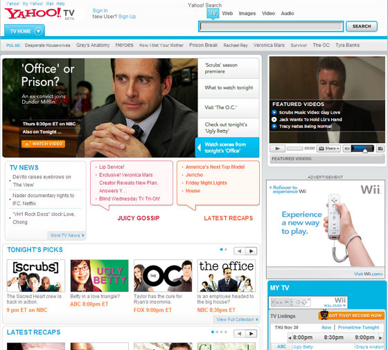
site this week. Certain bloggers have expressed their displeasure with the makeover. I think it looks good but certainly could be more functional.
Most Yahoo! pages are getting Flash-ier so it was time for the TV listing page to go under the knife. Some complaints have been that the Ajax interface slows it down but that wasn’t my experience.
The problem is not the “cool” new color scheme. The problem is the design placement. The most pertinent information is not close enough to the top. I have to scroll down too far from the Scrubs, Ugly Betty, and Grey’s Anatomy promos before I get to the “My TV” grid, which is the reason I would go to this site in the first place. They’ve also placed “TV News,” “Juicy Gossip,” and “Latest Recaps” before the actual listings. I’ll go to the PerezHilton blog if I want that crap.
I don’t think this is another example of Yahoo! spreading its peanut butter. I think this is Yahoo! giving itself the makeover it needs but maybe trying to hard to be cool. Function before fashion, Yahoo! Learn from Meevee.
Update: Apparently Yahoo has had seen the backlash themselves on their own blog regarding the TV listings page. It’s not pleasant. Hopefully they’ll take note.