Microsoft Expo’s project leader, Garry Wiseman, wrote a blog post earlier today criticizing Sina, one of China’s largest search engines, saying “Sina.com steals our design and graphics”.
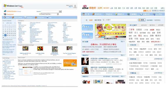
The post highlights the similar look and feel of Sina’s new classifieds site to a previous release of Expo, including the identical color scheme and a pushpin image that appears to have been flat out stolen:
Sina.com steals our design and graphics
We were recently made aware (thanks to a comment on our blog by Phillipe) of a new classifieds site in China that had not only lifted our previous user interface’s look & feel, but also directly copied some of our graphics (note the cool pushpin graphic that our designer Becky created). The shocking thing is that the website in question is owned by one of China’s largest search engines called Sina.com. Couldn’t they afford to hire a designer?Anyway, take a look for yourself at the images I’ve attached to this blog entry. Alternatively, check out the screenshots of our previous UI and then visit: http://post.sina.com.cn/v3_index.php
Let’s just say that I’m looking forward to our China launch..
- Garry
Decide for yourself if Sina ripped of Microsoft – the side by side screen shots are below and larger views are available on Garry’s post. There are definitely similarities, although the irony of Microsoft crying foul over a stolen user interface will not be lost on some readers.
A quick note: I know Garry well and like what he’s done at Expo over the last year or so on the project. Our previous coverage is here, here and here.


Not only the irony in Microsoft crying foul about someone stealing thier interface, but that it’s a company from CHINA.
An old client of ours was a chinese manufacturer building a ‘new’ line of network devices. Turns out later they were sued by 3com for reboxing their exact same hardware. Happens all the time unfortunately.
Take a look at new design of Czech portal http://www.atlas.cz.
Unbelievable! Personally I think both sites have a look of Yahoo! circa 2005 about them. It seems arrogant of Microsoft to say that the site ‘lifted’ their look and feel when many other sites share an equal number of similarities (the pushpin icon excepted).
And on the icon point, it seems like a double standard to me – on one hand Microsoft are saying “let’s make user interfaces from different vendors more consistent” by using the orange RSS icon in IE7, whilst at the same time saying… “as long as you don’t use OUR icons”. Anyone else see that?
Color/Tones are similar but other than that I don’t think they are that much alike. Certainly not enough to yell rip-off. The Czech portal is closer.
And for the rest of the site, the “home” icon for example, is stolen från Mac OS X.
It is not easy to steal where the landlord is a thief” – Irish proverb.
Clearly its a ripoff but does Microsoft have a copyright on “look & feel”?
Yeah, the site has more elements from Mac OS X (some of the icons are actual pixel-perfect copies of Mac OS X icons) than from live.
To Grant Gibson
MS developer team had contacted FF about using RSS orange icon, FF team agreed.
When Microsoft make a standard icon office, it is no brainer, it will be user all over in others application. The same things in push pin icon, it is so common. What’s the fuss of icons copying?
both site is totally diffrent look’s and feel.
Any one know that Microsoft never copy something from others?
to copy the pushpin icon.
this happens all the time, in fashion, in movies, in product design. etc.
if something is popular people will copy.
Microsoft not only stole my user interface, but they stole the whole concept of a unique feature in my app that I foolishly showed someone at MS while my product was still in development.
http://josheins...05/26/1498.aspx
“Clearly its a ripoff but does Microsoft have a copyright on “look & feel”?”
No, They just like to act like they do.
We hear a lot about Chinas’ technical ability but when it comes to the web they haven’t proved that they’re really inventors/innovators have they?
Microsoft and this Wiseman guy need to get a grip. A pushpin icon? LOL.
How about a search engine that doesn’t return shitty results?
Sina should be ashamed of it.
Rajesh
http://www.codegrounds.com – Write n Earn
Many of you see MS as one single man. In fact there are many team at MS, which with different style and behavior. Today, every team and even developer is blogging, so dont expect them behave the same manner.
hmmm… microsoft knows nothing about copying “look and feel”, right?
msn search looks an awful lot like google search to me
live.com personlized home page looks a lot like google ig
oh yeah, remember when windows ripped off the macintosh ui?
although, i do admit the blatant pushpin copy is kind of ridiculous.
Having just come off the phone to my lawyers over an IP issue I can confirm that it matters not whether your claim of copyright infringement is valid or not but simply how much money you’re willing to throw at the problem.
There’s no point in saying ..”Yeah but you have copied Y doing this, or X copied you doing that first”. The truth matters not.
If you have £300,000 or so to take some poor bugger to court over a spurious IP claim your likely to win.
MS have the cash and can thus buy their justice.
Who cares about Microsoft anymore?. They are fighting a rear guard action on all fronts. If they are spending their time sueing people over web interfaces then they are not spending time making their products better.
Lawsuits are the last bastion of a failing business model.
Whats the hooplah about? Just because Sina.com used a light shade of blue and a few layout similarities — i dont see that sina has ‘lifted’ MS’s design..
Probably, just a publicity stunt by the ‘Live’ team. All evidence pinpointed to a freakin pushpin.. I dont know whether it sounded hilarious or ridiculous to me…
Personally, when it comes to design styles and “looks” copying should be flattering. Its how many people learn how to get their own creative edge in the long run, by starting out with what seems to work.. Besides, how many of the web developers out there can say that they haven’t used someone else’s designs in their own along the way? personally looking at the images of Vista that I’ve seen, it doesn’t seem like its all new either — Haven’t I seen THAT interface style somewhere before?!
pranav – You might be right. I have no idea why this particular “news” is been put on TechCrunch.
Mike – care to elaborate on this??
Seriously he’s whining about a stolen interface because of a blue bar and a little push pin icon??? Get a life!
The Chinese steal much more important technology than this! Let’s do something about that first!
If I were Sina.com i would have chosen a better design to copy at
)
I thought that this was all decided a long time ago. Apple sued Microsoft for copying their “look and feel” and lost. Too bad for Microshaft!!
Sina’s design looks way better! M$ has nothing to look at indeed..
I think people are missing the point of my post a little here. The part that surprised me was that it wasn’t a small start-up who “leveraged” our designs, but a search engine which claims to have over 200m unique users a month. I called out the pushpin as that basically a step beyond borrowing our hex codes and background images.
The message you need to take away from this topic is that we need to be vigilant regarding IP (graphical or technical) being violated across borders. These guys have to understand that just because something was created in the US, it’s not OK to copy and paste and call it yours in China.
“I think people are missing the point of my post a little here.”
Garry – are you saying you post the “news” on TechCrunch? Mike didn’t write this??
What’s going on here? TechCrunch is been “group blogged”??
Ron:
Um, no. He’s referring to his “post” here:
http://teamexpo...ve.com/blog/cns!ED26394D7E8C131B!363.entry
Well, they do appear to have “stolen” the Mac OS X ‘Home’ icon.
Live.com search results looks google-ish to me. Someone has to quit whining here.
So M$ owns the color baby blue?
This is ridiculous. Besides all the points already made about MS integrity I must say that Sina’s site looks a lot like tons of Asian portal sites or portals anywhere. The color scheme? Please, light blue with orange highlights? I’ve seen it done a lot of times before. I must say it takes somebody from MS to be as arrogant to think they are innovating and everybody else is copying from them.
I would consider Garry a non-a-hole if he made a followup post appologizing on behalf of MS to at least:
-Alan Kay and the rest of Xerox Parc (Windows)
-Doug Engelbart (Word)
-Visicalc (Excel)
-Diffie Helman (Powerpoint)
-Netscape
-The various AJAX homepage vendors (for Live.com)
-A few dozen email vendors (Outlook)
and, for old time’s sake,
-Stacker.
For a company that’s made a fortune ripping off other people’s work (including mine), I’d say that guy has a lot of nerve.
Does someone have to remind Microsoft of their stealing ways? Apple sends them a prototype of Macintosh and they create Windows. Now, if you see a beta copy of Vista, looks exactly like Mac OS X.
“Good artists copy, great artists, steal.” That’s the way it is…
I think every company has a right to push copyright infrigement if they so feel obliged. I agree with the team at Live.com, if someone steals work they should be punished. And since we does anyone own source code? We all start from the bottom of the totem pole, working our way up we all snag small ideas from others that improve ourselves.
Stealing actual source code and just changing the name is completely different. And stealing graphics that took somone hours to do is out of hte question in my book. I completlty agree.
If you have work you think M$ stole than take them to court. Make a class action lawsuit. Otherwise shut up. This is stupid this product loyalty crap.
Live has been doing good things lately. Lets not forget that Microsoft is actually taking a stab at this Web2.0 community thing. Can’t be mad for them trying. It will only help us all in the future with more apps.
What goes around comes around…
Here’s an idea. Why doesn’t MS sue them or use your BSA goons for this. I am sure it wouldn’t be much of a big deal.
“Waahhhh…., they are using a color scheme similar to ours.” Grow Up!
They Steal everything, in the last 200 years the original thing to come out of China has been benwon balls
“Waaahhh, Mommy! Sina’s copying me, make her stop!”
“Sina’s copying me, make her stop!”
Oh and Frank “If you have work you think M$ stole than take them to court. Make a class action lawsuit. Otherwise shut up.”
You have fucking got to be kidding me. My 10 dollars vs their 10 billion? You are an idiot if you believe that is a fair fight.
They are stealing Mac OS X’s icons too! But it is quite famous that chineses like to take stuff other have made.
Jesus christ, alex. stereotype much? what else do you suppose those ‘dirty yellow bastards’ are famous for, math skills?
The message you need to take away from this topic is that we need to be vigilant regarding IP (graphical or technical) being violated across borders.
that’s an important message, but that message isn’t exactly strengthened by pointing at a babyblue bar and a pushpin icon and crying “theft”. sina’s site design doesn’t even remotely look close to microsoft’s. colour schemes are not IP. a single pushpin icon? i am sorry, that’s just too small to really tell, though at first glance it looks identical — i’d have to have the original files in hand to tell for sure. overall there’s not enough evidence to cry “rip-off” — certainly not from microsoft. there seems to be more evidence that the site graphics might have been cobbled together from various places because they don’t have a really unified style, and the site overall has the look and feel of so many portal sites. so, colour me unconvinced that microsoft has a case.
as it stands i am highly surprised to find the accusation featured on techcrunch.
Twig, I think the chance of gaining millions of dollars from the smallest thing stolen an dused in massive amount of M$ applications is WORTH a loan at the bank. Think about it. It helps
Actually, Sina’s site is much better designed. The pushpin graphic is the only real infringement. Everything else is very different.
I think Vista looks *alot* more like OS X than these sites look alike.
What’s good for the goose . . .
and how big do you figure this “Loan” is going to have to be? How long can the MS lawyers afford to keep me tied up in legal minutia? After I’ve re mortgaged the house and refi’d the car and lost my wife and kids trying to work two jobs to keep up with the multiple “loans” all while the MS war chest has suffered no impact? Trust me. I HAVE thought about it! again. you have got to be fucking kidding me!
Twig do you know what a Class Action Lawsuit? Stop getting bent out of shape.
A class action lawsuit is one filed by one or more people on behalf of themselves and a larger group of people who are facing the same issues.
And PPL HAVE won class action lawsuits against M$
http://www.comp...blogs/node/2883
Looks like Garry needs a history lesson. As the Apple suit tells us.. you can’t copyright look and feel. How to prove IP with look and feel. Dude, it’s going to be hard to prove that the placement of graphics on a web page is some type of unique IP.
Do you really think this is the upmost importance in Microsoft? Seriously. This are just two or three ppl from one deperatment firing up their day to complain about and not do work.
lol.
I can’t read them funny characters.