April 18, 2006

Yahoo Testing New Home Page Layout

Michael Arrington

167 comments »

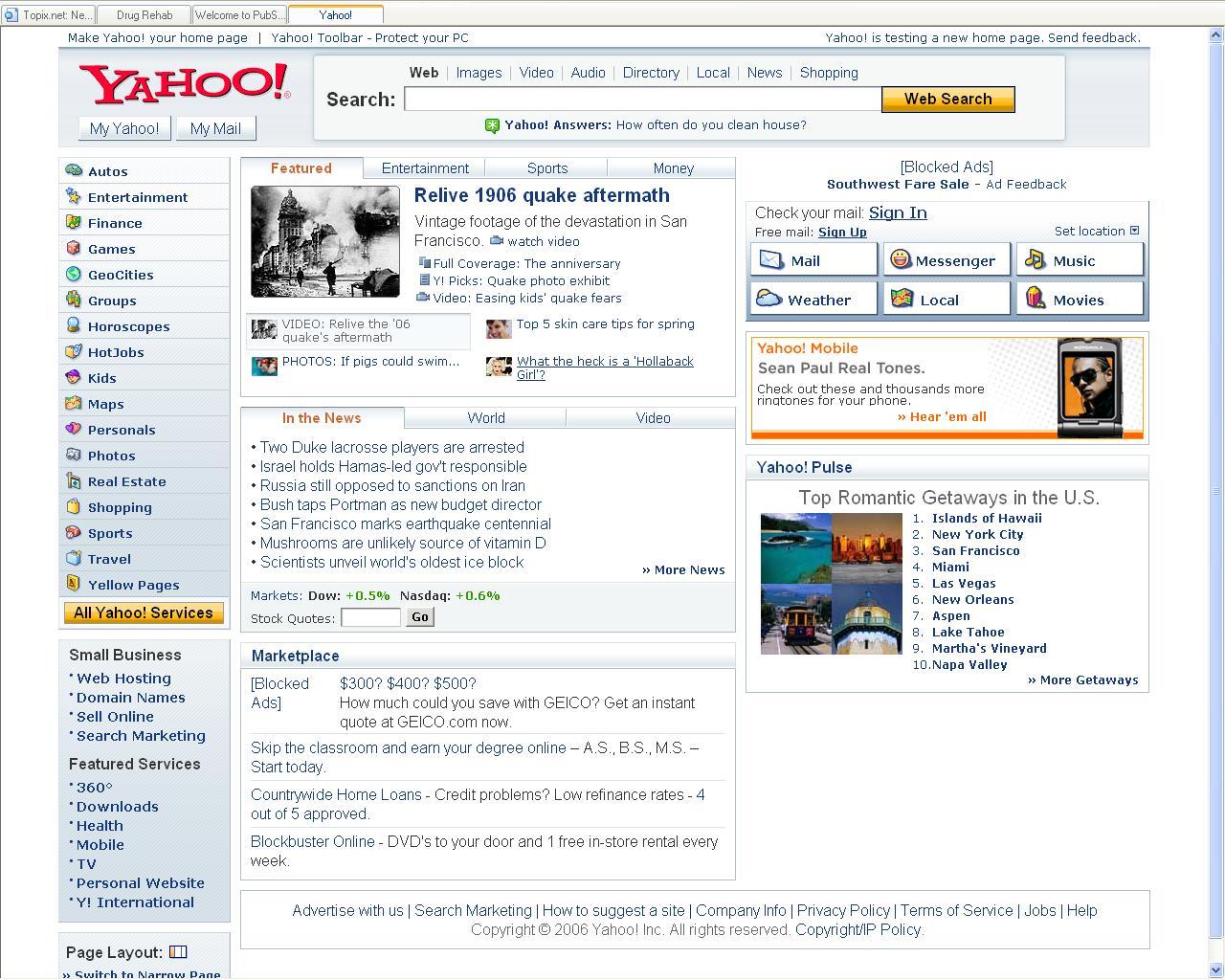
Yahoo is testing a new home page design with some of its users, and Steven Cohen grabbed screen shots.

There are a few differences but as far as I can tell this is a purely cosmetic makeover. The new site is cleaner and groups key resources on the left - things like email, My Yahoo and other Yahoo services and content.

Comparison screen shots below:

New Yahoo:

Current Yahoo:

  • Sphere It

Trackbacks/Pings (Trackback URL)

  1. Comme-ci, comme ça » Blog Archive » Förhandstitt av nya Yahoo
  2. TechCrunch » Yahoo Testing Free Wifi Product
  3. Martin Gordon’s Blog » Yahoo’s New Home Page Won’t Do Them Any Good
  4. Anonymous
  5. Yahoo Is Testing Out A New Homepage
  6. SimpleSEM - Yahoo! Testing New Search Home Page (Beta)
  7. Super Justin » Blog Archive » Yahoo Testing New Layout
  8. CodeRyder » Yahoo gets a face wash
  9. meneame.net
  10. The new look of Yahoo! - Fosfor
  11. alexiablogs » Yahoo!’s Facelift
  12. Macsira.com » Yahoo esta probando una pagina nueva
  13. Ivan Multescu » Blog Archive » New Yahoo Homepage
  14. New Yahoo Design at Drew’s Domain
  15. Yahoo Testing New Home Page Layout at jarkolicious
  16. 2dayBlog - Technology Journal, New Gadget everyday! » Blog Archive » Yahoo Gets a Face Wash
  17. Yud | Web Design and Marketing » Yahoo’s testing new home page
  18. *.* of anything and everything else » Blog Archive » *.links 1
  19. Yahoo меняет внешний вид домашней страницы и готовит новую почту | AJAX Planet
  20. x-ite :: marketing weblog » Blog Archive » Yahoo! komt met nieuwe layout
  21. Yahoo y nueva pagina de inicio at Erolando v4 - Tecnologia, Software y Noticias.
  22. Pronet Advertising
  23. 二三街角 » 最近是改頭換面的好日子 ?
  24. S.E.D @ work » Blog Archive » The human jam of a run
  25. RambleOn, the Chris Van Patten blog » Blog Archive » Interducin ratings
  26. Fyra nyanser av brunt » Blog Archive » Yahoo testar ny design
  27. TechCrunch » Blog Archive » Yahoo Launches New Home Page
  28. BiZwiKi.CN - 喧闹 PK 噪音 » Blog Archive » 雅虎启动新版主页
  29. Comment on Yahoo Testing New Home Page Layout by samihow -- Centplus Tech Blog
  30. E. David Zotter comments on "The hReview Microformat in Yahoo! -- Centplus Tech Blog
  31. The hReview Microformat in Yahoo! TechAlex points out a nice -- Centplus Tech Blog
  32. WordPress on YahooWhen we started, Yahoo asked What would the -- Centplus Tech Blog
  33. Comment on Yahoo Testing New Home Page Layout by AnonymousGlad -- Centplus Tech Blog
  34. Report: Yahoo implicated in 3rd China dissident caseAccording to the -- Centplus Tech Blog
  35. Web 2.0 - Что нового? » Yahoo запускает новую домашнюю страницу
  36. TechCrunch Japanese アーカイブ » Yahoo-ホームページを刷新
  37. TechCrunch » Blog Archive » New Yahoo Home Page Goes Live Today
  38. TechCrunch Japanese アーカイブ » Yahooの新しいトップページが、今日本番スタート
  39. catherine's
  40. Today on the web « There are the days

Comments

RSS feed for comments on this post.

  1. Frank Cefalu

    Its not bad design. But I think it takes away from their image and is leading them in a wrong direction. It has nothing to do with the tradition of yahoo, but a step towards the traditional news guru’s , e.g. CNN and MSNBC. Which is fine if they plan on becoming news orientated. But they arn’t. They are looking for so many ways to defeat google and trying a way to out do them, that it has finally come to this. This is defintly not the answer. They need to try and figure out how to optimize what they have now.

  2. Saul Weiner

    SO I actually like it. I hink teh busy site is actually better compartmentalized. Yahoo has always suffered from having too mcuh content on its site. This definitely eases things up. I wonder what they’ve set in place to ease navigation.

  3. John B

    Smoother fonts and 3D title bar changes take away from Yahoo’s image and lead them in the wrong direction?

    The content is exactly the same. I don’t see the connection.

  4. Robert R

    It has no character, no soul. Faceless portal with the Yahoo! logo.

  5. Chris S

    I think the design is OK. It’s definantly less overwhelming and “compartmentalized” as was stated.

    But I do think that they are on the wrong focus as well. Their main focus was(is?) a search engine, is it not? Why not focus on making their search engine better, with better features? Are they tapped out of ideas?

    Now their a news aggregate and the free AOL of the internet?

    Seems like their just trying to be “hip” to design now. Even if that is Web1.0 standards.

    Perhaps, though, this is a plan of attack. That this is going to be part of a series of updates to Yahoo! as a whole.

  6. radfaraf

    How do I get the option to use the new layout?

  7. moataz

    This isn’t really new news. Amr Awadallah talked about it on his blog back on Feb. 13. Here is his entry on this:

    http://www.awadallah.com/blog/.....xplosions/

    I agree with the others that say this design takes Yahoo in the wrong direction. Still it looks more organized than the current interface.

  8. Carl Spackler

    Looks like AOL. stank. not good. Is yahoo merging with AOL? Junk in that trunk.

  9. Gagan

    I do not know about the exact direction in which this new site design would take Yahoo. However, I do like the new design and a site makeover was long overdue. For a portal, the redifining of strategy is of paramount importance. And that too when there is competition hitting back. But a news-centric first page might be a good change. At the same time, the accessibility of other usual features is right there nicely outlined on the main page itself. Does that really take away the direction and the focus? Just leaves me wondering …

  10. myxmlfeed

    I prefer the current design. Something looks out of balance with the new one. But then again, I never use their front page anyway. I go to news.yahoo every once in a while and have to say the new design seems kind of modeled after that one. The News page is much better though with the darker grays and navy blue.

  11. Barry Schwartz

    Yea, this is back from mid February, posted info on it at http://www.seroundtable.com/archives/003301.html

  12. Andy Lann

    I too agree on the above comments: the design is okay but the direction is wrong. The top 3D-thingy is quite nice but it’s something with the content body that just don’t feel Yahoo at all. It’s like a bad msn.com theme.

  13. Duncan

    They keep rearranging the deckchairs on the titanic. Cosmetic changes, is that all there is?

  14. Smarphone T-Zones

    You can’t see the new site if you’re running firefox, or any netscape based browser.

    You think yahoo needs to hire some more programmers to make the site firefox compatible?

  15. huey

    i hate left navigation.

  16. Thiago

    I don’t like it. It looks like the old CNN and any other web portal design.

  17. Chris E

    Who cares about the home page - how about updating the my.yahoo.com page? Google and other ajax sites are leaving yahoo in the dust.

  18. Craig

    Does anyone remember when they used to have little *NEW* graphics next to the categories that had new websites in them.

    You’ve come a long way baby.

  19. YahooSerious

    It’s Ugly… I hope it doesn’t pan-out.

  20. jones

    agreed. with all the AOL UI folks going to yahoo… i have to agree it’s starting to look a LOT like AOL… :-\

  21. Steve

    I was one of their select users until I installed the IE7 Beta. Frankly, I hated the new layout. I always loved Yahoo’s clean, organized look and feel. The new one is messy and overloaded.

  22. Ethan

    i dont like it

  23. Steve

    Very drab.

    Steve
    http://www.networking-forum.com

  24. Frank Cefalu

    John B not once did I say anything about content. If your impressed by small things like 3d logos and cool fonts than please don’t crotique me.

    Nice reading material
    http://www.useit.com/alertbox/reading_pattern.html

    I look at users abilitiy to smoothly browse a site, look for content, on a familar level. People searching MSN & Yahoo are two different crowds. Doing this will totally throw off their immediate viewing population. Being one the same design scheme and layout as MSN leaves them to content comparison at that point. Right now Yahoo And MSN are different in design, visually. This helps users easily distinguish what they want their preference to be.

    My Summary? Site has no character. Period.

  25. Guy

    Looks like it may be customizable, note the page layout options that are in the bottom left. Maybe users will be able to customize the new home page like Google and/or Netvibes.

  26. Keith

    Finally, it is time that Yahoo improves their websites. With a lot new technology coming up, Yahoo should really harnass the present technology in order to keep up with the cutting edge, with the competitors, especially Google and MSN.

  27. Akram

    Yahoo’s current home page is neet and clear then this one.

  28. ThePlaz

    I don’t know. Yahoo has had their old page for quite a while.

  29. SG

    Would be interesting to use eye tracking technology to evaluate the two designs: http://www.etre.com/usability/eyetracking/showme/

  30. Webist

    If you use DSL from SBC this has been your Yahoo! look for a couple months already.

  31. Nukleon

    I agree the old page is cluttered - I never visit it. However, I dont really like the new page either. We already have “My Yahoo” to put news etc on. What I think the homepage of Yahoo needs these days is something that presents all the yahoo tools. They do so many things and manyof them are unknown or unused because we just dont see them.

  32. JOJOFACE

    Looks like… A CNN with smoothed edges?

  33. jd

    Seen it weeks ago. It was sporatic, but appeared every now and then for me weeks ago.

  34. TJ

    I got the page too. It’s in a F shape format. From previous DIGG story.

  35. E. David Zotter

    Yawn.

    Seriously, Yahoo has how much money…and this is the best they can do?

  36. Jason

    Looks nice, but where are the ads on the new version? In other words, expect to see more junk soon.

  37. Martin

    Bad Change.
    Hope they will keep the current design.

  38. Daniele Levy

    I think it’s an improvement vs. the current one in terms of navigation and content lay out. But yes, they can do better. The home page should be a combination of stadard features like the ones presented in the mockup above with personalized elements that are currently only possible on MyYahoo.

  39. TT

    hello!??? it is so AOL……
    can yahoo just make something unique?

  40. Nikki

    I almost like it, if I don’t see the current website before.

    I have been using the current website for a while, and I would say that the current website, though less graphics, gives more personality. The uniqueness of Yahoo homepage so far is its text oriented (my opinion) and that’s why Yahoo is Yahoo, in the amidst of other flashy, graphic-oriented websites. So the new version one doesn’t differentiate itself anymore. 3 out of 5

  41. Brandon

    very bland. very AOL. very overdone.
    doesnt feel like yahoo anymore.

    a new design isnt a bad thing, but it has lost the “yahoo flavor”

  42. Blaze

    I think it looks too much like msn so i dont really like it.

    The real question here is why were you looking at “Drug Rehab” at the same time? Pick up an addiction recently Michael? ;)

  43. criz

    looks like msn.com

  44. moataz

    this is the problem with yahoo! As many people have stated, it looks like AOL, or a new MSN, or CNN or something. Yahoo just doesn’t have a real personality that leads to consistent product design. When Google comes out with any new product, anyone can see a glimpse of it and immediately say “Ah, that’s Google”. The same can’t be said about Yahoo since they’re inconsistent in design.

  45. Muckenthaler

    They’re just putting a new coat of paint on… not that interesting. New strategy would have been more fun to debate.

  46. Zombie Flanders

    They moved the Directory–the one thing that I liked Yahoo for, and the one thing that I think made them the page to use in the first place–so you now have to click about 3 times to get there. The previous revision minimized it to one of the boxes at the bottom of the page, but now that’s gone too. Oh well. Anyone know any good sites to make my new home page?

  47. Anonymous

    Glad to see it’s finally lost the directory layout. It wasn’t working for the huge mess of content that needed to be squeezed in there.

    Now they need to fix the mess.

  48. Maddy

    Smaller area occupied by adverts, more information, better organization. Looking forward to it!

  49. tim

    where are the ads?

  50. Chee-Leong Lam

    Reminded me of CNN’s site. Pity. I prefer clean and light, perhaps not to the extreme of Google (which BTW reflects its function really well).

  51. understudy

    what do they gain with the change? doesn’t seem like much.

    the current design is sleek and functional. it isn’t broken.

    don’t break it.

    //

  52. Sanjana Hattotuwa

    Had this screen on my PC (only on IE) ages ago - http://yajitha.blogspot.com/20.....chine.html

  53. wper

    I love the new one.

  54. marian

    Do they allow to change the layout for the yahoo firstpage ? (the techcrunch screenshot is cut right at that section). Did anybody tried that? (ok, this would be a first for Y! firstpage, and .. dunno, maybe a little close to live.com ?)
    If anybody can hint me on the “Layout change” issue, please…

  55. K3vin187

    i’m pretty sure that there was more then one new design. I have seen at least 2

  56. Quick Online Tips

    Actually the Yahoo front page looks different depending on whether you see it on Internet Explorer or firefox.
    http://www.quickonlinetips.com.....-explorer/

  57. Shrikant Joshi

    Aha! Gradients! I knew it! Yahoo has finally gone (we)berserk.

    NO, wait! Make that web-2.0-erserk.

    Regards,
    Shri.

  58. Bob

    Google’s is better!

  59. Karen

    Interesting that it appears to take advantage of the way users look at pages. The design follows the “F” pattern documented by Nielson’s usability lab (see item at http://www.useit.com/alertbox/reading_pattern.html ).

    Notice that the categories or sections form the stem, while the two largest and most important sections form the arms. This is what the users see first and foremost.

  60. danilo

    I think unless strength colours has to change, it’s so old… I’m fell ‘back to past’ ….

  61. Fong Say Kiat

    very good! I like it! it is very nice!but I have no the new home page! I hope I have it!

  62. Fong Say Kiat

    I think the yahoo home page colour is sky blue nice!

  63. Fong Say Kiat

    I think the old home page is messy than the new home page!

  64. Diane Lawson

    The new design look is different and is so neat. Has a new look that people will pay attention to. I myself would love to have it. The current one is ok, but the new one is so designed so that everything is at your finger tips. Has that new look and it is all out in front of you. You can see everything without having to go looking for it. Hope to hear from you soon, Diane Lawson.

  65. Thomas Campbell

    What happened? For a while, I had the new homepage. I did’nt know it until my wife asked me, ( Why is yours different? )

    I just now noticed that I don’t have it anymore. Can I get it back?

  66. Will

    how do i get it????????????

  67. charry

    i don’t like the new design at all…
    it looks much more commercialized and
    tacky to me…to much infotainment

  68. Anitha

    i like it…whateva

  69. Stewart

    Don’t like it and I need the old one back please.

  70. Tanja

    I hate it, please change it back!

  71. sami

    how do i get the new yahoo layout?

  72. alex

    GREAT!!!!!!!!!!!!!!!!
    HOW DO I GET IT

  73. Roberta

    I got it and love it

  74. Javier

    I like the new lay out how can I get it

  75. Jackie

    i really like the new yahoo website i can i get it

  76. bettie cook

    ithing it is very good how do i get it

  77. DAVE WISE

    I THOUGHT I WAS DREAMING, IT WAS HERE
    THEN IT WAS GONE. I LOVE VERY THING ABOUT IT .

  78. Catherine Huke

    This web page is just like MSN. It is boring.

  79. Catherine Huke

    This is so so so copying other people. Boring! To much junk on yahoo. Like advertisements.

  80. Dean Kien

    I admit it is boring and there are a lot of advertisements! To much similar with MSN.

  81. Tim Dobbs

    I really love the new layout page. It is cleaner then the old one. Yes, I admit it looks a like MSN but it is a start!

  82. shaielsh

    It is very nice looking.

  83. Susie NEAL

    I really really liked it was better for me to find what i need so please give it back to me. Thank you very much Susie NEAL

  84. bill_Millan@yahoo.com

    I hate this I can’t find anything I can’t even find the Help link or a unsubsribe me. SUCKS!
    and I live(d) here.

  85. Barry

    All the graphics and boxes although very easy to use is very cluttered. I do not like the layout at all. I agree that it is very cool what they are trying to accomplish, but I just can’t stand it. I prefer the current look as it is very easy to navigate. They should work on that and not remodel the layout completely.

  86. Geoff Stephens

    At first glance, Different. But as you try to navigate, it doesn’t just flow with the user, and it should. I love alot of news on my home page, plus music. There has to be a way to just make it flow. Yahoo home page should be able to customize. I believe you as “Yahoo” would benifit from that. People like to make things reflect WHO THEY ARE. Not just a teenie bopper look, or a retirement home look. Keep working on it. You can do it.
    1. Flow.
    2. A home page we can customize. from age 10 to 90
    When my idea works, I’ll gladly accept 25% of yahoo’s income (-:

  87. FROM CHIEF STANLEY BUBA

    From Chief Stanley Buba.
    Chairman Foreign Contract Award Committee (NNPC)
    Maputo Street Zone 3
    Victoria Island- Lagos-Nigeria.
    Dear Sir ,

    Re: PAYMENT AUTHENTICATION.

    I am Chief Dr.Stanley Buba , Chairman Foreign Contract
    Award Committee, on Dept Settlement, my office monitors and controls the
    affairs of all banks and financial institutions in Nigeria concerned with foreign contract payments. I am the final signatory to any transfer or remittance of huge funds moving within banks both on the local and international levels in line to foreign contracts settlement.

    I have before me list of funds, which could not be transferred to some nominated accounts as these accounts have been identified either as ghost accounts, unclaimed deposits and over-invoiced sum etc.

    I write to present you to the federal government that you are among the people expecting the funds to be transferred into their account, on this note; I wish to have a deal with you as regards to the unpaid certified contract funds.

    I have every files before me and the data’s will be to change to your name to enable you receive the fund into your nominated bank account as the beneficiary of the fund’s amount $20 Million U.S.D.

    As it is my duty to recommend the transfer of these surplus funds to the Federal Government Treasury and Reserve Accounts as unclaimed deposits,

    I have the opportunity to write you based on the instructins I received 2 days ago from the Senate Committee on Contract Payments /Foreign Debts to submit the List of payment reports / expenditures and audited reports of revenues. Among several others, I have decided to remit this sum following my idea that we have a deal/agreement and I am going to do this legally.

    MY CONDITIONS.

    1. You will take 35% of your contract funds as soon as you confirm it in your designated bank account.
    2. This deal must be kept secret forever, and all correspondence will be strictly by email / telephone, for security purposes.
    3. You will be required to provide your full company’s name and address with your bank account information including your private telephone/fax numbers.

    I will advise you on what to do immediately and the transfer will commence without delay as I will proceed to fix your name on the Payment schedule instantly to meet the seven days mandate.
    PLS contact me on this email address: stanley_buba1@indiatimes.com
    Waiting for your reply soon.

    Yours Sincerely.

    Chief Dr.Stanley Buba.

  88. Darren

    It sucks, I keep emailing them telling them if they make the switch, I’ll change my default start page to Google or some other site. Yahoo’s been my start page for years, but they are losing their simplicity. The stupid idiots.

  89. Darren

    Also, you can’t tell from the screen shots provided, but they made the new page much wider, which I absolutely hate. It’s too much flash, not enough simple, readable text. It reminds me of the difference between the news on PBS vs Fox News. The old Yahoo page is like PBS (straightfoward, minimal usesless fluff), the new one is like Fox News.

  90. Golden Daffodil

    i like the new yahoo homepage… it is simple and easy to get along with.

  91. ldemarco

    The new page is too busy and hard to find what you want. All the “like” responses probably work for yahoo. It is not easy to use nor is it easy to look at.
    L&L DeMarco

  92. Martha Mcpherson

    I don’t like at all . Some how it just came up. 6-26-06 . I want the old one back !!!!!!!!!!!!!!! some one E- mail back and tell me how to get the old one to come back up !!!!!! or, I’am looking for a new home page !!!!!!!!!!!!!!!!!!!
    !!!!!!!!!!!!!!!!!!!!!!!!!!!!!!!!!!!!!!!!!!!!!!!!!!!!!!!!!!!!!!!!!!!!!!!!!!!!!!!!!!!!!!!!!!!!!!!!!!!!!!!!!!!!!!!!!!!!!!!!!!!!!!!!!!!!!!!!!!!!!!!!!!!!!!!!!!!!!!!!!!!!!!!!!!!!!!!!!!!!!!!!!!!!!!!!!!!!!!!!!!!!!!!!!!!!!!!!!!!!!!!!!!!!!!!!!!!!!!!!!!!!!!!!!!!!!!!!!!!!!!!!!!!!!!!!!!!!!!!!!!!!!!!!!!!!!!!!!!!!!!!!!!!!!!!!!!!!!!!!!!!!!!!!!!!!!!!!!!!!!!!!!!!!!!!!!!!!!!!!!!!!!!!!!!!!!!!!!!!!!!!!!!!!!!!!!!!!!!!!!!!!!!!!!!!!!!!!!!!!!!!!!!!!!!!!!!!!!!!!!!!!!!!!!!!!!!!!!!!!!!!!!!!!!!!!!!!!!!!!!!!!!!!!!!!!!!!!!!!!!!!!!!!!!!!!!!!!!!!!!!!!!!!!!!!!!!!!!!!!!!!!!!!!!!!!!!!!!!!!!!!!!!!!!!!!!!!!!!!!!!!!!!!!!!!!!!!!!!!!!!!!!!!!!!!!!!!!!!!!!!!!!!!!!!!!!!!!!!!!!!!!!!!!!!!!!!!!!!!!!!!!!!

  93. Wilsonn Pérez

    I really think the old page is better due to its simplicity. If you have the new page and would like to change back to the old page, you just have to click on “switch to old page”, which appears on the right bottom.

  94. yunghungkim

    this page isn’t as good as the old one please change it back. im more familiar with the old one

  95. borri

    The new page sucks. Period. I agree with some–Yahoo! USED to be the best homepage because of it’s simple look, not cluttered with big buttons and other crap I don’t even want to look at. Yuck. I will probably change to something else now..

  96. PJ

    I am soooo damn tired of Yahoo changing their homepage. It seems like just when you get used to the damn thing, here they come again and change it, like a middle aged woman who keeps changing her makeup and haircolor to try to be “newer and fresher”…enough is enough! Please guys, do what I did and click on the homepage feedback link on the bottom of the homepage and let them know they need to stop this crap NOW. They should allow US, the USERS of their homepage the decision on whether to get this new, ugly page or stick with the current one. If this change takes effect, I will definitely stop using Yahoo’s homepage and move on to something better…better in the sense it doesn’t keep changing and making it’s users have to relearn where everything is. Yahoo…you can suck the big one!

  97. Krista

    I don’t like the new home page - it is boring. I like the old home page because it is more inviting. The new design is too drabby looking and not as cheery. I look forward to checking my email and catching up on the latest news on the old home page. It may have a lot of information on it but I think it is easier on the eyes. I don’t have to go all over searching for news - it is right there! The new one is harder to find things and it is just not working for me. Don’t change it please ~ I will have to search for a new home page like a lot of other people!

  98. Penny

    I do not like the new home page. I will give it about 1 week and if the new page doesn’t plainly state how to go back to the old page I will find another home page. I don’t understand why they would want to change something that is working great. I have had yahoo for my home page for years and would hate to lose them but I will take my email account and business to someone else. There are too many free sites out there offering the same things with much easier layouts.

  99. karen phillips

    I logged into my computer yesterday July 28, 2006, and I had yahoo’s minimal homepage which requires you to navigate through several entries to reach what you want. Are you sure yahoo is randomly testing their homepage on customers and secondly when I tried to switch mine back with hitting return to old page format it would not redirect me to the old page. Can someone let me know how to switch my old page back to the previous format? I hope this isn’t any browser highjacking. I’m using a mac so that would be rather difficult to achieve. Please advise as to how to resolve the non response of my switching back to the old format.

  100. Donnie Gadow

    I don’t like new front page of Yahoo! I like the old front page .
    The new yahoo! front page because it is boring.

  101. Donnie Gadow

    Get a Job. Steven Cohen.

  102. Peter

    My Opinion: The new yahoo homepage sucks. If they kept the last layout and added the wide page option, I would be very happy.
    If it ain’t broke……

  103. Dirk Patrick

    Yahoo’s now home page is sucking! Whenever I try to click on my groups, that page will not let me go there. What is going on!! Yet, you can click on all the other links but not groups.
    What up?
    D Patrick

  104. lilly

    i don’t like the new home page for yahoo pls bring back the old one ..

  105. zsite

    Hello to Z! =)

  106. astromusicologie 101

    Nice! It looks really good!

  107. Drunk Idiot

    Just like when Coke messed up and went with the “New Coke”, Yahoo has messed up and tried to improve on their simple to use, plain brown wrapper, but excellent, web page.

    Plea to Yahoo Follows:
    Please, Yahoo, if you monitor these posts, give us a button to use the old web page as opposed to forcing us to the new. You make enough money to hire a few more web-masters to make two whole front pages. As far as I can tell, that is the only change.

    Please, I know most internet users are young and have to experience things to believe it…but read up on the “New Coke” fiasco and you will understand why Coke Classic came back.

    Drunk Idiot

  108. Silver

    I have had Yahoo! as my home page for years. I never thought anything could make me switch to Google, which is just awful. But now, with this new home page, I hate it. I mean I really hate it. I already hated how cluttered Yahoo! had become, but now it’s cluttered and obscure. Nothing is easy to find, the layout looks silly and dated, and it isn’t personalizable. I wish they wouldn’t change it, but they will, and I’ve already switched. If they were smart they would just leave the old one up (which is what Google has done).

  109. Astromusicologie 101

    THe new layout has taken some getting use to but I love what they have done using AJAX for the weather and news!

  110. alice

    I agree with others that the new home page is boring! More than that, it is unimaginative!
    I expect more from Yahoo. As a matter of fact, I suggest that the old page is just fine…I’d really like to see you improve on it if you possibly can
    Alice in Oregon

  111. Byron

    Yahoo new web page……………. SUX SUX SUX SUX SUX SUX SUX SUX SUX SUX SUX SUX SUX SUX SUX SUX SUX SUX SUX SUX SUX SUX SUX SUX SUX SUX SUX SUX SUX SUX SUX SUX SUX SUX SUX SUX SUX SUX SUX SUX SUX SUX SUX SUX SUX SUX SUX SUX SUX SUX SUX SUX SUX SUX SUX SUX SUX SUX SUX SUX SUX SUX SUX SUX SUX SUX SUX SUX SUX SUX SUX SUX SUX SUX SUX SUX SUX SUX SUX SUX
    Must have a bunch of Liberals & Democrats working for ‘em get your acts together or we’ll all be Doomed………………..

  112. hugh

    I agree with some of the other people, I never thought I would consider changing to google, now that I seem to be stuck with the new worthless yahoo page, i am switching if I can’t get the old page back. the new yahoo page must have been created by richard brodie, he is a chidish X employee of Microsoft that couldn’t write software if it had a color coded instruction booklet

  113. helmy ibrahim

    simply put i want the old home page back or i will start using msn.

    the new page is screwed up and misalligned . i doesn’t appear in its

    entirety like the old one and it looks uglyyyyyyyyyy.

  114. Richard Brodie

    Me? How did I get into this? And I can too write software if it’s color coded.

  115. christine

    how about the old home page being brought back. it is rediculous, i never asked for the new home page and we should be able to make out own choices not them being made for us. i am on the net everyday and allot each day,i don’t want to have to keep waisting my time trying tofind what i need- th eold home page back or i leave yahoo. now- this is still a free country and we still have the right to choose!

  116. christine

    another thing,i have been telling you guys for months now just how bad the new home page sucks and need to bring back the old one- how about listening to those who use it- not doing what you want and if you can’t do that how about at least stop trying to act like you are God and have all the answers- give us back the old page- the new one more than sucks but what i have for it isn’t proper to be posted.

  117. Emily

    I really do not like this new yahoo page. I want my old yahoo page back and not the new one.

  118. CRYSTAL

    i hate the new home page,it sucks big time! i didn’t ask for the new home page. i should of been able to choose. between the new & old.

  119. jim

    please give us the option of using the old or new web page. I do not like the new page and it is driving me over to excite.

  120. web hosting uk

    The new web page is boring. I don’t like the new design at all…
    I need the old one back please.

  121. Jessica

    I am having a hard time viewing the new web page. The letters are smaller and clouded. The previous web page had bigger and bolder letters which were easier to read. I say this being a 29 year old with good vision. I know change can be difficult but, this is not working for me or many others that subscride to Yahoo. I appreciate your effort in trying to make things better, however I think someone should listen to popular demand.
    How do I get a response from the Yahoo team?

  122. jm_dub

    I love Yahoo but they suck right now

  123. Francisco47s

    I have Cached the old Yahoo home page.

    Here is the url: